Selected from Medium
Author: Piotr Tempczyk
Translated by Machine Heart
Contributors: Chen Yunzhu, Liu Xiaokun
There are many studies on visualization in the field of convolutional neural networks, but there are not enough similar tools for LSTM. Visualizing LSTM networks can yield interesting results; due to their time-related characteristics, we can explore the relationships between data not only in the spatial dimensions of the visualized images but also in the temporal dimensions to explore the robustness of these relationships.
-
GitHub address: https://github.com/asap-report/lstm-visualisation
-
Dataset address: https://archive.ics.uci.edu/ml/datasets/Australian+Sign+Language+signs
For modeling long sequences, Long Short-Term Memory (LSTM) networks are currently the state-of-the-art tools. However, understanding the knowledge learned by LSTMs and studying the reasons for certain specific errors they make can be somewhat challenging. There are many articles and papers on this aspect in the field of convolutional neural networks, but we lack sufficient tools for visualizing and debugging LSTMs.
In this article, we attempt to partially fill this gap. We visualize the activation behavior of LSTM networks from the Australian Sign Language (Auslan) symbol classification model by training a denoising autoencoder on the activation units of the LSTM layer. By using a dense autoencoder, we project the 100-dimensional vectors of LSTM activation values into 2D and 3D. Thanks to this, we can visually explore the activation space to some extent. We analyze this low-dimensional space and attempt to explore how this dimensionality reduction helps find relationships between samples in the dataset.
Auslan Symbol Classifier
This article is an extension of Miroslav Bartold’s engineering thesis (Bartołd, 2017). The dataset used in that thesis comes from (Kadous, 2002). This dataset consists of 95 Auslan sign language symbols captured using gloves with high-quality position trackers. However, due to an issue with the data file for one of the symbols, 94 classes remain available. Each symbol was repeated 27 times by local sign language users, and each time step was encoded using 22 digits (11 for each hand). In the dataset, the longest sequence has a length of 137, but since there are very few long sequences, we kept the length at 90 and padded zero sequences at the front of shorter sequences.
Miroslav’s thesis tested several classifiers, all based on LSTM architecture, achieving classification accuracy around 96%.
If you are not familiar with LSTM, you can check out Christopher Olah’s blog, which has a very good explanation of LSTM networks: http://colah.github.io/posts/2015-08-Understanding-LSTMs/. Or read the article from Machine Heart: Understanding How LSTMs Work Before Calling the API.
In this study, we focus on an architecture with a single hidden layer of 100 LSTM units. The final classification layer has 94 neurons. Its input is a 22-dimensional sequence with 90 time steps. We used the Keras functional API, and the network architecture is shown in Figure 1.
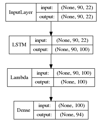
Figure 1: Model Architecture
The Lambda element shown in Figure 1 extracts the last layer’s activations from the complete activation sequence (as we passed return_sequences=True to the LSTM). For details of the implementation process, we hope everyone will check our repo.
First Attempt to Understand the Internal Structure of LSTM Networks
Inspired by “Visualizing and Understanding Recurrent Networks” (Karpathy, 2015), we attempted to localize some neurons corresponding to easily recognizable sub-gestures (and share them across different symbols), such as making a fist or drawing circles with the hand. However, this idea failed for the following five reasons:
-
The signals from the position tracker are insufficient to fully reconstruct hand movements.
-
There are significant differences in the representation of gestures between the tracker and real space.
-
We only have gesture videos from http://www.auslan.org.au, but no actual execution videos of the symbols in the dataset.
-
The vocabulary in the dataset and the videos comes from different dialects, so synonyms may occur.
-
100 neurons and 94 symbols create a very large space for human understanding.
Therefore, we focus solely on visualization techniques, hoping this can help us uncover some mysteries about LSTM units and the dataset.
Denoising Autoencoder
To visualize the LSTM output activation sequences for all gestures, we will attempt to reduce the 100-dimensional vector representing activation values to 2-3 dimensional vectors at each time step using a denoising autoencoder. Our autoencoder consists of 5 fully connected layers, with the third layer being a bottleneck layer with a linear activation function.
If you are not familiar with the topics mentioned above, you can learn more about autoencoders here: http://ufldl.stanford.edu/tutorial/unsupervised/Autoencoders/.
To ensure the images are clear and readable, the linear activation function has proven to be the best activation function. For all tested activation functions, all sample paths (the term will be explained in the next section) start near the point (0,0) on the graph. For non-odd symmetric functions (ReLU and sigmoid), all sample paths lie in the first quadrant of the coordinate system. For odd functions (such as tanh and linear functions), all paths are roughly evenly distributed across all quadrants. However, the tanh function compresses paths around -1 and 1 (which distorts the images too much), while the linear function does not have this issue. If you are interested in visualizing other types of activation functions, you can find the code implementation in the repo.
In Figure 2, we show the architecture of the 2D autoencoder. The 3D autoencoder is almost identical, except it has 3 neurons in the third Dense layer.
In all individual time steps of each gesture implementation, the autoencoder is trained using the output activation vectors of the LSTM units. These activation vectors are then shuffled, and some redundant activation vectors are removed. Redundant activation vectors refer to the vectors obtained from the start and end of each gesture, which have nearly constant activation.
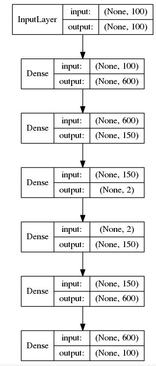
Figure 2 Autoencoder Architecture
The noise in the autoencoder follows a normal distribution with a mean of 0 and a standard deviation of 0.1, and this noise is added to the input vectors. The network is trained using the Adam optimizer to minimize the mean squared error.
Visualization
By inputting the LSTM unit activation sequences corresponding to individual gestures into the autoencoder, we can obtain activations at the bottleneck layer. We treat this low-dimensional bottleneck layer activation sequence as a sample path.
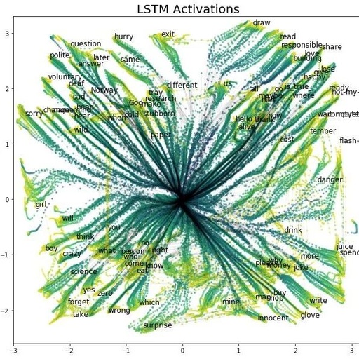
Near the last step of some samples, we provide the name of the gesture symbol it represents. In Figure 3, we present the visualization results of the training set sample paths.
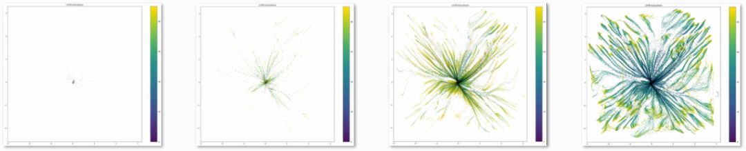
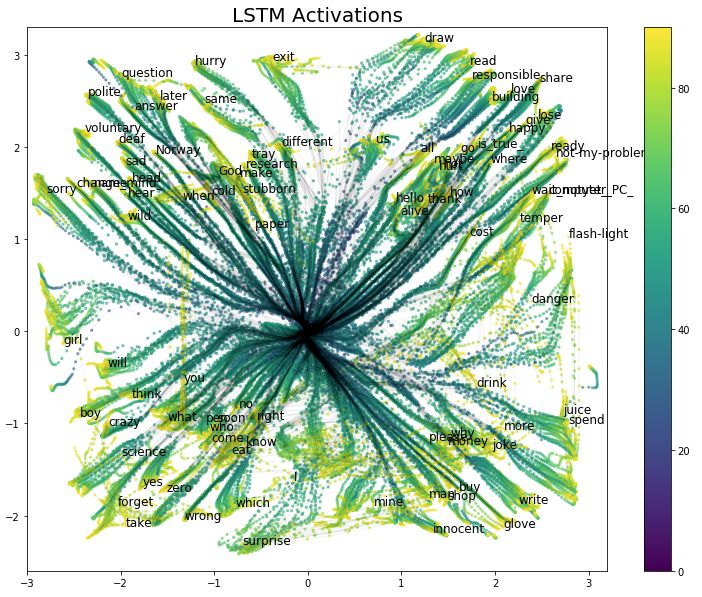
Figure 3 Visualization of LSTM Activation Time Evolution
Each point in the visualization represents a time step and the 2D activation values of the autoencoder for a sample. The color of the points indicates the time step length of each symbol execution (from 0 to 90), with black lines connecting points of the same sample path. Before visualization, each point was transformed by the function lambda x: numpy.sign(x) * numpy.log1p(numpy.abs(x)). This transformation allows us to observe the starting position of each path more closely.
In Figure 4, we show the activations at the last step of each training sample. This is the 2D projection of input points to the classification layer.
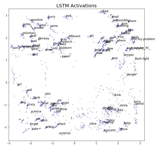
Figure 4 Activations of the Last Layer of LSTM
Surprisingly, all paths appear very smooth and are well-separated spatially, because in fact, before training the autoencoder, all activations for each time step and sample were shuffled. The spatial structure in Figure 4 explains why our final classification layer achieved such high accuracy on such a small training set (close to 2000 samples).
For those interested in studying this 2D space, we have provided a larger version of Figure 2 at the following address: https://image.ibb.co/fK867c/lstm2d_BIG.png.
In Figure 5, we present the visualization results of the 3D LSTM activations. For clarity, we only label a portion of the points. For data analysis purposes, we focus solely on 2D visualization in the second part of this article.
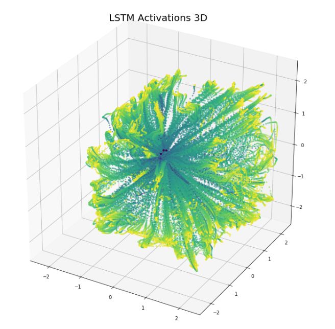
Figure 5 3D Visualization of LSTM Activations
Analysis
The visualizations look very effective, but is there something more meaningful? If some paths are close together, does that indicate that these gesture symbols are more similar?
Let’s consider the separation between right-hand and two-hand symbols (we have not seen symbols made with only the left hand). This separation is based on the statistical variability of the signals from the handheld tracker; for more detailed information, refer to the repo.
For clarity, we have plotted the paths without points in Figure 6. Right-hand gesture symbols are represented in cyan, and two-hand gesture symbols are represented in magenta. We can clearly see that both types of symbols occupy complementary parts of the space and rarely confuse each other.
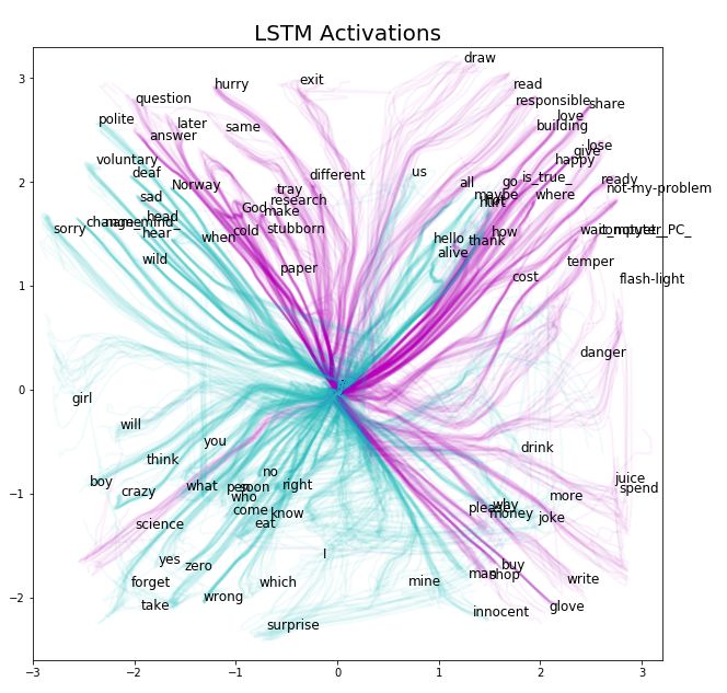
Figure 6 Classification of Activation Paths by Hand Usage
Now let’s take a look at the gestures for drink-danger. Both are “cyan” gestures but occupy most of the magenta area on the right side of Figure 6. In our data, both gestures are performed with one hand, but videos from the Auslan signbank indicate that the danger gesture is clearly two-handed.
This may be due to labeling errors. Note that dangerous is definitely one-handed, and drink is similar (at least in the first part of the gesture). Thus, we believe the label danger actually refers to dangerous. We have plotted these two gestures in Figure 7.
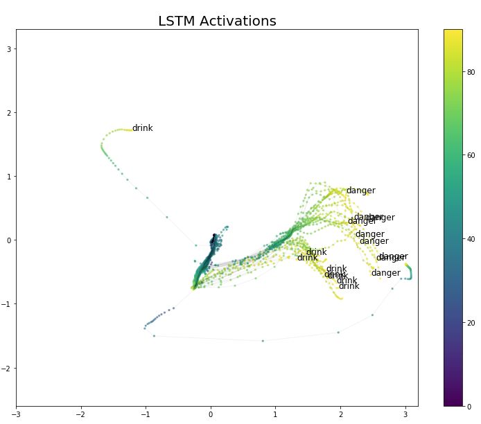
Figure 7 LSTM Activation Values for Labels Drink and Danger
In Figure 8, the situation for gestures Who and soon is quite similar. There is only one bent tracker in the glove, and the finger bending measurements are not very precise. This is why these two gestures appear more similar in Figure 8 than in the videos.
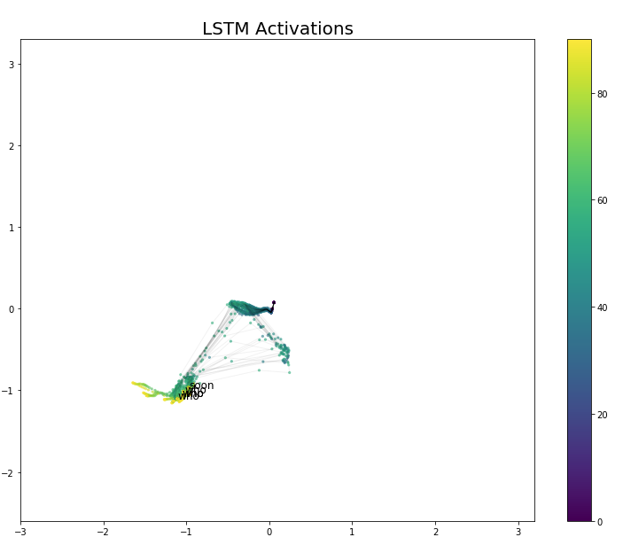
Figure 8 LSTM Activation Values for Labels Who and Soon
The sample paths for gestures Crazy and think occupy the same spatial region in Figure 9. However, think appears to be a major part of the longer crazy gesture. When we look at the videos in the Auslan signbank, we find that this relationship is correct, and the crazy symbol looks like the think symbol plus the process of opening the palm.
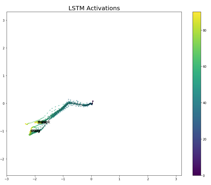
Figure 9 LSTM Activation Values for Think and Crazy
In Figure 10, although we find that the symbol you is orthogonal to crazy, think, sorry (and other gestures not shown here), when we compare their videos in the signbank, we do not find any similarities between these symbols and you.
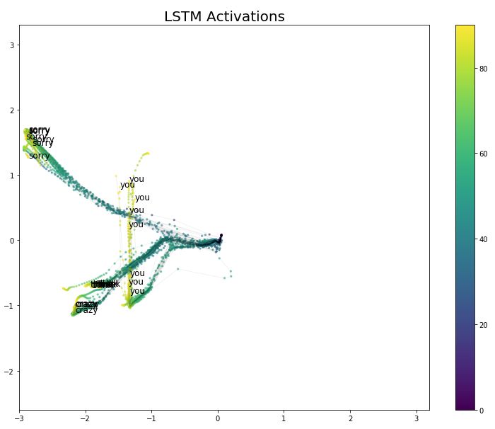
Figure 10 LSTM Activation Values for Think/Crazy/Sorry/You
We should remember that the state of each LSTM unit retains its previous state, fed by the corresponding input sequence at each time step, and there may be temporal evolution differences when paths occupy the same space. Therefore, besides the factors we considered in our analysis, there are actually more variables that determine the shape of the paths. This may explain why we find some relationships between sample paths intersecting even when we cannot observe visual similarity between the symbols.
Some of the tight connections derived from the visualization results have proven to be incorrect. Some connections change during the intervals of re-training the autoencoder (or after re-training the LSTM units); some connections do not change, possibly representing true similarities. For example, God and Science sometimes share similar paths in the 2D space, while at other times they drift apart.
Misclassified Samples
Finally, let’s take a look at the misclassified samples. In Figures 11, 12, and 13, we visualize the misclassified samples in the training, validation, and testing sets, respectively. The blue labels above the misclassified samples indicate their true categories. The labels chosen by the model are marked in red below.
For the training samples, only three samples were misclassified, and two of them (hurt-all and thank-hot) are very close in the two-dimensional space. Thank-hot is also very close in the video, but Hurt-all is not.
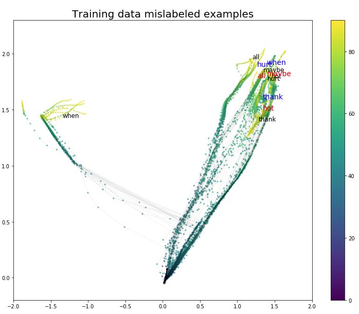
Figure 11 Misclassified Samples in the Training Set
As we expected, there are more misclassified samples in the validation and testing sets, but these errors occur more frequently among gestures that are closer in the projection space.
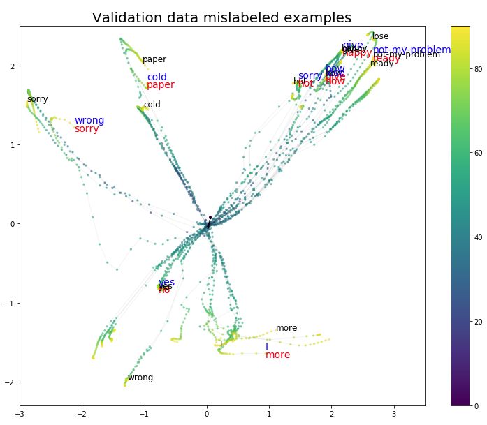
Figure 12 Misclassified Samples in the Validation Set
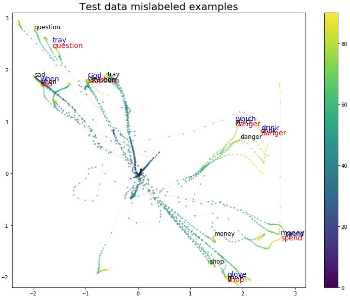
Figure 13 Misclassified Samples in the Testing Set
Conclusion
We projected the 100-dimensional activation values into a low-dimensional space. This projection looks very interesting, as it seems to preserve many (but not all) relationships between symbols. These relationships seem similar to the relationships we perceive when observing gestures in real life, but without actual matching gesture videos for analysis, we cannot confirm this.
These tools can be used to some extent to observe the structure of LSTM representations. Moreover, compared to using raw input, it can serve as a better tool for finding sample relationships. 
Original article link: https://medium.com/asap-report/visualizing-lstm-networks-part-i-f1d3fa6aace7
This article is translated by Machine Heart, please contact this public account for authorization to reprint.
✄————————————————
Join Machine Heart (Full-time Reporter/Intern): [email protected]
Submissions or inquiries: [email protected]
Advertising & Business Cooperation: [email protected]