The idea of building a machine learning or deep learning model follows the principle of constructive feedback.You build a model, get feedback from metrics, improve it, and continue until you achieve the desired classification accuracy.The evaluation metrics explain the performance of the model.An important aspect of evaluation metrics is their ability to distinguish the results of models.
This article explains 12 important evaluation metrics that data science professionals must understand. You will learn about their uses, advantages, and disadvantages, which will help you select and implement them accordingly.
Recommended online tools: Three.js AI Texture Development Kit – YOLO Synthetic Data Generator – GLTF/GLB Online Editor – 3D Model Format Online Converter – Programmable 3D Scene Editor

1. Background Knowledge

Evaluation metrics are quantitative measures used to assess the performance and effectiveness of statistical or machine learning models. These metrics provide insights into how well the model is performing and help compare different models or algorithms.
When evaluating machine learning models, it is crucial to assess their predictive capability, generalization ability, and overall quality. Evaluation metrics provide an objective standard for measuring these aspects. The choice of evaluation metrics depends on the specific problem domain, data type, and expected outcomes.
I have seen many analysts and aspiring data scientists who are even too lazy to check how robust their models are. Once they finish building the model, they hurriedly map the predictions to unseen data. This is an incorrect approach. The fundamental fact is that building a predictive model is not your motivation. It is about creating and selecting a model that can provide a high accuracy score on out-of-sample data. Therefore, it is crucial to check the accuracy of the model before calculating the predictions.
In our industry, we consider different types of metrics to evaluate our machine learning models. The choice of evaluation metrics entirely depends on the type of model and the implementation plan of the model. After completing the model building, these 12 metrics will help you assess the accuracy of the model. Considering the growing popularity and importance of cross-validation, I have also mentioned its principles in this article.
1.1 Types of Predictive Models
When we talk about predictive models, we refer to regression models (continuous output) or classification models (nominal or binary output). The evaluation metrics used in each model differ.
In classification problems, we use two types of algorithms (depending on the type of output it creates):
-
Class Output: Algorithms like SVM and KNN create class outputs. For example, in a binary classification problem, the output will be 0 or 1. Today, we have algorithms that can convert these class outputs into probabilities. However, these algorithms have not been well accepted in the statistical community.
-
Probability Output: Algorithms like logistic regression, random forests, gradient boosting, and Adaboost provide probability outputs. Converting probability outputs into class outputs is merely a matter of creating threshold probabilities.
In regression problems, we do not encounter this inconsistency. The output is essentially always continuous and does not require further processing.
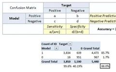
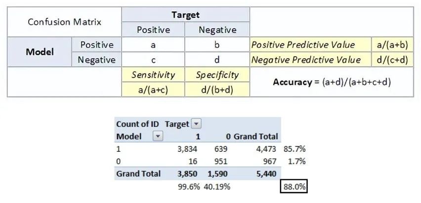
For the discussion of classification model evaluation metrics, I used my predictions on the BCI challenge problem on Kaggle. The solution to the problem is outside the scope of our discussion here. However, this article uses the final predictions from the training set. The predictions for the problem are probability outputs, which are converted to class outputs with a threshold of 0.5.

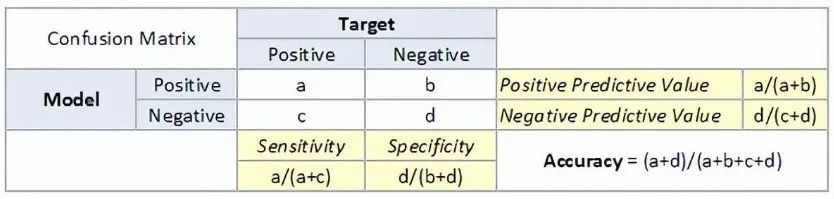
2. Common Evaluation Metrics

-
True Positive: Predicted as positive, and it is true.
-
True Negative: Predicted as negative, and it is true.
-
False Positive: Type 1 error, predicted as positive, but the result is false.
-
False Negative: Type 2 error, predicted as negative, but the result is false.
-
Accuracy: The proportion of correct predictions to the total number of correct predictions.
-
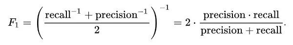
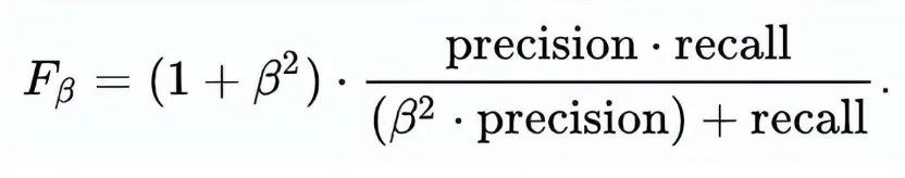
Positive Predictive Value or Precision: The proportion of correctly identified positive samples.
-
Negative Predictive Value: The proportion of correctly identified negative samples.
-
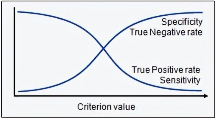
Sensitivity or Recall: The proportion of correctly identified actual positive samples.
-
Specificity: The proportion of actual negative samples that are correctly identified.
-
Rate: It is a measurement factor in the confusion matrix. It also has four types: TPR, FPR, TNR, and FNR.
-
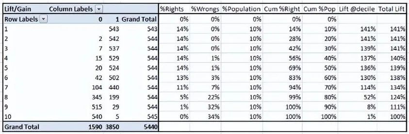
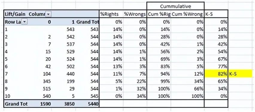
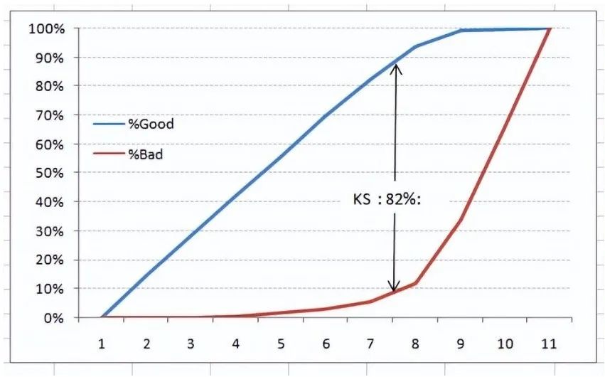
Step 1: Calculate the probability for each observation -
Step 2: Sort these probabilities in descending order. -
Step 3: Construct deciles, each containing nearly 10% of the observations. -
Step 4: Calculate the response rate for good (responders), bad (non-responders), and total for each decile.
-
.90-1 = Excellent (A) -
.80-.90 = Good (B) -
.70-.80 = Fair (C) -
.60-.70 = Poor (D) -
.50-.60 = Fail (F)
We find ourselves in the excellent range for the current model. However, this could just be overfitting. In this case, timely and timeout validation becomes very important.
-
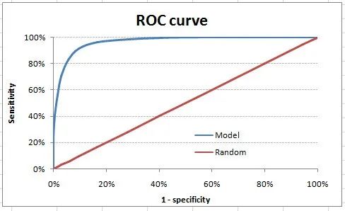
For models that output classes, they will be represented as a single point on the ROC graph. -
Such models cannot be compared with each other because the judgment needs to be made against a single metric rather than using multiple metrics. For example, models with parameters (0.2,0.8) and (0.8,0.2) could come from the same model; hence, these metrics should not be directly compared. -
In the case of probability models, we are fortunate to get a number, i.e., AUC-ROC. But we still need to examine the entire curve to make a definitive decision. It is also possible that one model performs better in certain areas, while another model performs better in others.
-
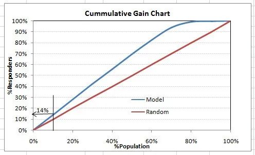
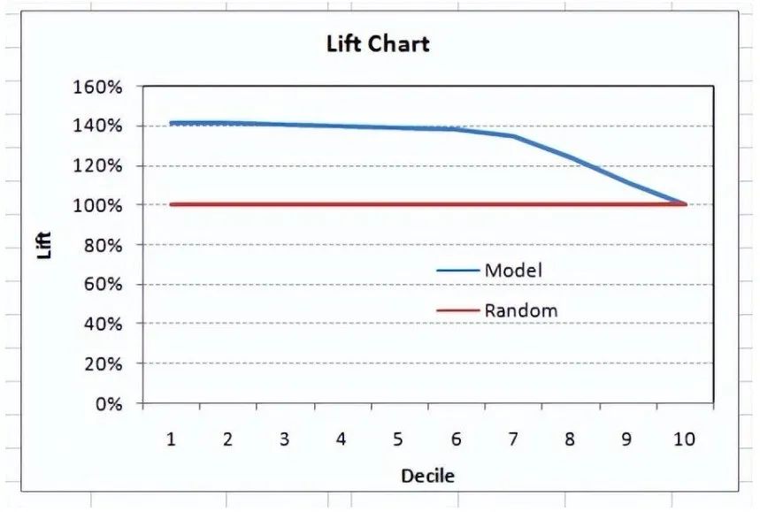
The degree of lift depends on the overall response rate of the population. Therefore, if the overall response rate changes, the same model will give different lift charts. The solution to this problem could be a real lift chart (finding the ratio of the lift for each decile to the perfect model lift). But such a ratio has little meaning for businesses.
-
On the other hand, the ROC curve is almost independent of response rates. This is because it has two axes derived from the bar calculations of the confusion matrix. If the response rate changes, the numerators and denominators of the x and y axes will change in a similar proportion.
-
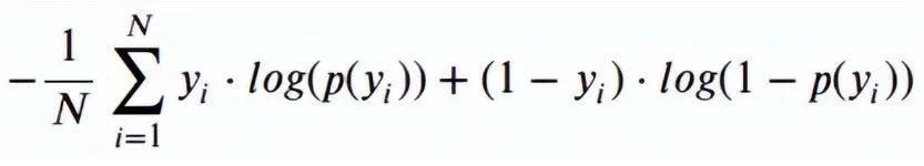
p(yi) is the predicted probability of the positive class -
1-p(yi) is the predicted probability of the negative class -
yi = 1 indicates positive class, 0 indicates negative class (actual value)
-
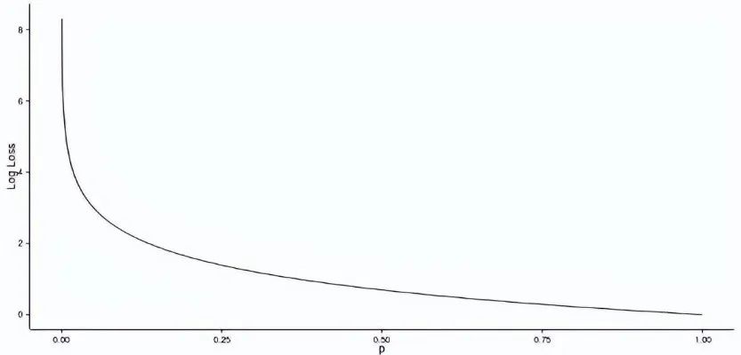
Log Loss (1, 0.1) = 2.303 -
Log Loss (1, 0.5) = 0.693 -
Log Loss (1, 0.9) = 0.105
<span>Gini</span> = <span>2</span>*AUC – <span>1</span>A Gini coefficient above 60% indicates a good model. For this case, we get a Gini coefficient of 92.7%.
2.8 Consistent/Inconsistent Ratio
This is again one of the most important evaluation metrics for any classification prediction problem. To understand this, let’s assume there are 3 students who are likely to pass the exam this year. Here are our predictions:
-
A – 0.9 -
B – 0.5 -
C – 0.3
Now imagine, if we take two pairs from these three students, how many pairs do we get? We will have 3 pairs: AB, BC, and CA. Now, at the end of the year, we see that A and C passed this year while B failed. No, we choose all pairs that can find one responder and another non-responder. How many such pairs do we have?
We have two pairs AB and BC. Now, for each of the 2 pairs, a consistent pair is one where the probability of the responder is higher than that of the non-responder. An inconsistent pair is the opposite. If the two probabilities are equal, we say it is a tie. Let’s see what happens in our case:
-
AB: Consistent
-
BC: Inconsistent
Thus, in this example, we have 50% consistent cases. A consistency rate above 60% is considered a good model. This metric is not typically used when deciding how many customers to target, etc. It is primarily used to assess the predictive capability of the model. Decisions like the number of targets are again made by KS/lift charts.
2.9 Root Mean Square Error (RMSE)
RMSE is the most commonly used evaluation metric in regression problems. It follows the assumption that the errors are unbiased and follow a normal distribution. Here are the key points to consider for RMSE:
-
The power of the “square root” allows this metric to display a large amount of deviation. -
The “squared” nature of this metric helps provide more reliable results, preventing the cancellation of positive and negative error values. In other words, this measure appropriately reflects the reasonable size of the error term. -
It avoids using absolute error values, which are highly undesirable in mathematical calculations. -
Using RMSE to reconstruct the error distribution is considered more reliable when we have more samples. -
RMSE is significantly affected by outliers. Therefore, ensure that you have removed outliers from the dataset before using this metric. -
Compared to mean absolute error, RMSE gives higher weight and penalizes large errors.
The RMSE metric is given by the following formula:
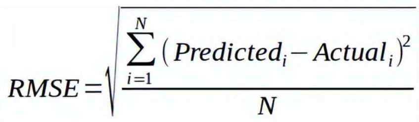
Where N is the total number of observations.
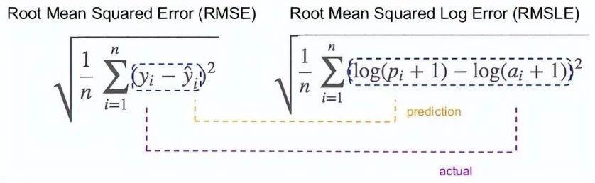
2.10 Root Mean Square Log Error
For root mean square log error, we take the logarithm of the predicted and actual values. So basically, what variance are we measuring? RMSLE is typically used when we do not want to penalize huge discrepancies between predicted and actual values (when both predicted and actual values are huge numbers).
-
If both predicted and actual values are small: RMSE and RMSLE are the same. -
If either predicted or actual values are large: RMSE > RMSLE -
If both predicted and actual values are large: RMSE > RMSLE (RMSLE becomes negligible)
2.11 R Squared
We understand that as RMSE decreases, the performance of the model improves. But these values alone are not intuitive.
For classification problems, if the accuracy of the model is 0.8, we can measure how good our model is compared to a random model with an accuracy of 0.5. So the random model can serve as a baseline. But when we talk about the RMSE metric, we do not have a baseline to compare.
This is where we can use the R-squared measure. The formula for R-squared is as follows:
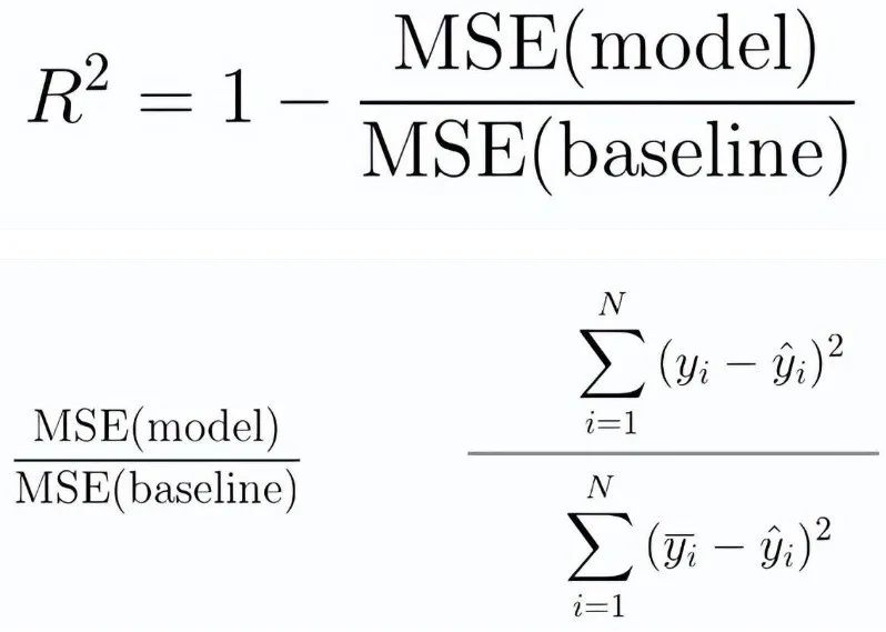
-
MSE (model): Mean squared error of predictions vs actual values -
MSE (baseline): Mean squared error of mean predictions vs actual values
In other words, how well does our regression model perform compared to a very simple model that predicts the average of the targets in the training set?
2.12 Adjusted R Squared
If the performance of the model equals the baseline, then R-squared is 0. The better the model, the higher the r2 value. The best model with all correct predictions has an R-squared value of 1. However, when adding new features to the model, the R-squared value can either increase or stay the same. R-squared is not penalized for adding features that have no value to the model. Therefore, an improved version of R-squared is the adjusted R-squared. The formula for adjusted R-squared is given by:
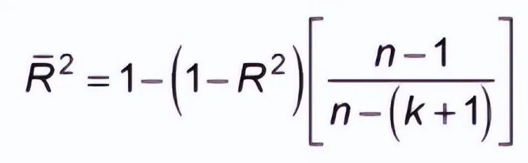
-
k: Number of features -
n: Number of samples
As you can see, this metric takes into account the number of features. When we add more features, the term in the denominator n-(k +1) decreases, thus increasing the entire expression.
If R-squared does not increase, it means that the added features do not add value to our model. So overall, we subtract a larger value from 1, and the adjusted r2 conversely decreases.
In addition to these 12 evaluation metrics, there is another method to check model performance. These 7 methods have statistical significance in data science. However, with the advent of machine learning, we now have the privilege of having more powerful model selection methods. Yes! I am talking about cross-validation.
Although cross-validation is not a truly publicly available evaluation metric for conveying model accuracy, the results of cross-validation provide a sufficiently good intuitive result to summarize the model’s performance.

3. Cross-Validation

Let’s first understand the importance of cross-validation. Due to a busy schedule these days, I haven’t had much time to participate in data science competitions. Long ago, I participated in the TFI competition on Kaggle. Without going into my competition performance in detail, I want to show you the difference between my public leaderboard score and private leaderboard score.
For the TFI competition, here are my three solutions and scores (the lower, the better)

You will notice that the third entry with the worst public score is the best model in the private ranking. There are over 20 models above “submission_all.csv”, yet I still chose “submission_all.csv” as my final entry (it performed really well). What causes this phenomenon? The difference between my public and private leaderboard is due to overfitting.
Overfitting is not an issue, but when your model becomes very complex, it also starts capturing noise. This “noise” adds no value to the model, only increasing inaccuracy.
In the next section, I will discuss how to know if a solution is overfitting before we actually know the test set results.
3.1 The Concept of Cross-Validation
Cross-validation is one of the most important concepts in any type of data modeling. It simply states that before finalizing the model, try to leave out a sample that is not used to train the model and test the model on that sample.

The above figure shows how to validate the model using real-time samples. We simply divide the overall population into 2 samples and build the model on one sample. The remaining population is used for timely validation.
Does this method have a downside?
I believe the downside of this method is that we lose a significant amount of data when training the model. Therefore, the bias of this model is very high. This does not provide the best estimate of coefficients. So what is the next best option?
If we split the training population and the first 50 populations in a 50:50 ratio and then validate the remaining 50 populations, what would happen? Then we train the other 50 samples and test the first 50 samples. This way, we can train the model on the entire population at once while training 50% at a time. This reduces the bias from sample selection to some extent but provides a smaller sample to train the model. This method is called 2-fold cross-validation.
3.2 K-Fold Cross-Validation
Let’s infer from the last example of 2-fold cross-validation to k-fold. Now we will try to visualize how k-fold validation works.

This is 7-fold cross-validation.
What happens behind the scenes is this: We divide the entire population into 7 equal samples. Now, we train the model on 6 samples (green box) and validate it on 1 sample (gray box). Then, in the second iteration, we use a different sample for validation to train the model. In 7 iterations, we basically build a model on each sample and use each sample for validation. This is a way to reduce selection bias and variance in predictive capability. Once we have all 7 models, we calculate the average of the error terms to find out which model is the best.
How does this help find the best (non-overfitted) model?
K-fold cross-validation is widely used to check if a model is overfitting. If the performance metrics across the k modeling are close to each other and the average metric is the highest, you might rely more on the cross-validation score in Kaggle competitions rather than the Kaggle public score. This way, you can ensure that the public score is not just a coincidence.
But how do we choose k?
This is the tricky part. We need to weigh the trade-offs when choosing k.
-
For smaller k, we have higher selection bias but lower performance variance.
-
For larger k, we have less selection bias, but greater performance variance.
Think about the extreme cases:
-
k = 2: We only have 2 samples similar to the 50-50 example. Here, we build models for only 50% of the population each time. But since validation is a significant group, the variance of validation performance is low.
-
k = number of observations (n): This is also known as “leave-one-out.” We have n samples, and modeling is repeated n times, leaving one observation for cross-validation. Thus, selection bias is small, but variance of validation performance is very high.
Generally, for most purposes, a value of k = 10 is recommended.

4. Conclusion
