Introduction
Using single-cell data, cells arranged along trajectories can be calculated, allowing for an unbiased study of cellular dynamics. Since 2014, more than 50 trajectory inference methods have been developed, each with its own set of methodological characteristics. This article will use two forms of pseudotime analysis (Diffusion Components and Diffusion Pseudotime) to infer the differentiation trajectory of a set of cells. These methods can order a group of single cells along a path/trajectory/lineage and assign a pseudotime value to each cell, indicating its position along that path. This can serve as a starting point for further analysis to determine the gene expression programs driving cellular phenotype transitions.
1. Diffusion Map
Diffusion mapping is a nonlinear dimensionality reduction method introduced by Coifman et al. (2005). Diffusion mapping is based on a distance metric (diffusion distance), conceptually related to how cells follow noisy quasi-diffusion dynamics, moving from a pluripotent state to a more differentiated state. It is suitable for analyzing single-cell gene expression data from time-course experiments. Cells are implicitly arranged along their developmental paths, with branching points indicating where differentiation events occur.
The authors follow the method proposed by Haghverdi et al. (2015) to implement diffusion mapping in R, which is less affected by sampling density heterogeneity, allowing for the identification of both abundant and rare cell populations. Additionally, destiny implements complex noise models to reflect zero-inflation/missingness caused by dropout events in single-cell qPCR data and allows for the presence of missing values. Finally, the authors further improved Haghverdi et al.’s (2015) method and implemented nearest neighbor approximation analysis to handle large datasets of up to 300,000 cells.
1. Download Test Data
Using the preprocessing of the data by Guo et al. (2010) as an example. This dataset was generated by the Biomark RT-qPCR system and contains Ct values for 48 genes at 7 different developmental time points from 442 mouse embryonic stem cells, ranging from the fertilized egg to the blastocyst. Starting from the totipotent 1-cell stage, cells smoothly transition during transcription to either the trophoblast or inner cell mass. Subsequently, cells transition from the inner cell mass to the endoderm or epithelial cell lineage. This smooth transition from one developmental state to another includes two branching events, which are reflected in the expression profiles of the cells and can be visualized using destiny.
# Downloading the table mmc4.xls from website below# http://www.sciencedirect.com/science/article/pii/S1534580710001103library(readxl)raw_ct<-read_xls('mmc4.xls','Sheet1')raw_ct[1:9, 1:9] # preview of a few rows and columnsThe input data format for destiny is the ExpressionSet format file established by the Biobase package. If our data is an expression matrix, it needs to be converted to this format. This object internally stores an expression matrix features×samples, which can be accessed using exprs(ct), as well as a samples×annotations data frame for annotation information, which can be accessed using phenoData(ct). Annotations can be directly accessed via $column and ct[[‘column’]]. Note that the expression matrix is transposed compared to the common data frame samples×features.
library(destiny)library(Biobase) # as.data.frame because ExpressionSets do not support readxl’s “tibbles”ct<-as.ExpressionSet(as.data.frame(raw_ct))ct2. Data Cleaning
Remove all cells with values greater than background expression and unavailable data points (NA). Additionally, we also remove cells from the 1-cell stage embryo, as they are processed differently (Guo et al. (2010)).
First, add an annotation column containing the embryonic cell stage for each sample by extracting the number of cells from the “cell” annotation information.
num_cells<- gsub('^(\d+)C.*$','\1', ct$Cell) # retain only (\d+)ct$num_cells<- as.integer(num_cells)Then, create two filtering criteria using the new annotation column.
# cells from 2+ cell embryos have_duplications<-ct$num_cells>1# cells with values <= 28normal_vals<- apply(exprs(ct), 2,function(smp)all(smp<=28))Use these two filtering criteria combined to exclude non-dividing cells and those with Ct values exceeding baseline, and store the results as cleaned_ct.
cleaned_ct<-ct[, have_duplications & normal_vals]br3. Data Normalization
Following the method by Guo et al. (2010), subtract the average expression of each cell using endogenous controls Actb and gapdh to normalize each cell. Note that since the expression of housekeeping genes is also random, it is unclear how to normalize sc-qPCR data. Therefore, if using the expression levels of housekeeping genes for normalization, it is crucial to take the average of several genes.
housekeepers<- c('Actb','Gapdh')# housekeeping gene namesnormalizations<- colMeans(exprs(cleaned_ct)[housekeepers, ])guo_norm<-cleaned_ctexprs(guo_norm)<-exprs(guo_norm)-normalizations4. Visualization
To create a diffusion map to plot, call the DiffusionMap function, with optional parameters; if the number of cells is small (<~1000), there is no need to specify the approximation value k. The diffusion map illustrates the branching of embryonic development in the initial days well.
library(destiny)#data(guo_norm)dm<-DiffusionMap(guo_norm)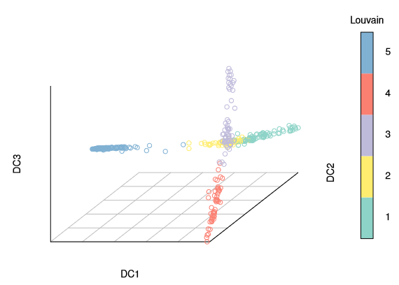
The diffusion map can be annotated using the annotation column for cell stages.
palette(cube_helix(6))# configure color paletteplot(dm,pch=20, # pch for prettier points col_by='num_cells', # or “col” with a vector or one color legend_main='Cell stage')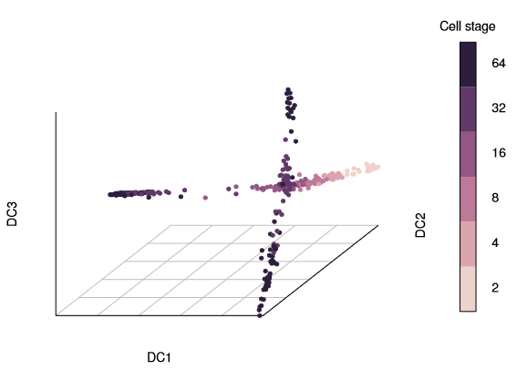
Three branches appear in the figure, with a branching at the 16-cell and 32-cell stages. The diffusion map arranges cells based on their expression profiles: the most and least dividing cells appear at the tips of different branches.
To display a two-dimensional plot, you can include vectors of the two diffusion components (1:2).
plot(dm, 1:2, col_by='num_cells', legend_main='Cell stage')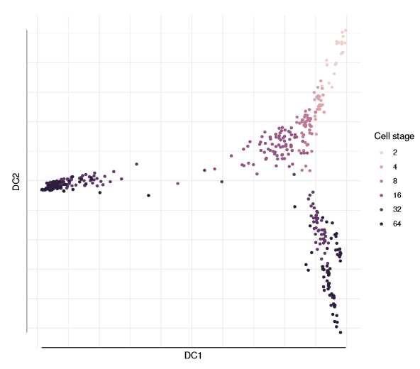
Other Visualization Methods
3D Diffusion Map
Diffusion mapping consists of feature vectors known as diffusion components (DCs) and corresponding eigenvalues. By default, the top 20 are returned. You can subset the DCs directly using the eigenvectors (dif):
library(rgl)plot3d(eigenvectors(dm)[, 1:3], col= log2(guo_norm$num_cells), type='s', radius=.01)view3d(theta=10, phi=30, zoom=.8)# now use your mouse to rotate the plot in the windowrgl.close()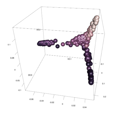
ggplot2 Visualization
library(ggplot2)qplot(DC1, DC2, data=dm, colour= factor(num_cells)) + scale_color_cube_helix()# or alternatively:#ggplot(dif, aes(DC1, DC2, colour = factor(num.cells))) + ...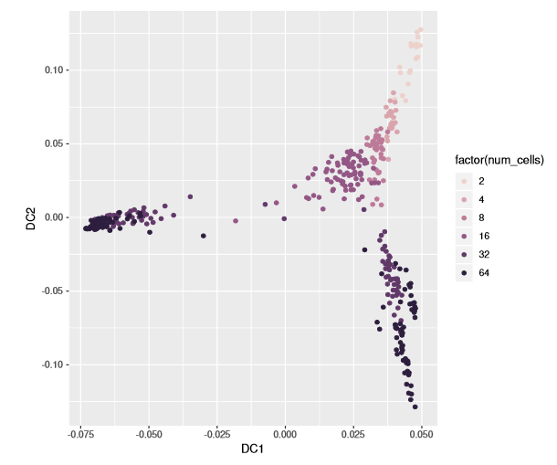
5. Diffusion Components (DCs) Parameter Selection
Diffusion mapping consists of eigenvectors of the diffusion distance matrix (which we refer to as diffusion components) and corresponding eigenvalues. The latter indicates the importance of the diffusion components, that is, how well the eigenvectors approximate the data. The significance of the eigenvectors diminishes.
qplot(y=eigenvalues(dm)) + theme_minimal()+ labs(x='Diffusion component (DC)', y='Eigenvalue')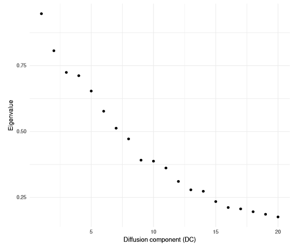
The larger the DC, the greater the noise.
plot(dm, 3:4, col_by='num_cells', draw_legend= FALSE)plot(dm, 19:20, col_by='num_cells', draw_legend= FALSE)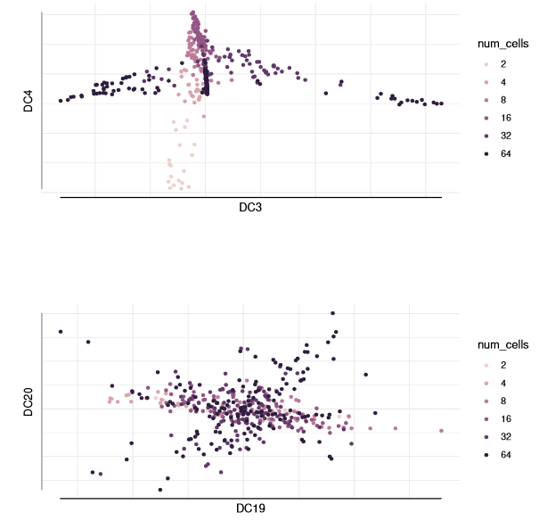
2. Diffusion Pseudotime (DPT)
1. Load Test Data
# load destiny and sample and samplelibrary(destiny)data(guo)guo# Also we need grid.arrangelibrary(gridExtra)2. Diffusion Pseudotime Analysis
dm<-DiffusionMap(guo)dpt<-DPT(dm) # tips=01The result object will have three automatically selected tip cells.
Of course, you can also specify the tip cells yourself.
set.seed(4)dpt_random<-DPT(dm, tips= sample(ncol(guo), 3L))When plotting without specifying parameters, the DPT of the first tip cell will be plotted.
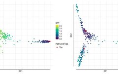
grid.arrange(plot(dpt), plot(dpt_random), ncol=2)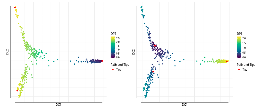
grid.arrange(plot(dpt, col_by='DPT3'),plot(dpt, col_by='Gata4', pal=viridis::magma),ncol=2)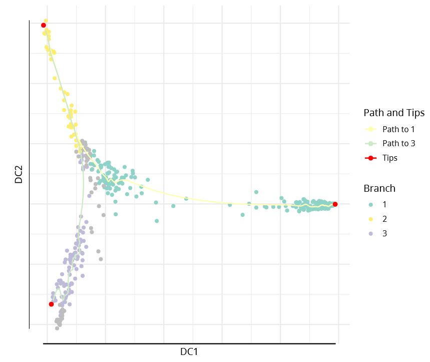
The DPT object also contains clusters based on tip cells and DPT, allowing specification of paths from starting points to endpoints.
plot(dpt, root=2, paths_to= c(1,3), col_by='branch'
3. Further Branch Segmentation
First, as mentioned above, simply plot the branch colors, then determine the branch numbers to plot, specifying them in the subsequent plot. To best visualize the new branches, we specify the dcs parameter to visually expand all four branches.
plot(dpt, col_by='branch', divide=3, dcs= c(-1,-3,2), pch=20)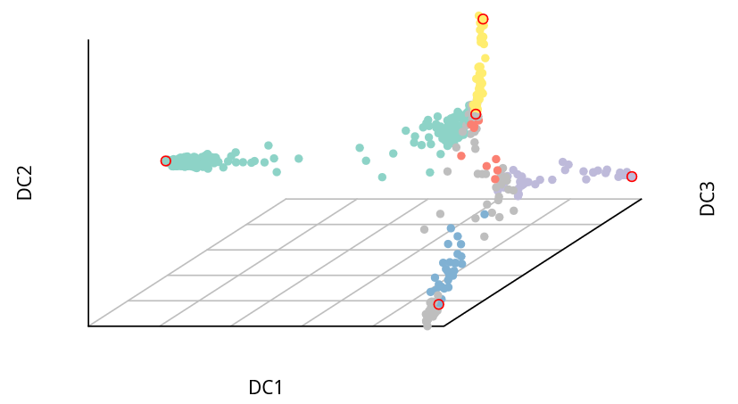
References:
Haghverdi, L., M. Büttner, F. A. Wolf, F. Buettner, and F. J. Theis2016. Diffusion pseudotime robustly reconstructs lineage branching.Nature Methods