
When trading, it is best to follow your own trading system and execute the trading plan as if you were a robot, adhering to the principles set in the trading system with cold detachment and unwavering focus.
For instance, going long when the moving average is broken upwards, going short when it is broken downwards, buying on MACD golden cross, and selling on MACD death cross are all fundamental trading systems. However, if you can choose a good stock and consistently execute your plan, you are likely to outperform most investors in the market.
For technical indicators like moving averages and MACD, there is a very useful derivative feature in the Tongda Xin software called “Expert System Indicators.” This feature can overlay buy and sell signals based on various technical indicators on the daily chart, making it easier for everyone to monitor the market and make decisions.
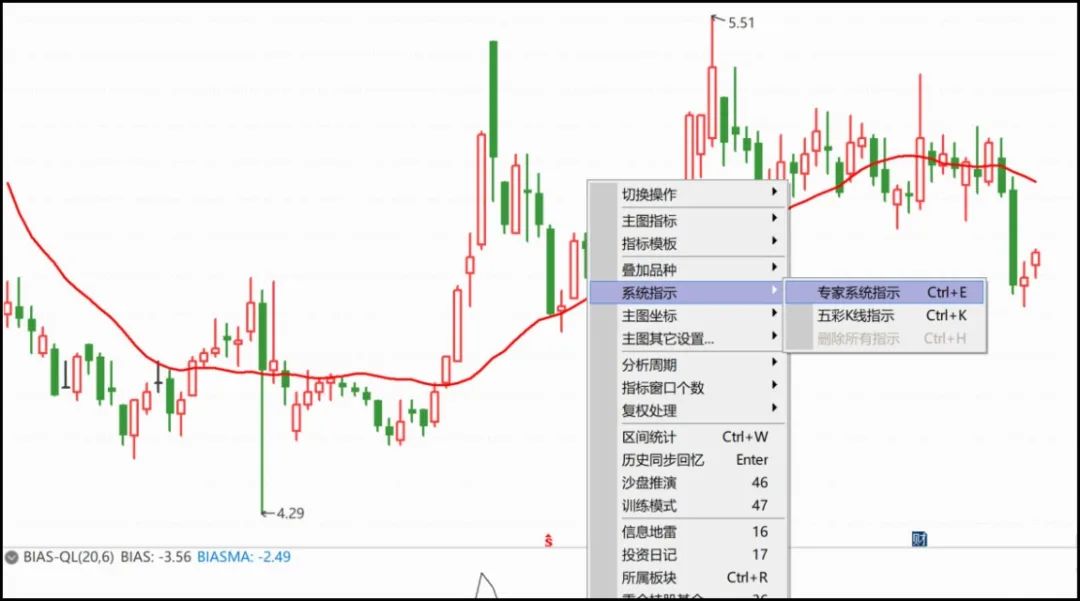
The specific operation method is to right-click on the daily chart and select “System Indicators” -> “Expert System Indicators,” or press the shortcut key “Ctrl+E” to access the “Expert System Indicators” feature. (See the image below)
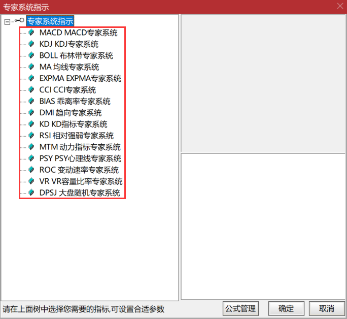
In the “Expert System Indicators” feature, there are various meticulously crafted indicator formulas, including commonly used technical indicators like MACD, KDJ, BOLL, MA, as well as relatively less common indicators like CCI, BIAS, and MTM (see the image below). The greatest feature of these technical indicators is that they can be overlaid with the main candlestick chart and mark buy and sell points directly on it.
Taking the most commonly used technical indicator, MACD, as an example, many friends know that generally, a MACD golden cross is a buy signal, while a death cross is a sell signal. In Tongda Xin software, we can easily display the MACD indicator in the sub-chart by entering “MACD”. (See the image below)
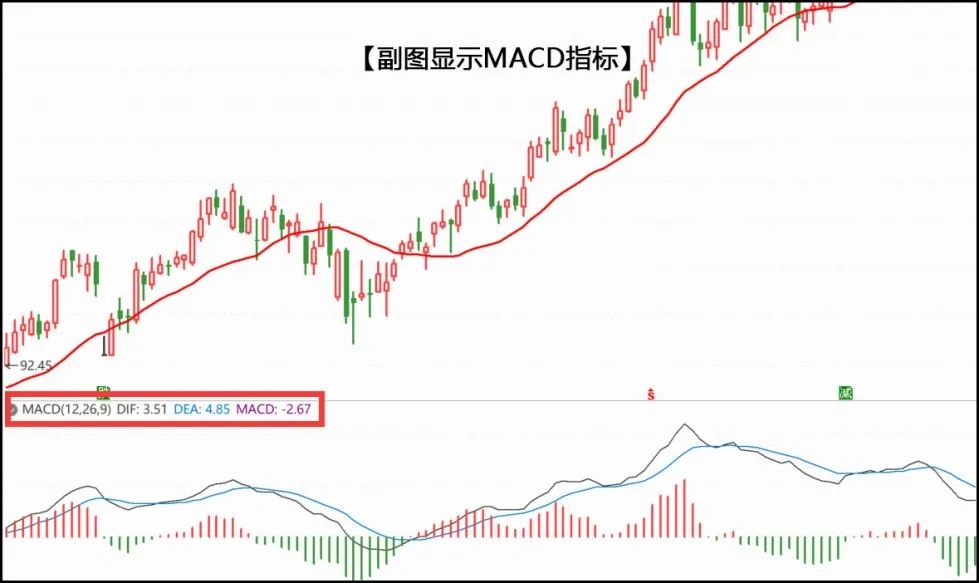
However, displaying the MACD indicator on the sub-chart is not very intuitive. When I observe the golden cross and death cross, I still have to look at the sub-chart in conjunction with the main chart, which is time-consuming and eye-straining.
So, can I display where the MACD golden cross and death cross occur directly on the candlestick chart?
Yes, the secret is the “Expert System Indicators.”
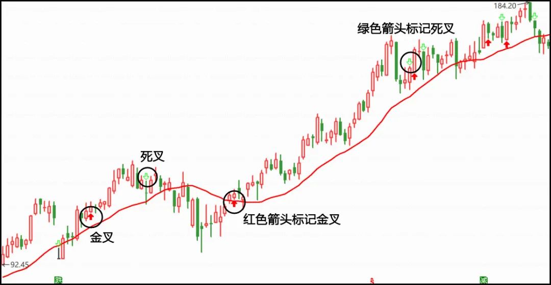
As shown in the image below, after selecting the MACD expert system in the Expert System Indicators, you can see the buy and sell conditions for that system on the right side: when the MACD histogram changes from red to green, it marks a sell point, and when it changes from green to red, it marks a buy point.
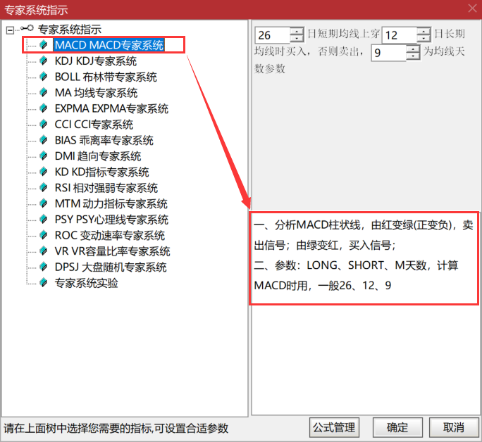
After clicking “OK,” you will find that red and green arrows have appeared on the candlestick chart. These red and green arrows are the signal markers from the Expert System Indicators. The red upward arrow indicates that a MACD golden cross has formed at that point, while the green downward arrow indicates a death cross.
It can be said that the greatest feature of the Expert System Indicators is that it directly marks the signals of buy and sell points that meet the current technical indicators on the candlestick chart, significantly improving viewing efficiency without the need to switch back and forth between various technical indicators, thus saving valuable space for the few sub-chart windows below the daily chart.
Of course, one point still needs to be emphasized: all buy and sell points marked by the “Expert System Indicators” are for reference only and do not constitute trading advice. Please pay attention to this.
Additionally, the “Expert System Indicators” can also allow you to write formulas according to your own ideas. The specific methods are introduced in the fifth video of today’s public account, and interested friends can take a closer look.