
Click the “Deephub Imba” above to follow our official account and never miss great articles!
Streamlit is an open-source Python library for creating data science and machine learning applications. Its primary goal is to enable developers to quickly build interactive data applications in a simple way, without extensive front-end development experience. Streamlit provides an easy way to convert data scripts or analysis code into applications with a visual interface that can be accessed via web browsers.

Here are some of the main features and advantages of Streamlit:
-
Easy to Use: Streamlit’s design allows users to create interactive applications in just a few lines of code. No complex front-end development knowledge is required, not even HTML or CSS.
-
Python Support: Streamlit is written and driven by Python, allowing data scientists and analysts to build applications in a familiar programming language.
-
Real-time Preview: After making changes in the code, the Streamlit application automatically reloads, enabling immediate visibility of the changes, thus speeding up the development process.
-
Rich Visualization Elements: Streamlit supports a variety of visualization elements such as charts, images, text, tables, etc., allowing users to display and present data.
-
Interactivity: Users can interact with the application through interactive elements like sliders and buttons, changing data inputs or parameters to observe results in real time.
-
Easy Deployment: Deploying a Streamlit application is relatively simple; it only requires running a Python script on a server without complex configuration.
-
Integration with Data Science Ecosystem: Streamlit easily integrates with popular data science libraries (like Pandas, Matplotlib, Plotly, etc.), allowing users to seamlessly embed analysis and visualization results into applications.
-
Custom Themes and Styles: Users can customize the appearance and style of their applications to match their branding or design needs.
Whether for creating data displays, visualizations, model demonstrations, or prototyping, Streamlit is a very useful tool. In this article, we will get started with Streamlit by creating a simple dashboard.

Goals
Our goal is to create a dashboard styled as shown below.
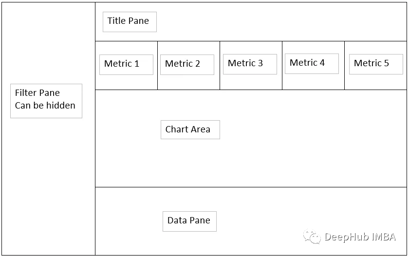
Our goal is to establish a dashboard that can display data as shown in the sketch above.
Data Processing
First, we will process the data.
 import pandas as pd
 import numpy as np
 import plotly.express as px
 import streamlit as st

 def dateAge(x):
     #function for generating future bucket grouping
     a = (x - np.datetime64("today","D")) / np.timedelta64(1,"D")
     if a <= 0:
         y = "0 or Less"
     elif a >0 and a <= 5:
         y = "5 days"
     elif a > 5 and a <= 14:
         y = "6 to 14 days"
     elif a > 14 and a <= 30:
         y = "15 to 30 days"
     else:
         y = "over 30 days"
     return y

 #built as a function for cache use with StreamLit later
 def getData():
     x = pd.read_csv(r'C:\Users\aryan.sinanan\Desktop\Python\raw_data\demand.csv')
    return x

 #assign data to df variable
 df = getData()

 #Set Org level max and role title or partial name you are looking for
 org_level = ["6","7","8"]
 role_title = "Data"

 #Datatype convert to date from dd-MMM-yy
 df["Resource Start Date"] = pd.to_datetime(df["Resource Start Date"],format="%d-%b-%y")
 df["Resource End Date"] = pd.to_datetime(df["Resource End Date"],format="%d-%b-%y")

 #Define Future Bucket
 df["Date Bucket"] = df["Resource Start Date"].apply(dateAge)

 #clean up Location names
 df.loc[df["Role Work Location"] == "melbourne", "Role Work Location"] = "Melbourne"
 df.loc[df["Role Work Location"] == "canberra", "Role Work Location"] = "Canberra"

 #rename columns
 df.rename(columns={
     "Project Has Security/ Nationality Restriction":"Clearance Required",
     "Resource Start Date":"Start Date",
     "Resource End Date":"End Date",
     "Role ID":"ID",
     "Role Title":"Title",
     "Role Description":"Description",
     "Role Talent Segment":"Talent Segment",
     "Role Career Level From":"Career Level From",
     "Role Career Level To":"Career Level To",
     "Role Work Location":"Work Location",
     "Role Location Type":"Location Type",
     "Role Fulfillment Entity L3":"Fulfillment Entity L3"
     }, inplace = True)

 #drop the unncessary columns
 df_sub = df.loc[:,("ID","Clearance Required","Start Date","End Date","Date Bucket","Title","Description","Talent Segment","Assigned Role","Career Level To","Work Location","Location Type","Role Primary Contact","Role Primary Contact\n(Email ID)")]

 #filter the dataframe using ord_level and role_title
 df_filter = df_sub[(df_sub["Assigned Role"].str.contains( role_title ,case=False,na=False)) & (df_sub["Career Level To"].isin(org_level))]
Building the Navigation Bar
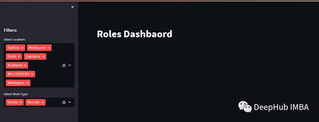
While Streamlit allows us to control element layout, its controls are relatively simple. For instance, the menu must be placed on the left side, commonly referred to as the sidebar. Therefore, we will use the sidebar as a filtering condition.
The following code shows common page titles and sidebar code:
 #title
 st.markdown("# Roles Dashboard")

 #defining side bar
 st.sidebar.header("Filters:")

 #placing filters in the sidebar using unique values.
 location = st.sidebar.multiselect(
     "Select Location:",
     options=df_filter["Work Location"].unique(),
     default=df_filter["Work Location"].unique()
 )

 #placing filters in the sidebar using unique values.
 work_type = st.sidebar.multiselect(
     "Select Work Type:",
     options=df_filter["Location Type"].unique(),
     default=df_filter["Location Type"].unique()
 )
The result of the above code is as follows:
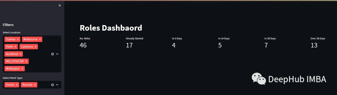
Building Summary Metrics
After filtering in the sidebar, we need to display the filtered information. Here, we will first display the summary metrics of the filtered data.
 #taking the filtered dataframe created in a previous step and applying a query
 df_selection = df_filter.query(
     "`Work Location`== @location & `Location Type` == @work_type"
 )

 #defining our metrics
 total_roles = df_selection["ID"].value_counts().sum()
 bucket_0 = df_selection[df_selection["Date Bucket"]=="0 or Less"].value_counts().sum()
 bucket_5 = df_selection[df_selection["Date Bucket"]=="5 days"].value_counts().sum()
 bucket_14 = df_selection[df_selection["Date Bucket"]=="6 to 14 days"].value_counts().sum()
 bucket_30 = df_selection[df_selection["Date Bucket"]=="15 to 30 days"].value_counts().sum()
 bucket_31 = df_selection[df_selection["Date Bucket"]=="over 30 days"].value_counts().sum()

 #placing our metrics within columns in the dashboard
 col1,col2,col3,col4,col5,col6=st.columns(6)
 col1.metric(label="No. Roles",value=total_roles)
 col2.metric(label="Already Started",value=bucket_0)
 col3.metric(label="In 5 Days",value=bucket_5)
 col4.metric(label="In 14 Days",value=bucket_14)
 col5.metric(label="In 30 Days",value=bucket_30)
 col6.metric(label="Over 30 Days",value=bucket_31)
The result is as follows, showing that we can already display some data.
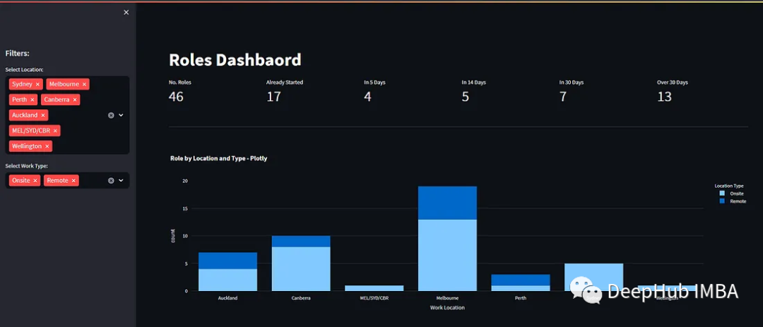
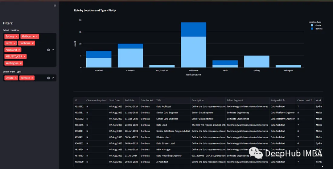
Building Charts
Next, we can create charts.
 #a dividing line
 st.divider()

 #dataframe for chart
 df_1 = df_selection.groupby(["Work Location","Location Type"]) ["Work Location"].value_counts().reset_index()

 #defining the chart
 fig_count_location_type = px.bar(df_1,x="Work Location",y="count",color="Location Type",title="Role by Location and Type - Plotly")

 #displaying the chart on the dashboard
 st.plotly_chart(fig_count_location_type, use_container_width=True)
Using plotly_chart, we can easily create tables.
Building Tables
We can also display all data from the filtered dataset by showing the DataFrame, which means displaying detailed data.
 #a dividing line
 st.divider()

 #showing the dataframe
 st.dataframe(df_selection,hide_index=True,column_config={
     # we can also config the formatting of a given column
     "ID": st.column_config.NumberColumn(
         #show the ID as a number no formatting
         format="%d"
     ),
     #set the formatting of the dateColumn to dd-MMM-yyyy
     "Start Date": st.column_config.DateColumn(
         format="DD-MMM-YYYY"
     ),
     #set the formatting of the dateColumn to dd-MMM-yyyy
     "End Date": st.column_config.DateColumn(
         format="DD-MMM-YYYY"
     ),
     #reduce the column size to medium
     "Title": st.column_config.TextColumn(
         width="medium"
     ),
     #reduce the column size to medium
     "Description": st.column_config.TextColumn(
         width="medium"
     )
 })
As you can see, we have displayed all the data from the DataFrame in table form.
Conclusion
Streamlit enables developers to quickly and easily build powerful and interactive applications, allowing better interaction and communication with data. As seen in the examples above, building applications with Streamlit does not require in-depth front-end development knowledge, as one of Streamlit’s design goals is to allow data scientists, analysts, and other non-front-end developers to easily create interactive applications without focusing too much on complex front-end technologies.
The development approach of Streamlit is similar to general Python programming; you only need to use some simple Streamlit functions and commands to configure and control the application’s appearance and behavior. The power of Streamlit lies in its ability to simplify complex front-end development processes into a few lines of Python code, enabling anyone to easily create data applications with interactivity and visualization effects.
Author: Aryan Sinanan

If you like it, please follow us!