Big Data Digest authorized reprint from Data Pie THU
Author: Haaya Naushan
Translation: Che Qianzi, Ouyang Jin
When it comes to analyzing social networks, my previous articles mainly focused on Natural Language Processing (NLP), or more specifically, Arabic NLP.
However, tweets are not just text data; they represent network connections between Twitter users. Adding network analysis allows for a comprehensive understanding of the content and behavior within social media data; thus, combining network and text data enables a more detailed understanding of social media networks.
My journey of learning Python began out of necessity, with the goal of bringing Twitter network graphs to life, and coding seemed like the solution. Therefore, my first script was a desperate struggle with pandas—to create a simple CSV file that could be used in Gephi (a popular open-source graph visualization software). Months later, reading my initial code became my motivation, and improving that first script turned out to be a lesson in humility.
Recently, while collaborating with researchers from the World Bank on a survey in Lebanon, I used the improved script. Under the guidance of domain knowledge and expertise, I analyzed a Twitter hashtag “# لبنان_ينتفض” (translated: Lebanon Rises). The data collection period was extensive: starting from the first protests of the “October Revolution” in 2019, through the Beirut explosion in August 2020, until it concluded in November 2020.
As part of the survey, I observed the retweet network of Twitter influencers, and someone suggested that I focus on specific time periods, so my initial approach was to create static snapshots.
However, the temporal nature of the data prompted me to visualize the temporal dynamics of retweet behavior. Thanks to my first script, I was able to create several animated graphs like the examples above using basic Python and Gephi. After that, I exported my time-dynamic Twitter network animation by creating screen capture GIFs using CloudApp.
In this brief data visualization tutorial, I will outline the steps and minimal code required to create animated network data. I will use Twitter as an example, but the same process can be applied to other social media networks. Since this tutorial focuses on data visualization, I will skip the explanation of the data collection process. Nevertheless, I introduced how to collect the data needed for this tutorial in “Twitter Script Scraping Beginner Knowledge Points Sharing”.
Link:
Gephi has several options for loading network data from databases or loading network data in graphic file formats (such as .graphml or .gexf). However, for dynamic graphs, the simplest choice is to load data from a properly labeled and formatted spreadsheet into Gephi. In graph terminology, “nodes” represent individual Twitter users, and “edges” represent retweet connections between users. I started with CSV files for nodes and edges, which were created from raw Twitter data using the networkx tool in Python. This excellent article explains how to start visualizing Twitter networks, including how to create nodes and edges using networkx.
The code snippet below shows how to load Twitter data from the nodes and edges CSV files so that they can be properly labeled and formatted in Python.
1. import pandas as pd
2.
3. data_dir = 'C:/your_data_dir/'
4.
5. # load nodes csv to pandas dataframe
6. df_nodes = pd.read_csv(data_dir + 'nodes.csv', low_memory=False)
7. print(f"The nodes dataframe has shape {df_nodes.shape}")
8.
9. # load edges csv to pandas dataframe
10. df_edges = pd.read_csv(data_dir + 'edges.csv', low_memory=False)
11. print(f"The edges dataframe has shape {df_edges.shape}")
After loading the raw Twitter data, process the nodes first, then the edges, and save both as CSV files.
Gephi requires an input node table, where the first column is named “Id”, containing the Twitter user Id, and the second column is “Label”, containing the Twitter username. Other columns represent node attributes, which can be selectively entered as needed. In the code example below, I included a column for Louvain clusters (derived from the Louvain community detection algorithm, which can be implemented in networkx) and a column for the number of Twitter followers. The last step in processing the nodes is to save the nodes dataframe as a CSV for later import into Gephi.
# select necessary columns for list of nodes with attributes
2. df_nodes = df_nodes.loc[:, ['user_id', 'user_screen_name', 'cluster', 'user_followers_count']].drop_duplicates('user_id')
3. print(f"This nodes dataframe has shape {df_nodes.shape}")
4.
5. # Label "Id" and "Label" columns
6. df_nodes['Id'] = df_nodes['user_id']
7. df_nodes['Label'] = df_nodes['user_screen_name']
8. # Arrange dataframe so first column is "Id" and second is "Label". All other columns are node attributes.
9. df_nodes = df_nodes.loc[:, ['Id', 'Label', 'cluster', 'user_followers_count']]
10. print(f"the first five rows of the nodes dataframe look like this {df_nodes.head(5)}")
11.
12. # Save labeled and formatted nodes dataframe as a csv for Gephi
13. df_nodes.to_csv(data_dir + 'nodes.csv', index=False, encoding='utf-8')
Next, for the edges data table, similar to the nodes, Gephi requires specific labeling and sorting of the data upon import. The first two required columns are “Source” and “Target”, which represent the pairs of Twitter users involved in retweets. The third column is “Type”, which in this Twitter example is set to “directed”, as we are dealing with retweet data. The fourth column is “Label”, which in this case is a simple index. The fifth column is the most important, named “Timeset”, which contains the creation time of the retweet—note that it is in ISO format. The “Timeset” column is the time variable that will be used to set the animation of the network graph in Gephi. Finally, the edges dataframe can be saved as CSV for import into Gephi.
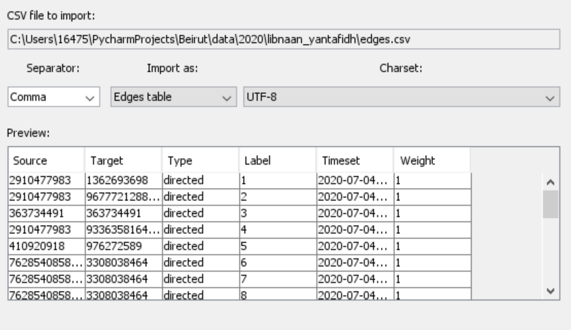
Now that the spreadsheets for nodes and edges data have been formatted and labeled, they can be imported into Gephi via the “Import Spreadsheet” menu option. Start with the nodes; the screenshot below shows the first import menu, where the delimiter should be “comma”, the import option should be “Node table”, and the encoding should be “UTF-8”.
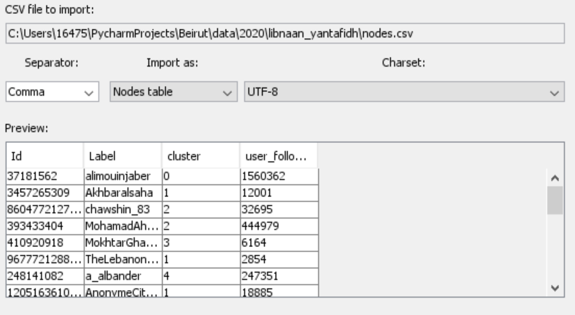
Node’s Gephi spreadsheet import interface
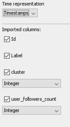
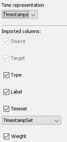
The next step is to select the columns to import and specify the data types for the attribute columns. Note to select “Timestamps” in the dropdown menu for time representation, which is very important for later importing timestamped edge data.
The node import process is completed by adding the nodes to the new Gephi workspace
Next, add edge data from the “edges” spreadsheet. The edge import process seen in the screenshot below is similar to the node import process; the only difference is the selection of the “Edges table” import option.
Gephi spreadsheet import edge data
The screenshot below shows the second import screen, where we specify the time representation as “Timestamps”, and set the data type for the “Timeset” column as “TimestampSet”.
The final step of the edge data import process is to merge the edge data into the already imported node workspace. In Gephi’s data laboratory, the edge data table should be visible, as shown in the screenshot below, with the “timestamp” appearing in ISO format.
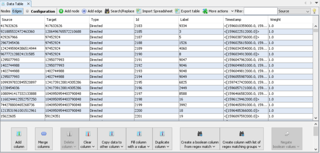
Gephi’s edge data screenshot
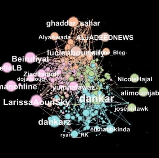
As with my previous programs, I applied a force-directed algorithm to the imported network graph to layout the nodes and selected attributes for coloring and sizing the nodes. In the “Overview” window below, the designed network graph shows a wide bar displaying the “Enable timeline” option.
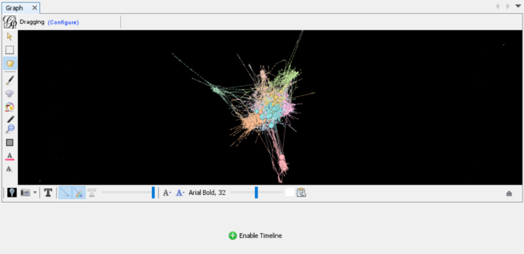
Twitter retweet network graph
Simply select “Enable timeline”, and a checked numeric timeline will appear, as shown below. The settings wheel in the lower left corner allows you to set the time format, which I selected as “Datetime”.
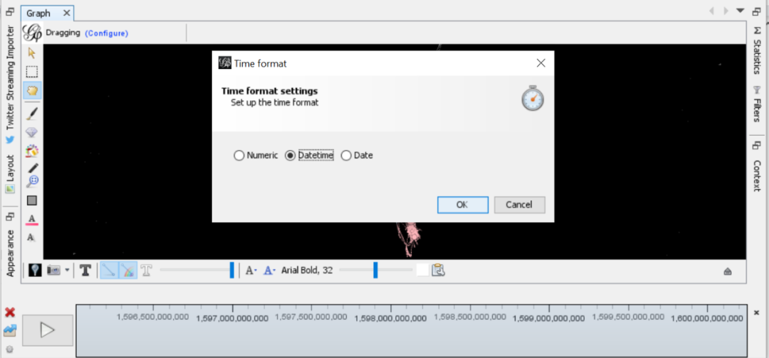
Screenshot of adjusting time format settings
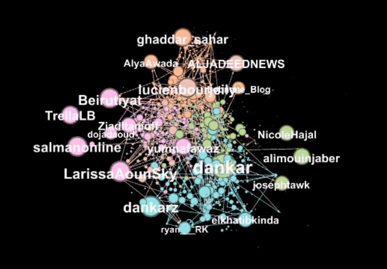
Simply use the cursor to select the size of the time interval window and press play.
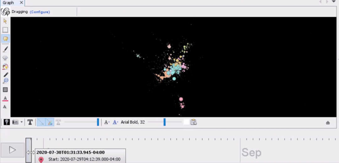
Using the cursor to adjust the time window size and dragging it to the desired starting position. Press “play” to start the animation as described earlier; I used CloudApp to create animated network screen capture GIFs and then shared them with my co-author. That’s it! With just a bit of Python code, it’s easy to modify network data for animation processing in Gephi.
I hope this tutorial is helpful, and if so, consider leaving a comment below so I know that everyone is interested in this topic and/or this style of article. Feel free to ask any questions or comments, and you can contact me via LinkedIn.
Original title:
Animate Dynamic Graphs with Gephi Data visualization tutorial on animating time-dynamic behaviour in social network graphs.
Original link:
https://towardsdatascience.com/animate-dynamic-graphs-with-gephi-d6bd9faf5aec