Source: Dolphin Intelligent Science Laboratory
The idea of building a machine learning or deep learning model follows the principle of constructive feedback. You build a model, get feedback from the metrics, improve it, and keep going until you achieve the desired classification accuracy. Evaluation metrics explain the performance of the model. An important aspect of evaluation metrics is their ability to distinguish the results of the model.
This article explains 12 important evaluation metrics that every data science professional must understand. You will learn their uses, advantages, and disadvantages, which will help you choose and implement them accordingly.
Recommended Online Tools: Three.js AI Texture Development Kit – YOLO Synthetic Data Generator – GLTF/GLB Online Editor – 3D Model Format Online Converter – Programmable 3D Scene Editor

1. Background Knowledge

Evaluation metrics are quantitative measures used to assess the performance and effectiveness of statistical or machine learning models. These metrics can provide insights into the execution of the model and help compare different models or algorithms.
When evaluating machine learning models, it is crucial to assess their predictive ability, generalization capability, and overall quality. Evaluation metrics provide objective standards to measure these aspects. The choice of evaluation metrics depends on the specific problem domain, data types, and expected outcomes.
I have seen many analysts and aspiring data scientists who are even too lazy to check how robust their models are. Once they finish building the model, they hastily map the predictions to unseen data. This is an incorrect practice. The fundamental fact is that building a predictive model is not your motivation. It’s about creating and selecting a model that can provide a high accuracy score on out-of-sample data. Therefore, checking the accuracy of the model before calculating predictions is crucial.
In our industry, we consider different types of metrics to evaluate our machine learning models. The choice of evaluation metrics entirely depends on the type of model and the implementation plan of the model. After completing the model building, these 12 metrics will help you assess the accuracy of the model. Given the increasing popularity and importance of cross-validation, I have also mentioned its principles in this article.
1.1 Types of Predictive Models
When we talk about predictive models, we are referring to regression models (continuous output) or classification models (nominal or binary output). The evaluation metrics used in each model are different.
In classification problems, we use two types of algorithms (depending on the type of output they create):
-
Classification Output: Algorithms like SVM and KNN create class outputs. For example, in a binary classification problem, the output will be 0 or 1. Today, we have algorithms that can convert these class outputs into probabilities. However, these algorithms are not well accepted in the statistical community.
-
Probability Output: Algorithms like logistic regression, random forests, gradient boosting, and Adaboost provide probability outputs. Converting probability outputs to class outputs is just a matter of creating a threshold probability.
In regression problems, we do not have this inconsistency in outputs. The outputs are inherently always continuous and do not require further processing.
For the discussion of evaluation metrics for classification models, I used my predictions on the BCI challenge problem on Kaggle. The solution to the problem is outside the scope of our discussion here. However, this article uses the final predictions from the training set. The predictions for this problem are probability outputs, assuming a threshold of 0.5, which are then converted to class outputs.

2. Common Evaluation Metrics

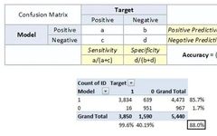
Now we introduce commonly used evaluation metrics in machine learning.2.1 Confusion MatrixThe confusion matrix is an N X N matrix, where N is the number of predicted classes. For the current problem, we have N=2, so we get a 2 X 2 matrix. It is a performance measurement for machine learning classification problems where the output can be two or more classes. The confusion matrix is a table that contains four different combinations of predicted and actual values. It is very useful for measuring precision, recall, specificity, accuracy, and most importantly, the AUC-ROC curve.Here are some definitions of the confusion matrix to remember:
-
True Positive: Predicted as positive, and it is true.
-
True Negative: Predicted as negative, and it is true.
-
False Positive: Type 1 error, predicted as positive, but the result is false.
-
False Negative: Type 2 error, predicted as negative, but the result is false.
-
Accuracy: The proportion of correctly predicted total to the total number of correct predictions.
-
Positive Predictive Value or Precision: The ratio of correctly identified positive samples.
-
Negative Predictive Value: The ratio of correctly identified negative samples.
-
Sensitivity or Recall: The ratio of correctly identified actual positive samples.
-
Specificity: The ratio of actual negative samples that are correctly identified.
- Rate: It is a measurement factor in the confusion matrix. It also has four types: TPR, FPR, TNR, and FNR.
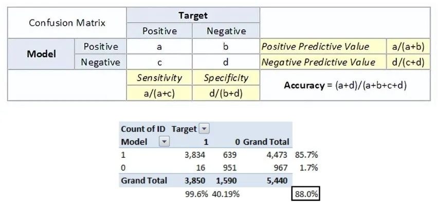 The accuracy for the problem at hand is 88%. From the above two tables, we can see that the positive predictive value is high, but the negative predictive value is low. Sensitivity and specificity are also similar. This is primarily driven by the threshold we selected. If we lower the threshold, these two pairs of completely different numbers will become closer.In general, we care about one of the metrics defined above. For example, in a pharmaceutical company, they would be more concerned about the minimum false positive diagnosis. Therefore, they would be more concerned with high specificity. On the other hand, a loss model would focus more on sensitivity. The confusion matrix is typically used only with class output models.2.2 F1 ScoreIn the previous section, we discussed precision and recall for classification problems and emphasized the importance of choosing precision/recall basis for our use case. What if we try to achieve the best precision and recall at the same time for a use case? The F1 Score is the harmonic mean of precision and recall for classification problems. The formula for the F1 Score is as follows:
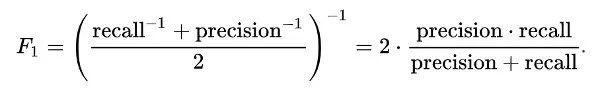 Now, an obvious question that comes to mind is why use the harmonic mean instead of the arithmetic mean. This is because the HM penalizes extreme values more. Let’s understand this with an example. We have a binary classification model with the following results:Precision: 0, Recall: 1Here, if we take the arithmetic mean, we would get 0.5. Clearly, the above result comes from a foolish classifier that ignores input and predicts one of the classes as output. Now, if we take the HM, we would get 0, which is accurate because the model is useless for all intents and purposes.This seems straightforward. However, in some cases, data scientists may want to give a higher importance/weight percentage to precision or recall. By slightly modifying the above expression so that we can include an adjustable parameter beta for this purpose, we get:
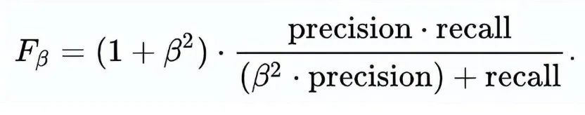 Fbeta measures the effectiveness of the model for users who weigh recall β times more than precision.2.3 Gain and Lift ChartsGain and lift charts primarily involve examining the sorting of probabilities. Here are the steps to build a lift/gain chart:
- Step 1: Calculate the probabilities for each observation
- Step 2: Sort these probabilities in descending order.
- Step 3: Build deciles, each with approximately 10% of observations.
- Step 4: Calculate the response rates for good (responders), bad (non-responders), and totals for each decile.
You will get the following table, from which to draw the gain/lift chart: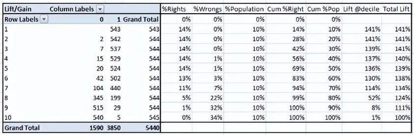 This is a very information-rich table. The cumulative gain chart is a chart between cumulative %Right and cumulative %Population. For the current case, this is the chart:
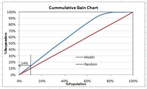 This chart tells you how well the model separates responders from non-responders. For example, the first decile has 10% of the population and contains 14% of the responders. This means we achieved a 140% lift at the first decile.What is the maximum lift we can achieve in the first decile? From the first table in this article, we know that the total number of responders is 3850. Additionally, the first decile will contain 543 observations. Therefore, the maximum lift for the first decile could be 543/3850 ~ 14.1%. Thus, our model is already very close to perfect.Now let’s plot the lift curve. The lift curve is a graph between total lift and percentage of population. Note that for a random model, this value remains at 100% consistently. This is the plot for the current case:
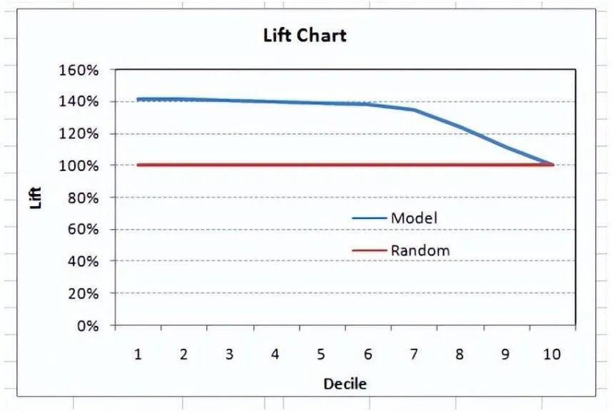 Deciles can also be plotted for the lift of deciles:
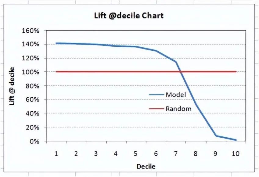 What does this chart tell you? It indicates that our model performs well before the 7th decile. After that, each decile will be biased towards non-responders. Any lift at a decile above 100% until the minimum 3rd decile and maximum 7th decile model is a good model. Otherwise, you might first consider oversampling.Lift/gain charts are widely used in targeting marketing campaign issues. This tells us which decile we can target specific customers for a marketing campaign. Additionally, it also tells you how much response you can expect from the new target group.2.4 K-S ChartThe K-S or Kolmogorov-Smirnov chart measures the performance of classification models. More accurately, K-S is a measure of the separation degree of positive and negative distributions. If the scores separate the overall into two distinct groups, one containing all positive samples and the other containing all negative samples, then K-S is 100.On the other hand, if the model cannot distinguish between positives and negatives, it is as if the model randomly selects cases from the population. K-S will be 0. In most classification models, K-S will fall between 0 and 100, with higher values indicating better capability of the model to distinguish between positive and negative cases.For this case, the following table:
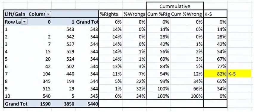 We can also plot %Cumulative Good and Bad to see the maximum separation. Here is an example chart:
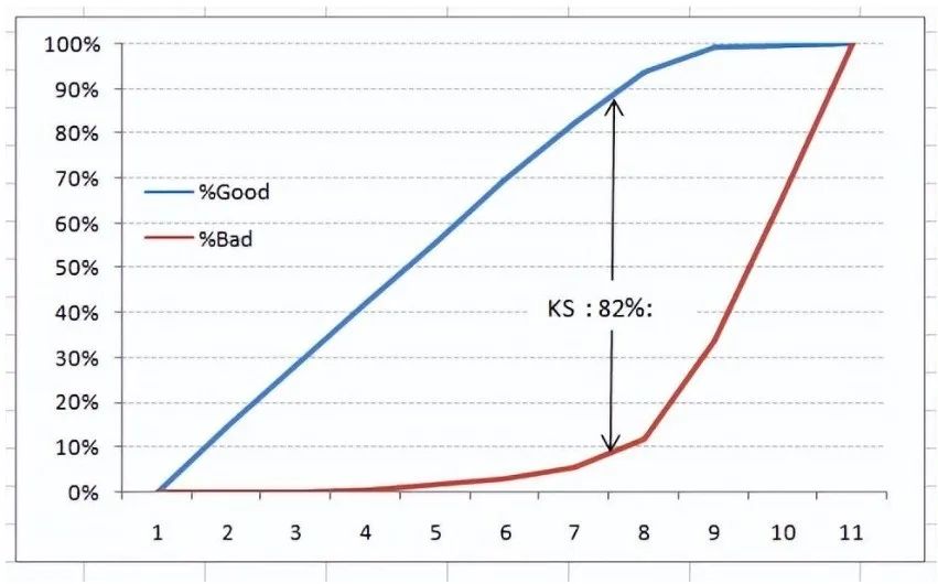 The evaluation metrics introduced here are mainly used for classification problems. So far, we have learned about the confusion matrix, lift and gain charts, and K-S charts. Let’s continue to learn some more important metrics.2.5 Area Under the ROC Curve (AUC – ROC)This is another popular evaluation metric in the industry. The biggest advantage of using the ROC curve is that it is independent of changes in the responder ratio. This statement will become clearer in the following sections.First, let’s try to understand what the ROC (Receiver Operating Characteristic) curve is. If we look at the confusion matrix below, we will find that for probability models, each metric will yield different values.
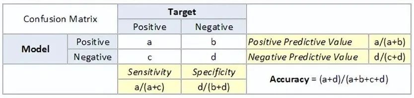 Thus, for each sensitivity, we get different specificities. The distinctions are as follows:
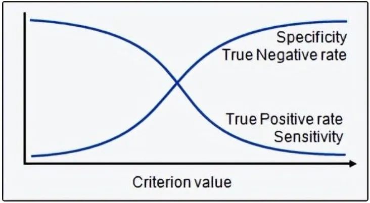 The ROC curve is a graph between sensitivity and (1-specificity). (1-specificity) is also called the false positive rate, while sensitivity is also known as the true positive rate. Here is the ROC curve for the current case.
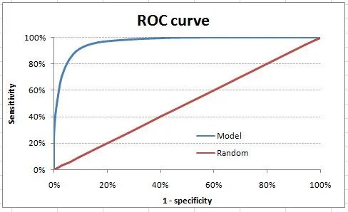 We take a threshold = 0.5 as an example (refer to the confusion matrix). This is the confusion matrix:
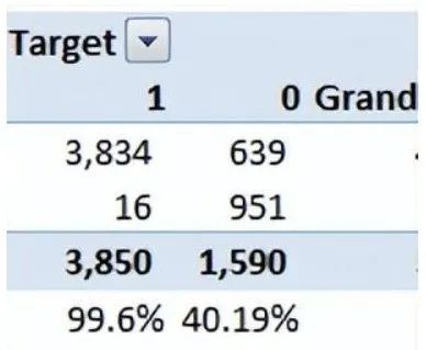 As you can see, the sensitivity at this threshold is 99.6%, and (1-specificity) is about 60%. This coordinate becomes a point in the ROC curve. To simplify this curve into a single number, we find the area under this curve (AUC).Note that the area of the entire square is 1*1 = 1. Therefore, AUC itself is the ratio of the area under the curve to the total area. For the current case, we get an AUC ROC of 96.4%. Here are some rules of thumb:
- .90-1 = Excellent (A)
- .80-.90 = Good (B)
- .70-.80 = Average (C)
- .60-.70 = Poor (D)
- .50-.60 = Fail (F)
We find ourselves in the excellent range for the current model. However, this may just be overfitting. In this case, timely and out-of-sample validation becomes very important.
Key points to remember:
- For models with class as output, they will be represented as a single point in the ROC chart.
- Such models cannot be compared with each other as judgments need to be made againstsingle metrics rather than using multiple metrics. For example, a model with parameters (0.2,0.8) and a model with parameters (0.8,0.2) could come from the same model; therefore, these metrics should not be directly compared.
- In the case of probability models, we are fortunate enough to get a number, which is AUC-ROC. But we still need to examine the entire curve to make a conclusive decision. It is also possible that one model performs better in certain areas while another model performs better in other areas.
Advantages of using ROC:
-
The degree of lift depends on the total response rate of the population. Therefore, if the overall response rate changes, the same model will give different lift charts. A way to solve this problem could be to use the true lift chart (finding the ratio of the lift for each decile to the lift of a perfect model). But such ratios are almost meaningless for businesses.
-
On the other hand, the ROC curve is almost independent of the response rate. This is because it has two axes derived from the bar calculations of the confusion matrix. If the response rate changes, the numerator and denominator of the x-axis and y-axis will change in a similar proportion.
2.6 Log LossAUC ROC considers predicted probabilities to determine the performance of our model. However, AUC ROC has a problem as it only considers the order of probabilities, thus not taking into account the model’s ability to predict higher probabilities for samples that are more likely to be positive. In this case, we can use log loss, which is simply the negative average of the logarithm of the corrected predicted probabilities for each instance.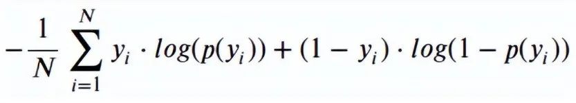
- p(yi) is the predicted probability of the positive class
- 1-p(yi) is the predicted probability of the negative class
- yi = 1 indicates the positive class, 0 indicates the negative class (actual value)
Let’s calculate the log loss for some random values to get the key points of the above mathematical function:
- Log Loss (1, 0.1) = 2.303
- Log Loss (1, 0.5) = 0.693
- Log Loss (1, 0.9) = 0.105
If we plot this relationship, we will get the following curve: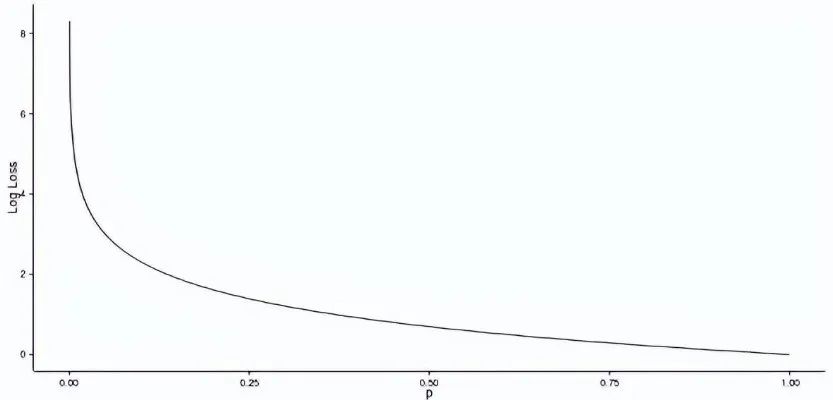 From the slowly declining slope to the right, it is evident that as the predicted probability increases, the log loss gradually decreases. However, moving in the opposite direction, as the predicted probability approaches 0, the log loss increases very rapidly.Therefore, the lower the log loss, the better the model. However, there is no absolute measure of a good log loss, and it depends on the use case/application.While AUC is calculated based on binary classifications with different decision thresholds, log loss actually considers the “certainty” of classifications.2.7 Gini CoefficientThe Gini coefficient is sometimes used for classification problems. The Gini coefficient can be directly derived from the AUC ROC number. The Gini coefficient is simply the ratio of the area between the ROC curve and the diagonal line to the area of the triangle above. Here is the formula used:
<span>Gini</span> = <span>2</span>*AUC – <span>1</span>
A Gini coefficient above 60% indicates a good model. For this case, we obtain a Gini coefficient of 92.7%.
2.8 Consistent/Inconsistent Ratio
This is again one of the most important evaluation metrics for any classification prediction problem. To understand this, let’s assume there are 3 students who might pass the exam this year. Here are our predictions:
- A – 0.9
- B – 0.5
- C – 0.3
Now imagine, if we take pairs from these three students, how many pairs do we get? We will have 3 pairs: AB, BC, and CA. Now, by the end of the year, we see that A and C passed this year while B failed. No, we choose all pairs that can find one responder and another non-responder. How many such pairs do we have?
We have two pairs: AB and BC. Now, for each of the 2 pairs, a consistent pair is one where the probability of the responder is higher than that of the non-responder. Inconsistent pairs are the opposite. If the two probabilities are equal, we say it’s a tie. Let’s see what happens in our case:
-
AB: Consistent
-
BC: Inconsistent
Therefore, in this example, we have 50% consistent cases. A consistency rate above 60% is considered a good model. This metric is generally not used to decide how many customers to target, etc. It is mainly used to assess the predictive ability of the model. Decisions like target numbers are again made by KS/lift charts.
2.9 Root Mean Square Error (RMSE)
RMSE is the most commonly used evaluation metric in regression problems. It follows the assumption that the errors are unbiased and follow a normal distribution. Here are the key points to consider for RMSE:
- The power of “square root” allows this metric to show significant deviations.
- The “squared” nature of this metric helps provide more reliable results, preventing the cancellation of positive and negative error values. In other words, this measure properly indicates the reasonable size of the error term.
- It avoids the use of absolute error values, which is highly undesirable in mathematical calculations.
- When we have more samples, using RMSE to reconstruct the error distribution is considered more reliable.
- RMSE is significantly affected by outliers. Therefore, ensure that you have removed outliers from the dataset before using this metric.
- Compared to mean absolute error, RMSE gives more weight and penalizes large errors.
The RMSE metric is given by the following formula:
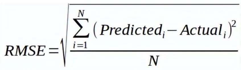
Where N is the total number of observations.
2.10 Root Mean Square Logarithmic Error
For root mean square logarithmic error, we take the logarithm of the predicted values and actual values. So basically, what variance are we measuring? RMSLE is typically used when we do not want to penalize huge differences between predicted values and actual values (when both predicted and actual values are large numbers).
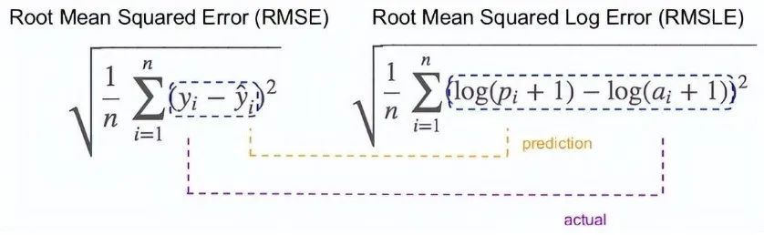
- If both predicted and actual values are small: RMSE and RMSLE are the same.
- If either predicted or actual values are large: RMSE > RMSLE
- If both predicted and actual values are very large: RMSE > RMSLE (RMSLE becomes negligible)
2.11 R-Squared
We understand that as RMSE decreases, the performance of the model will improve. But these values are not intuitive on their own.
For classification problems, if the accuracy of the model is 0.8, we can measure how well our model performs compared to a random model with an accuracy of 0.5. So, the random model can serve as a baseline. But when we talk about the RMSE metric, we have no baseline to compare against.
This is where we can use the R-squared measure. The formula for R-squared is as follows:
- MSE (model): Mean squared error between predicted values and actual values
- MSE (baseline): Mean squared error between average predictions and actual values
In other words, how good is our regression model compared to a very simple model that predicts the average of the target in the training set?
2.12 Adjusted R-Squared
If the performance of the model equals the baseline, R-squared is 0. The better the model, the higher the r2 value. The best model with all correct predictions has an R-squared value of 1. However, when adding new features to the model, the R-squared value either increases or remains the same. R-squared is not penalized for adding features that do not add any value to the model. Thus, an improved version of R-squared is the adjusted R-squared. The formula for adjusted R-squared is given by:
- k: Number of features
- n: Number of samples
As you can see, this metric takes into account the number of features. When we add more features, the term in the denominator n-(k +1) decreases, thus increasing the entire expression.
If R-squared does not increase, it means that the added features do not add value to our model. So overall, we subtract a larger value from 1, and the adjusted r2 will decrease in turn.
In addition to these 12 evaluation metrics, there are other methods to check model performance. These 7 methods have statistical significance in data science. However, with the advent of machine learning, we are now fortunate to have more powerful model selection methods. Yes! I am talking about cross-validation.
Although cross-validation is not a truly public evaluation metric to convey model accuracy, the results of cross-validation provide sufficiently good intuitive results to summarize the performance of the model.
Now let’s delve into cross-validation.

3. Cross-Validation

Let’s first understand the importance of cross-validation. Due to a busy schedule these days, I do not have much time to participate in data science competitions. A long time ago, I participated in the TFI competition on Kaggle. Without diving deep into my competition performance, I want to show you the difference between my public leaderboard score and private leaderboard score.
For the TFI competition, here are my three solutions and scores (the lower the better)
You will notice that the third entry with the worst public score is actually the best model in the private ranking. “submission_all.csv” has over 20 models, but I still chose “submission_all.csv” as my final entry (which performed really well). What caused this phenomenon? The difference between my public and private leaderboard is due to overfitting.
Overfitting is not an issue, but when your model becomes very complex, it starts to capture noise as well. This “noise” adds no value to the model and only increases inaccuracies.
In the next section, I will discuss how to know if the solution is overfitting before we actually know the test set results.
3.1 Concept of Cross-Validation
Cross-validation is one of the most important concepts in any type of data modeling. It simply says that before finalizing the model, try to leave a sample that is not used to train the model and test the model on that sample.
The above image shows how to validate the model using a real-time sample. We simply divide the population into 2 samples and build the model on one sample. The remaining population is used for timely validation.
Does this method have negative effects?
I think the downside of this method is that we lose a significant amount of data when training the model. Therefore, the bias of the model is very high. This does not provide the best estimate of coefficients. So what is the next best option?
If we train the training population and the first 50 groups in a 50:50 split, then what will happen if we validate the remaining 50 groups? Then we train on the other 50 samples and test on the first 50 samples. This way, we can train the model on the entire population at once, but train on 50% at a time. This somewhat reduces the bias introduced by sample selection but provides a smaller sample to train the model. This method is called 2-fold cross-validation.
3.2 K-Fold Cross-Validation
Let’s infer from the last example of 2-fold cross-validation to k-fold. Now, we will try to visualize how k-fold validation works.
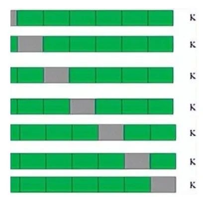
This is 7-fold cross-validation.
What happens behind the scenes is that we divide the entire population into 7 equal samples. Now, we train the model on 6 samples (green boxes) and validate it on 1 sample (gray box). Then, in the second iteration, we use a different sample for validation to train the model. In 7 iterations, we basically build a model on each sample and use each sample as validation. This is a way to reduce selection bias and decrease the variance of predictive ability. Once we have all 7 models, we calculate the average of the error terms to find out which model is best.
How does this help find the best (non-overfitted) model?
K-fold cross-validation is widely used to check if the model is overfitting. If the performance metrics for each of the k modeling instances are close to each other and the average of the metrics is the highest. In Kaggle competitions, you might rely more on cross-validation scores than Kaggle public scores. This way, you can determine that the public score is not just a coincidence.
But how do we choose k?
This is the tricky part. We need to weigh the trade-offs when choosing k.
-
For smaller k, we have higher selection bias but lower performance variance.
-
For larger k, we have lower selection bias, but greater performance variance.
Think about the extreme cases:
-
k = 2: We only have 2 samples that are similar to 50-50. Here, we build models for only 50% of the population each time. But since validation is a significant population, the variance of validation performance is small.
-
k = number of observations (n): This is also called “leave-one-out.” We have n samples, and modeling is repeated n times, leaving one observation for cross-validation. Thus, selection bias is small, but the variance of validation performance is very large.
In general, for most purposes, a value of k = 10 is recommended.

4. Conclusion

Measuring the performance of training samples is meaningless. Setting aside timely validation batches is a waste of data. K-Fold gives us a way to use each data point, which can significantly reduce this selection bias. Additionally, K-fold cross-validation can be used with any modeling technique.
Moreover, the metrics covered in this article are some of the most commonly used evaluation metrics in classification and regression problems.
For reference links, click the bottom left corner to read the original text. For academic sharing only, if there is any infringement, it will be removed immediately.
Editor / Garvey
Reviewer / Fan Ruiqiang
Recheck / Garvey
Click below
Follow us