

This article is approximately 12,000 words long and is recommended to be read in 10 minutes. This article will delve into the art of machine learning visualization, exploring various techniques that help us understand complex data-driven systems.Machine learning models have powerful and complex mathematical structures. Understanding their intricate workings is an important aspect of model development.Model visualization is crucial for gaining insights, making informed decisions, and effectively communicating results.
In this article, we will delve into the art of machine learning visualization, exploring various techniques that help us understand complex data-driven systems. At the end of the article, practical code for a visualization example will also be provided.
What is Visualization in Machine Learning?
Machine learning visualization (abbreviated as ML visualization) generally refers to the process of representing machine learning models, data, and their relationships through graphics or interactive means. The goal is to make it easier to understand the complex algorithms and data patterns of models, making it easier for both technical and non-technical stakeholders to grasp.
Visualization bridges the gap between the mysterious inner workings of machine learning models and our visual understanding of patterns.
The main purposes of visualizing ML models are as follows:
-
Model Structure Visualization:Common model types, such as decision trees, support vector machines, or deep neural networks, typically consist of many computational and interactive layers that are difficult for humans to grasp. Visualization allows us to more easily see how data flows through the model and where transformations occur.
-
Visualizing Performance Metrics:Once we have trained a model, we need to evaluate its performance. Visualizing metrics such as accuracy, precision, recall, and F1 score helps us understand how the model performs and where improvements are needed.
-
Comparative Model Analysis:When dealing with multiple models or algorithms, visualizing structural or performance differences allows us to choose the best model or algorithm for a specific task.
-
Feature Importance:Understanding which features have the greatest impact on model predictions is crucial. Visualization techniques like feature importance graphs can easily identify the key factors driving model outcomes.
-
Interpretability:Due to their complexity, ML models are often “black boxes” for human creators, making it difficult to explain their decisions. Visualization can clarify how specific features influence outputs or the robustness of model predictions. -
Facilitating Communication:Visualization is a universal language for conveying complex ideas simply and intuitively. They are crucial for effectively sharing information with management and other non-technical stakeholders.
Model Structure Visualization
Understanding how data flows through a model is essential for grasping how machine learning models convert input features into their outputs.
Decision Tree Visualization
Decision trees have a flowchart-like structure familiar to most people. Each internal node represents a decision based on a specific feature value. Each branch in the node represents the outcome of that decision. Leaf nodes represent the model’s output.
This structure’s visualization provides a direct representation of the decision-making process, enabling data scientists and business stakeholders to understand the decision rules learned by the model.
During training, decision trees identify the features that best separate samples in the branches based on specific criteria (usually Gini impurity or information gain). In other words, it determines the most discriminative features.
Visualizing decision trees (or their collections, such as random forests or gradient-boosted trees) involves graphical rendering of their overall structure, clearly and intuitively showing the splits and decisions at each node. The depth and width of the tree and the leaf nodes are immediately apparent. Furthermore, decision tree visualization helps identify key features that are the most discriminative attributes leading to accurate predictions.
The path to accurate predictions can be summarized in four steps:
-
Feature Clarity:Decision tree visualization is like peeling back layers of complexity to reveal key features. It’s similar to viewing a decision flowchart where each branch represents a feature, and each decision node contains critical aspects of our data. -
Discriminative Attributes:The beauty of decision tree visualization lies in its ability to highlight the most discriminative features. These factors significantly impact outcomes, guiding the model in making predictions. By visualizing the tree, we can pinpoint these features precisely, thus understanding the core factors driving model decisions. -
Path to Accuracy:Each path on the decision tree is a journey toward accuracy. Visualization illustrates the sequence of decisions leading to a specific prediction. This is the gold standard for understanding the logic and criteria our model uses to arrive at specific conclusions. -
Simplicity in Complexity:Despite the complexity of machine learning algorithms, decision tree visualization offers simplicity. It transforms complex mathematical computations into intuitive representations, making them accessible to both technical and non-technical stakeholders.

The above image shows the structure of a decision tree classifier trained on the famous Iris dataset. This dataset consists of 150 samples of iris flowers, each belonging to one of three species: setosa, versicolor, or virginica. Each sample has four features: sepal length, sepal width, petal length, and petal width.
From the decision tree visualization, we can understand how the model classifies the flowers:
-
Root Node:At the root node, the model determines whether the petal length is 2.45 cm or less. If so, it classifies the flower as setosa. Otherwise, it moves to the next internal node. -
Second Split Based on Petal Length:If the petal length is greater than 2.45 cm, the tree again uses this feature to make a decision. The criterion is whether the petal length is less than or equal to 4.75 cm. -
Split Based on Petal Width:If the petal length is less than or equal to 4.75 cm, the model then considers petal width and determines whether it is greater than 1.65 cm. If so, it classifies the flower as virginica. Otherwise, the model’s output is versicolor. -
Split Based on Sepal Length:If the petal length is greater than 4.75 cm, the model during training determined that sepal length is best suited to distinguish between flower species. If the sepal length is greater than 6.05 cm, the flower is classified as virginica. Otherwise, the model’s output is versicolor.
Visualization captures this hierarchical decision process and represents it in a way that is easier to understand than a simple list of decision rules.
Ensemble Model Visualization
Ensemble methods like random forests, AdaBoost, gradient boosting, and bagging combine multiple simpler models (called base models) into a larger, more accurate model. For example, a random forest classifier contains many decision trees. It is crucial to understand the contributions and complex interactions of the models that make up the ensemble when debugging and evaluating it.
One way to visualize ensemble models is to create a chart showing how the base models contribute to the output of the ensemble model. A common approach is to plot the decision boundaries (also known as surfaces) of the base models, highlighting their influence on different parts of the feature space. By studying how these decision boundaries overlap, we can understand how the base models produce the collective predictive power of the ensemble.
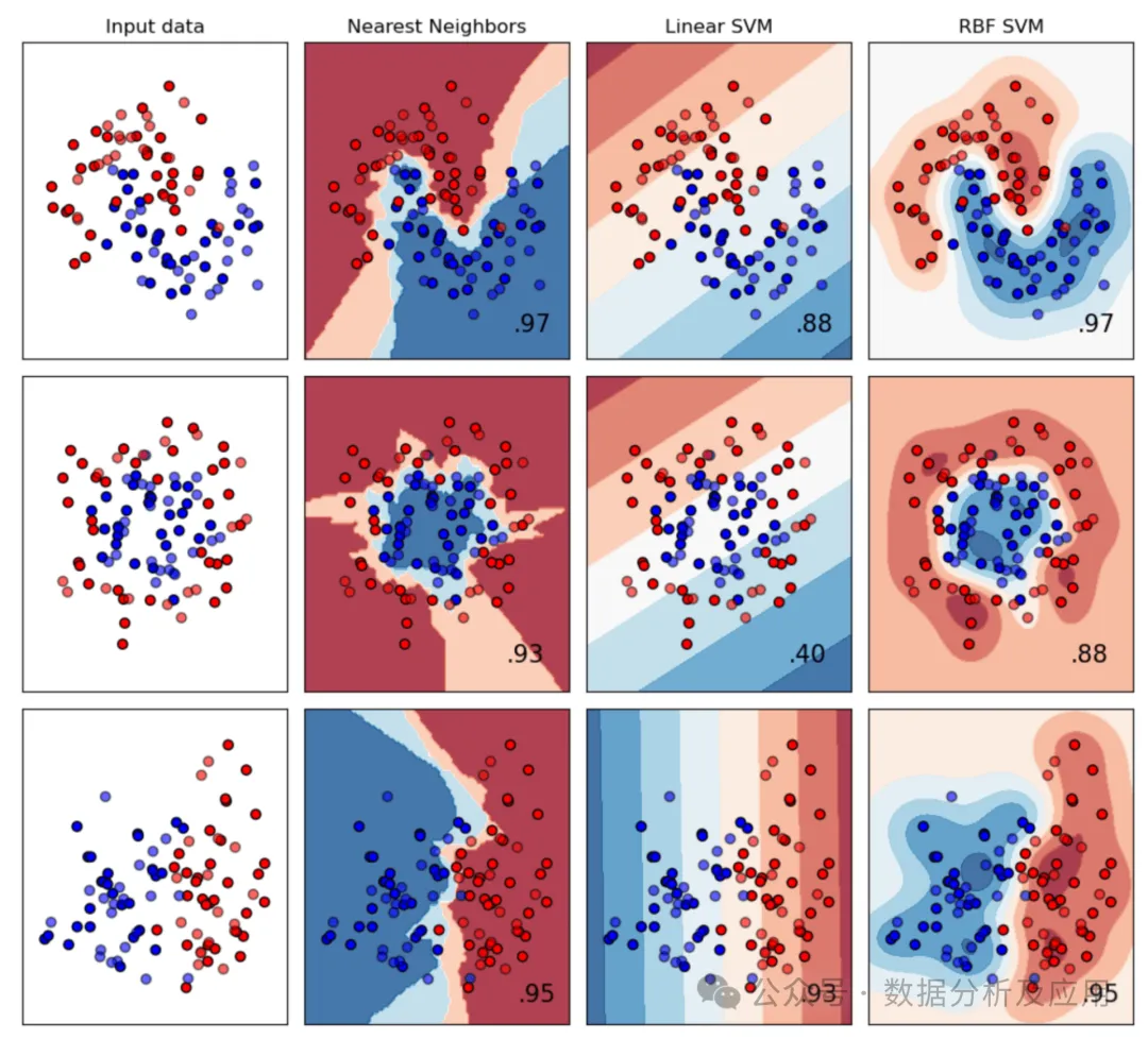
Ensemble model visualization can also help users better understand the weights assigned to each base model in the ensemble. Often, base models have a strong influence on certain regions of the feature space while having little impact on others. However, there may also be base models that have never made significant contributions to the ensemble output. Identifying base models with particularly low or high weights helps make the ensemble model more robust and improve its generalization.
Intuitive Model Building
Visual ML is a method of designing machine learning models using low-code or no-code platforms. It allows users to create and modify complex machine learning processes, models, and results through a user-friendly visual interface. Visual ML does not retrospectively generate model structure visualizations, but places them at the core of the ML workflow.
In short, Visual ML platforms provide drag-and-drop model-building workflows that allow users from various backgrounds to easily create ML models. They bridge the gap between the abstract world of algorithms and our innate ability to grasp patterns and relationships visually.
These platforms can save us time and help us quickly build model prototypes. Since models can be created in minutes, it becomes easy to train and compare different model configurations. The best-performing model can then be further optimized, perhaps using a more code-centric approach.
Data scientists and machine learning engineers can leverage Visual ML tools to create:
-
Experimental prototypes; -
MLOps pipelines; -
Generate optimal ML code for production; -
Extend existing ML model codebases for larger samples.
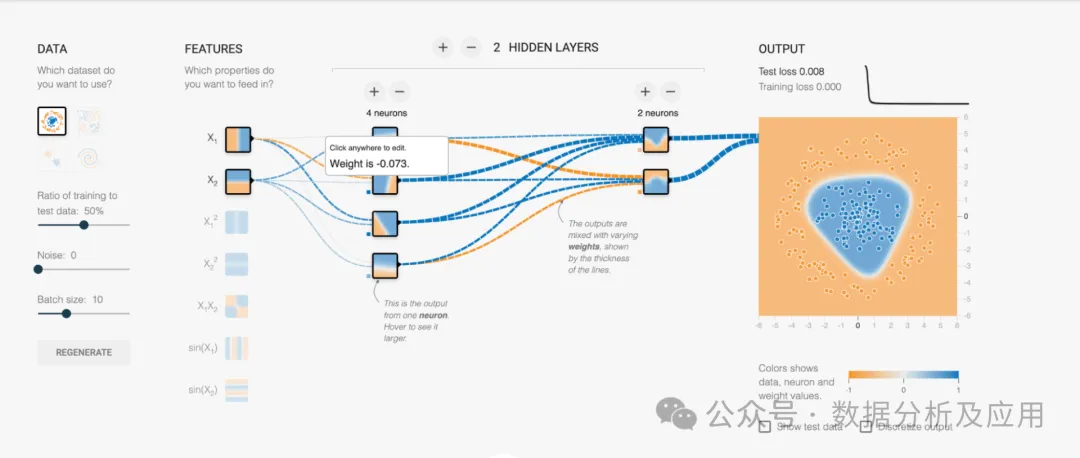
Examples of Visual ML tools include TensorFlow’s Neural Network Playground and KNIME, which is an open-source data science platform built entirely around Visual ML and no-code concepts.
Visualizing Machine Learning Model Performance
In many cases, we are less concerned with how the model works internally and are more interested in understanding its performance. Which samples are reliable? Where does it often draw incorrect conclusions? Should we choose model A or model B?
In this section, we will introduce machine learning visualization effects that help us better understand model performance.
Confusion Matrix
The confusion matrix is a fundamental tool for evaluating the performance of classification models. The confusion matrix compares the model’s predictions with the ground truth, clearly showing which samples the model misclassified or where it struggles to distinguish between categories.
For binary classifiers, the confusion matrix has only four fields: true positives, false positives, false negatives, and true negatives:
|
|
|
|
|
|
|
|
|
|
|
|
The confusion matrix for multi-class models follows the same general idea. The diagonal elements represent correctly classified instances (i.e., the model’s output matches the true value), while the non-diagonal elements represent misclassifications.
import matplotlib.pyplot as plt
from sklearn.datasets import make_classification
from sklearn.metrics import confusion_matrix, ConfusionMatrixDisplay
from sklearn.model_selection import train_test_split
from sklearn.svm import SVC

# generate some sample data
X, y = make_classification(n_samples=1000,n_features=10,n_informative=6,n_redundant=2,n_repeated=2,n_classes=6,n_clusters_per_class=1,random_state=42)

# split the data into train and test sets
X_train, X_test, y_train, y_test = train_test_split(X, y,random_state=0)

# initialize and train a classifier
clf = SVC(random_state=0)
clf.fit(X_train, y_train)

# get the model’s prediction for the test set
predictions = clf.predict(X_test)

# using the model’s prediction and the true value,
# create a confusion matrix
cm = confusion_matrix(y_test, predictions, labels=clf.classes_)

# use the built-in visualization function to generate a plot
disp = ConfusionMatrixDisplay(confusion_matrix=cm, display_labels=clf.classes_)
disp.plot()
plt.show()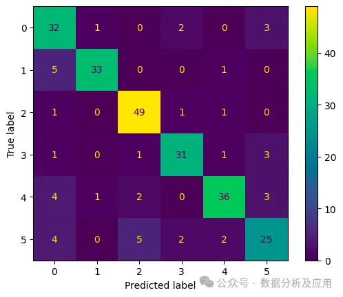
-
Diagonal: Ideally, the main diagonal of the matrix should be filled with the highest numbers. These numbers represent instances where the model correctly predicted the class, aligning with the true class. It seems our model is doing well here! -
Off-diagonal Entries: The numbers outside the main diagonal are equally important. They reveal where the model made mistakes. For example, if we look at the cell intersecting row 5 and column 3, we see there are 5 instances where the true class is “5,” but the model predicted class “3.” Perhaps we should take a look at the affected samples to better understand what’s happening here! -
Instant Performance Analysis: By examining the off-diagonal entries, you can immediately see they are very low. Overall, the classifier seems to perform well. You will also notice that the sample sizes for each of our categories are roughly the same. In many real-world scenarios, this is not the case. Then, generating a second confusion matrix showing the likelihood of correct classifications (rather than absolute numbers of samples) might be helpful.
Visual enhancements such as color gradients and percentage annotations make confusion matrices more intuitive and easier to interpret. Confusion matrices styled similarly to heat maps draw attention to classes with high error rates, guiding further model development.
Confusion matrices can also help non-technical stakeholders grasp the strengths and weaknesses of the model, facilitating discussions about whether additional data or precautions are needed when making critical decisions based on model predictions.
Visualizing Clustering Analysis
Clustering analysis groups similar data points based on specific features. Visualizing these clusters can reveal patterns, trends, and relationships within the data.
Coloring each point in a scatter plot according to its cluster assignment is a standard method for visualizing clustering analysis results. The clustering boundaries and their distribution in the feature space are clearly visible. Pair plots or parallel coordinates help understand relationships between multiple features.
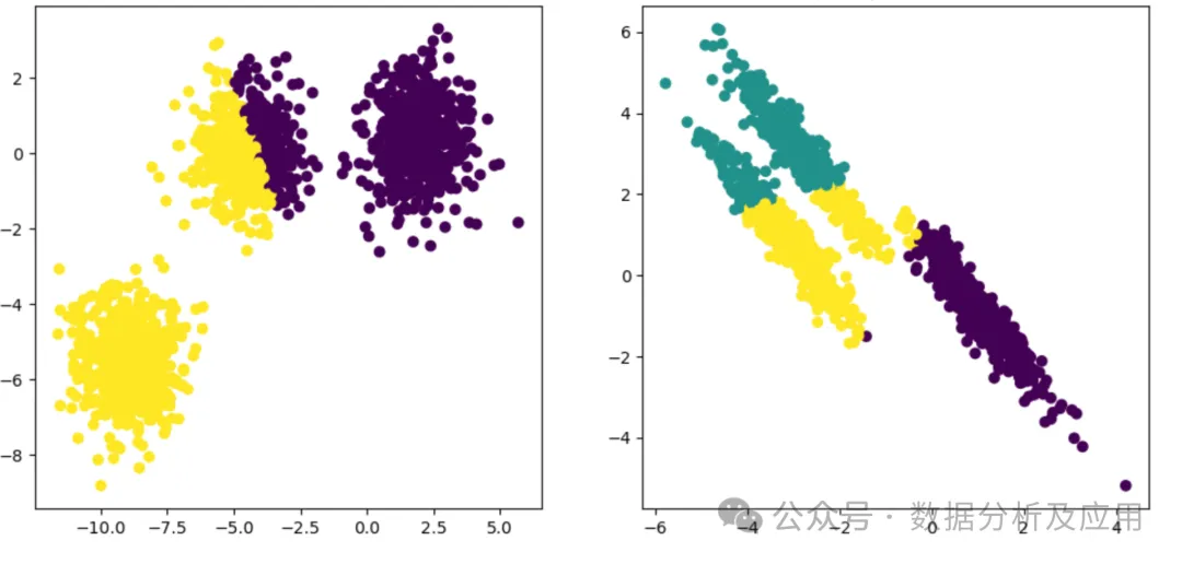
Example of visualizing clustering analysis: Two different data clusters generated by k-means clustering. You can see that in both cases, the clusters found by the model (color-coded) do not match the actual clusters in the data | Source
A popular clustering algorithm, k-means, starts by selecting initial points called centroids. A simple method is to randomly select k samples from the dataset.
Once these initial centroids are established, k-means alternates between two steps:
-
It associates each sample with the nearest centroid, creating clusters consisting of samples associated with the same centroid. -
It recalibrates the centroids by averaging the values of all samples in the cluster.
As this process continues, the centroids move, and the associations of points with clusters are iteratively refined. Once the difference between the new and old centroids falls below a set threshold, stability is reached, and k-means ends.
The result is a set of centroids and clusters that can be visualized in a graph, as shown above.
For larger datasets, techniques like t-SNE (t-distributed Stochastic Neighbor Embedding) or UMAP (Uniform Manifold Approximation and Projection) can be used to reduce dimensions while preserving clustering structures. These techniques help effectively visualize high-dimensional data.
t-SNE takes complex high-dimensional data and transforms it into a low-dimensional representation. The algorithm first assigns a position in low-dimensional space to each data point. It then examines the original data and considers its neighboring points, determining each point’s actual position in this new space. Points that are similar in high-dimensional space are pulled closer together in the new space, while those that are different are pushed apart.
This process is repeated until points find their perfect positions. The final result is a clustering representation where similar data points form groups, allowing us to see patterns and relationships hidden in high-dimensional chaos. It’s like a symphony, where each note finds its harmonious position, creating a beautiful data composition.

-
Neighbor Finding: UMAP first identifies the neighbors of each data point. It determines which points are close to each other in the original high-dimensional space. -
Fuzzy Simplex Construction: Imagine creating a network of connections between these neighboring points. UMAP models the strength of these connections based on the relevance or similarity of the points. -
Low-Dimensional Layout: After determining their proximity, UMAP carefully arranges the data points in low-dimensional space. In this new space, points that were closely connected in high-dimensional space are placed together closely.
-
Optimization: UMAP aims to find the best representation in lower dimensions. It minimizes the distance differences between the original high-dimensional space and the new low-dimensional space. -
Clustering: UMAP uses clustering algorithms to group similar data points. Imagine gathering marbles of similar colors together—this allows us to see patterns and structures more clearly.
Comparative Model Analysis
Comparing performance metrics of different models is crucial for determining which machine learning model is best suited for the task. Whether during the experimental phase of a machine learning project or when retraining production models, visualizations are often needed to translate complex numerical results into actionable insights.
Thus, visualizations of model performance metrics, such as ROC curves and calibration plots, are tools that every data scientist and machine learning engineer should have in their toolbox. They are foundational for understanding and communicating the effectiveness of machine learning models.
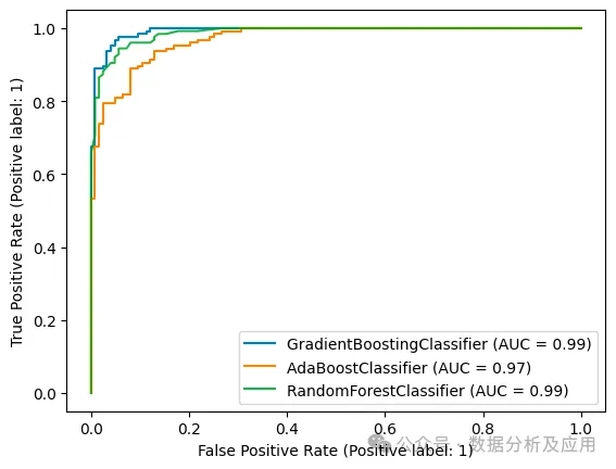
ROC Curve
The Receiver Operating Characteristic curve (ROC curve) is essential when analyzing machine learning classifiers and comparing ML model performance.
ROC curves compare the true positive rate of the model with its false positive rate as a function of the cutoff threshold. It describes the trade-off we always have to make between true positives and false positives and provides insights into the model’s discriminative power.
A curve close to the upper left corner indicates excellent performance: the model achieves a high true positive rate while maintaining a low false positive rate. Comparing ROC curves helps us choose the best model.
Here’s a step-by-step explanation of how the ROC curve works:
In binary classification, we are interested in predicting one of two possible outcomes, usually labeled as positive (e.g., presence of a disease) and negative (e.g., absence of a disease).
Remember, we can convert any classification problem into a binary one by selecting one class as the positive outcome and designating all other classes as negative. Therefore, the ROC curve is still useful for multi-class or multi-label classification problems.
The axes of the ROC curve represent two metrics:
-
True Positive Rate (Sensitivity): The proportion of actual positive cases correctly identified by the model. -
False Positive Rate: The proportion of actual negative cases incorrectly identified as positive.
Machine learning classifiers typically output the probability that a sample belongs to the positive class. For example, the values output by a logistic regression model range between 0 and 1, which can be interpreted as likelihoods.
As data scientists, we are responsible for selecting a threshold above which we assign a positive label. The ROC curve shows us the impact of this choice on the classifier’s performance.
If we set the threshold to 0, all samples will be assigned to the positive class, resulting in a false positive rate of 1. Therefore, in any ROC curve plot, you will see the curve ending at (1, 1).
If we set the threshold to 1, no samples will be assigned to the positive class. However, since in this case we never incorrectly assign negative samples to positive, the false positive rate will be 0. You may have guessed it, this is what we see at the lower left corner of the ROC curve plot: the curve always starts from (0, 0).
By changing the threshold for classifying samples as positive, we plot the curve between these points. The resulting curve (the ROC curve) reflects how the true positive rate and false positive rate vary with that threshold.
But what have we learned from this?
The ROC curve shows us the trade-offs we must make between sensitivity (true positive rate) and specificity (1 – false positive rate). In simpler terms, we can either identify all positive samples (high sensitivity) or ensure that all samples identified as positive actually belong to the positive class (high specificity).
Consider a classifier that can perfectly distinguish positive samples from negative ones: it always has a true positive rate of 1 and a false positive rate of 0, regardless of the threshold we choose. Its ROC curve will rise from (0,0) straight up to (0,1) and then follow a line between (0,1) and (1,1).
Thus, the closer the ROC curve is to the left boundary of the graph and then the top boundary, the stronger the model’s discriminative power, and the better it meets sensitivity and specificity goals.
To compare different models, we often do not use the curves directly but calculate the area under the curve. This quantifies the model’s overall ability to distinguish between positive and negative classes.
This so-called ROC-AUC (Area Under the ROC Curve) can take values between 0 and 1, with higher values indicating better performance. In fact, our perfect classifier would achieve exactly 1 for the ROC-AUC.
When using the ROC-AUC metric, it’s essential to remember that the baseline is not 0, but 0.5—the ROC-AUC of a completely random classifier. If we use np.random.rand() as a classifier, the generated ROC curve will be a diagonal line from (0,0) to (1,1).
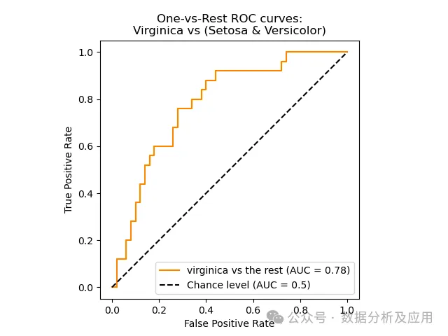
Example of comparative model analysis: The ROC curve of a random classifier is a diagonal line, resulting in a ROC-AUC of 0.5. The actual ML classifier’s ROC curve, shown in yellow, is always above that line, with a ROC-AUC of 0.78 | Source

Experiment Tracking
Calculate and log ROC-AUC
from sklearn.metrics import roc_auc_score

clf.fit(x_train, y_train)

y_test_pred = clf.predict_proba(x_test)
auc = roc_auc_score(y_test, y_test_pred[:, 1])

# optional: log to an experiment-tracker like neptune.ai
neptune_logger.run["roc_auc_score"].append(auc)

Create and log ROC plot
from scikitplot.metrics import plot_roc
import matplotlib.pyplot as plt

fig, ax = plt.subplots(figsize=(16, 12))
plot_roc(y_test, y_test_pred, ax=ax)

# optional: log to an experiment tracker like neptune.ai
from neptune.types import File
neptune_logger.run["roc_curve"].upload(File.as_html(fig))
Calibration Curve
Although machine learning classifiers typically output values between 0 and 1 for each class, these values do not represent statistically meaningful probabilities or confidence levels. In many cases, this is perfectly fine, as we are only interested in obtaining the correct labels.
However, if we want to report confidence levels along with classification results, we need to ensure that our classifiers are well-calibrated. Calibration curves are useful visual aids for understanding how well-calibrated a classifier is. We can also use them to compare different models or check whether our attempts to recalibrate a model have been successful.
Let’s again consider a model that outputs values between 0 and 1. If we choose a threshold, say 0.5, we can convert it into a binary classifier where all samples with higher outputs are assigned to the positive class (and vice versa).
Calibration curves plot the “positive score” based on the model’s output. The “positive score” is the conditional probability that a sample belongs to the positive class given the model’s output (P(sample belongs to the positive class | model output between 0 and 1)).
Does this sound too abstract? Let’s look at an example:

First, look at the diagonal. It represents a perfectly calibrated classifier: the model’s output between 0 and 1 is exactly the probability that the sample belongs to the positive class. For example, if the model outputs 0.5, the sample has a 50:50 chance of being positive or negative. If the model outputs 0.2, the likelihood of the sample belonging to the positive class is only 20%.
Next, consider the calibration curve of a naive Bayes classifier: you will see that even if this model outputs 0, the sample has about a 10% chance of being positive. If the model outputs 0.8, the sample still has a 50% chance of being negative. Thus, the classifier’s outputs do not reflect its confidence levels.
Calculating the “positive score” is far from straightforward. We need to create bins based on the model’s outputs, and this is complicated due to the uneven distribution of samples across the model’s value range. For example, logistic regression classifiers often assign values close to 0 or 1 to many samples but rarely output values close to 0.5. You can find a deeper discussion of this topic in the scikit-learn documentation. There, you can also learn about possible methods for recalibrating models, which is beyond the scope of this article.
For our purposes, we have learned how calibration curves visualize complex model behaviors in an easy-to-grasp manner. By quickly glancing at the graph, we can see whether the model is well-calibrated and which model is closest to ideal.
Visualizing Hyperparameter Optimization
Hyperparameter optimization is a critical step in developing machine learning models. The goal is to select the best configuration of hyperparameters—a general term for parameters that are not learned from data but are predefined by their human creators. Visualization can help data scientists understand the impact of different hyperparameters on model performance and attributes.
Finding the optimal configuration of hyperparameters is a skill in itself, far beyond what we will focus on in the machine learning visualization aspects here. To learn more about hyperparameter optimization, I recommend this article written by a former Amazon AI researcher about improving ML model performance.
A common method for systematic hyperparameter optimization is to create a list of possible parameter combinations and train a model for each parameter combination. This is often referred to as “grid search.”
For example, if you are training a support vector machine (SVM), you might want to try different values for the parameters C (regularization parameter) and gamma (kernel coefficient):
import numpy as np
C_range = np.logspace(-2, 10, 13)
gamma_range = np.logspace(-9, 3, 13)
param_grid = {"gamma": gamma_range, "C": C_range}from sklearn.model_selection import GridSearchCV,
grid = GridSearchCV(SVC(), param_grid=param_grid, scoring='accuracy')
grid.fit(X, y)print("The best parameters are %s with a score of %0.2f"% (grid.best_params_, grid.best_score_))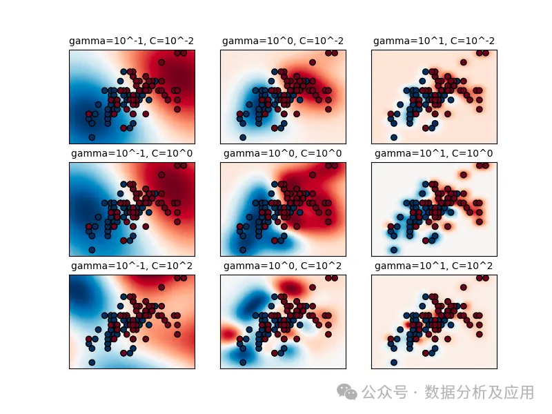
The graph shows that the value of gamma has a significant impact on the performance of the support vector machine. If gamma is set too high, the influence radius of the support vectors is small, which can lead to overfitting, even with a lot of regularization through C. In this case, the influence area of any support vector spans the entire training set, making the model similar to a linear model that uses a hyperplane to separate dense areas of different classes.
The best model is located along the diagonal of C and gamma, as shown in the second plotting panel. By adjusting gamma (lower values indicate smoother models) and increasing C (higher values emphasize correct classification), we can traverse this diagonal to obtain well-performing models.
Even from this simple example, you can see how useful visualization is for gaining insights into the underlying reasons for performance differences in models. This is why many machine learning experiment tracking tools enable data scientists to create various types of visualizations to compare model versions.
Feature Importance Visualization
Feature importance visualization provides a clear and intuitive way to grasp the contribution of each feature in the model’s decision-making process. Understanding which features significantly influence predictions is crucial in many applications.
There are many different methods to extract insights about feature importance from machine learning models. Broadly, we can categorize them into two types:
-
Some types of models (like decision trees and random forests) inherently contain feature importance information as part of their model structure. All we need to do is extract and visualize it.
-
Most machine learning models currently in use do not provide out-of-the-box feature importance information. We must use statistical techniques and algorithmic methods to reveal the importance of each input feature to the model’s final output.
Below, we will look at an example from each category: the impurity mean decrease method for a random forest model and the LIME interpretability method that is model-agnostic. Other methods you might want to explore include permutation importance, SHAP, and integrated gradients.
For the purposes of this article, we are less concerned with how to obtain feature importance data and more focused on its visualization. For this, bar charts are preferred for structured data, where the length of each bar represents the importance of the feature. Heatmaps are obviously a favorite for images, and for textual data, highlighting the most important words or phrases is typical.
In a business context, feature importance visualization is a valuable tool for communicating with stakeholders. It provides a straightforward narrative showcasing the primary factors influencing predictions. This transparency enhances decision-making capabilities and can foster trust in model outcomes.
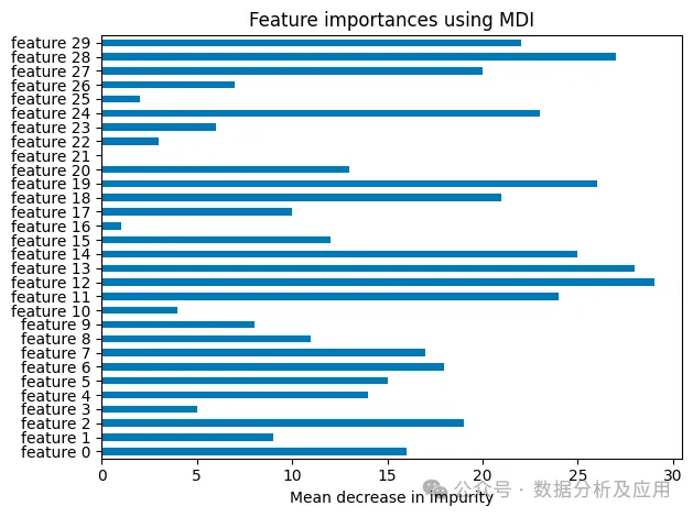
Feature Importance Assessment Using Impurity Mean Decrease
The average decrease in impurity is a metric for measuring the contribution of each feature to the performance of the decision tree. To understand this, we first need to grasp what “impurity” means in this context.
Let’s illustrate:
-
Imagine we have a fruit basket containing apples, pears, and oranges. When the fruit pieces are in the basket, they are thoroughly mixed, and we can say that the impurity of this set of fruits is high. -
Now, our task is to classify them. If we put all the apples in one bowl, the oranges on a tray, and the pears in another basket, we will be left with three perfectly pure sets of apples. -
But here’s the catch: we cannot see the fruit pieces when making decisions. For each piece of fruit, we are told its color, diameter, and weight. We then need to decide where it should go. Therefore, these three attributes are our features. -
The weight and diameter of the fruit pieces will be very similar. They won’t help us classify them much—or in other words, they won’t help reduce impurity. -
However, color will be helpful. We may still struggle to distinguish between green or yellow apples and green or yellow pears, but if we learn that the color is red or orange, we can confidently make a decision. Therefore, “color” will yield the greatest average decrease in impurity.
Now, let’s use this analogy in the context of decision trees and random forests:
When building a decision tree, we want each node to be as pure as possible regarding the target variable. In simpler terms, when creating new nodes for our tree, our goal is to find the features that best separate the samples reaching the node into two different sets, such that samples with the same label are in the same set. (For complete mathematical details, see the scikit-learn documentation).
Each node in the decision tree reduces impurity—roughly speaking, it helps sort training samples by target labels. Suppose a feature is the decision criterion for many nodes in the tree, and it can effectively cleanly separate samples. In that case, it will account for a significant portion of the overall impurity reduction achieved by the decision tree. This is why examining the “average decrease in impurity” responsible for a feature is a great metric for assessing feature importance.
Wow, this is quite complex!
Fortunately, visualizations are easy to read. We can clearly identify the main drivers of the model and use this information in feature selection. Reducing the model’s input space to the most critical features can lower its complexity and help prevent overfitting.
Moreover, understanding feature importance aids in data preparation. Features with lower importance may be candidates for removal or merging, simplifying input data preprocessing.
However, before we continue, I want to mention an important caveat. Since the impurity reduction at nodes is determined using the training dataset, the “average decrease in impurity” does not necessarily translate to previously unseen test data:
Suppose our training samples are numbered, and this numbering serves as input features for the model. If our decision tree is complex enough, it may only know which sample has which label (e.g., “fruit 1 is an orange,” “fruit 2 is an apple”… the impurity average reduction of numerical features will be huge, and it will appear as a very important feature in our visualizations, even though it is completely useless when applying our model to previously unseen data.
Local Interpretable Model-Agnostic Explanations (LIME)
Local interpretability methods aim to clarify how models behave for specific instances (in contrast to global interpretability, which examines the model’s behavior across its entire feature space).

Examples of Local Interpretable Model-Agnostic Explanations (LIME) and generated important features | Source: Author
One of the oldest and still widely used techniques is LIME (Local Interpretable Model-Agnostic Explanations). To reveal the contribution of each input feature to the model’s prediction, a linear model is fitted that approximates the model’s behavior in a specific region of the feature space. Roughly speaking, the coefficients of the linear model reflect the importance of the input features. The results can be visualized as feature importance graphs, highlighting the features that have the most impact on specific predictions.
Local interpretability techniques can extract intuitive insights from complex algorithms. The visualizations of these results can support discussions with business stakeholders or serve as a basis for cross-checking the model’s learning behavior with domain experts. They provide practical, actionable insights that enhance trust in the complex inner workings of models and can become important tools for facilitating the adoption of machine learning.
How to Adopt Model Visualization in Machine Learning?
In this section, I will share tips for seamlessly integrating model visualization into your daily data science and machine learning routines.

1. Start with Clear Objectives
Before diving into model visualization, determine a clear purpose. Ask yourself, “What specific goals do I intend to achieve through visualization?
Are you seeking…
-
…to improve model performance? -
…to enhance interpretability? -
…to better communicate results to stakeholders?
Defining objectives will provide the direction needed for effective visualizations.
2. Choose Appropriate Visualizations
Always adopt a top-down approach. This means starting from a very abstract level and then exploring deeper for more insights.
For example, if you are seeking to improve model performance, ensure you start with simple methods, such as plotting the model’s accuracy and loss using basic line graphs.
If your model is overfitting, you can then rank features based on their contribution to model performance using feature importance techniques. You can plot these feature importance scores to visualize the most influential features in the model. Features with high importance may point to overfitting and information leakage.
Similarly, you can create partial dependence plots for relevant features. PDPs show how the predictions of the target variable change as specific features vary while keeping other features constant. You should look for unstable behaviors or dramatic fluctuations in the curves, which may indicate overfitting due to that feature.
3. Select the Right Tools
The choice of the right tools depends on the task at hand and the capabilities offered by the tools. Python provides a wealth of libraries like Matplotlib, Seaborn, and Plotly for creating static and interactive visualizations. Framework-specific tools (like TensorBoard for TensorFlow and scikit-plot for scikit-learn) are valuable for model-specific visualizations.
4. Iterate and Improve
Remember, model visualization is an iterative process. Continuously optimize your visualizations based on feedback from the team and stakeholders. The ultimate goal is to make your models transparent, interpretable, and accessible to all stakeholders. Their feedback and the evolving project requirements may mean you need to rethink and adjust your approach.
Integrating model visualization into your daily data science or machine learning practices enables you to make clear, confident data-driven decisions. Whether you are a data scientist, domain expert, or decision-maker, making model visualization a routine practice is a key step in maximizing the potential of machine learning projects.
Conclusion
Effective machine learning model visualization is an indispensable tool for any data scientist. It enables practitioners to gain insights, make informed decisions, and transparently communicate results.
In this article, we covered a wealth of information on how to visualize machine learning models. In summary, here are some key points:
Purposes of Visualization in Machine Learning:
-
Visualization simplifies complex ML model structures and data patterns for better understanding. -
Interactive visualizations and Visual ML tools enable users to dynamically interact with data and models. They can adjust parameters, zoom in on details, and gain a better understanding of ML systems. -
Visualizations aid in making informed decisions and effective communication of results.
-
Model structure visualizations help data scientists, AI researchers, and business stakeholders understand complex algorithms and data flows. -
Visualizing model performance provides insights into the performance characteristics of individual models and model ensembles. -
Visualizations for comparative model analysis help practitioners choose the best-performing models or validate whether new model versions represent an improvement. -
Feature importance visualizations reveal the impact of each input feature on model outputs.
-
Start with clear objectives and simple visualizations. -
Select appropriate visualization methods that meet your needs and are accessible to your target audience. -
Choose the right tools and libraries to help you efficiently create accurate visualizations. -
Continuously listen for feedback and adjust visualizations according to stakeholders’ needs.
Editor: Huang Jiyan