
MLNLP(Machine Learning Algorithms and Natural Language Processing) community is a well-known natural language processing community both domestically and internationally, covering NLP graduate students, university professors, and corporate researchers.The vision of the community is to promote communication and progress between the academic and industrial fields of natural language processing and machine learning, especially for beginners. Reproduced from | Jishi Platform Authors丨Feng Yuyiao, Akun Source丨https://www.zhihu.com/question/21664179
When writing papers, one of the most frustrating aspects aside from innovation is creating illustrations. This article summarizes some methods for creating beautiful illustrations, hoping to help those working hard on their papers.
1
Method 1: Author – Feng Yuyiao
I strongly recommend the Python plotting module matplotlib: python plotting. The resulting graphs are truly high-end, sophisticated, and understatedly luxurious~ Suitable for various plotting from 2D to 3D, from scalar to vector. It can save in multiple formats from eps, pdf to svg, png, jpg. Moreover, the plotting functions of Matplotlib are basically similar to those of Matlab, making the learning curve relatively low. It is open-source and free. As shown in the figure (the figure described in the title is at the end): (The following images are all referenced from the Thumbnail gallery) This ordinary function graph: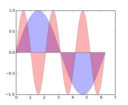
plt.fill(x, y1, 'b', x, y2, 'r', alpha=0.3)And this scatter plot (I don’t know how to say it in Chinese…):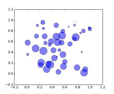
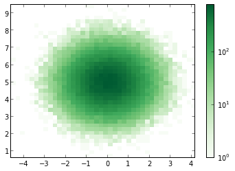
plt.scatter(x, y, s=area, alpha=0.5)Exquisite curves and semi-transparent colors show your noble and cool personality, and the best part is that it can all be done with just one line of code. From now on, you will no longer have to endure the painful color schemes in Matlab and GNUPlot.Want to plot 3D data? No problem (though using mayavi might be more convenient):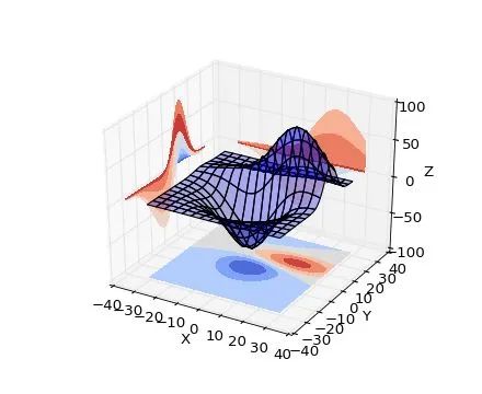
ax.plot_surface(X, Y, Z, rstride=8, cstride=8, alpha=0.3)cset = ax.contourf(X, Y, Z, zdir='z', offset=-100, cmap=cm.coolwarm)cset = ax.contourf(X, Y, Z, zdir='x', offset=-40, cmap=cm.coolwarm)cset = ax.contourf(X, Y, Z, zdir='y', offset=40, cmap=cm.coolwarm)With just four lines of code (the last three lines are for drawing contour lines on the coordinate plane, strictly speaking, it’s still one line).In addition, whether you have a vector field, network, or any other peculiar requirement, it can all be handled: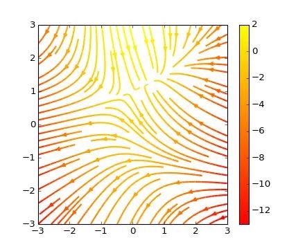
plt.streamplot(X, Y, U, V, color=U, linewidth=2, cmap=plt.cm.autumn)plt.colorbar()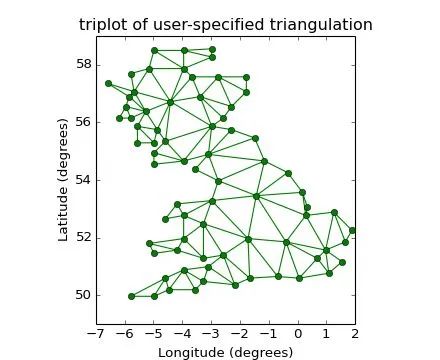
plt.triplot(x, y, triangles, 'go-')plt.title('triplot of user-specified triangulation')plt.xlabel('Longitude (degrees)')plt.ylabel('Latitude (degrees)')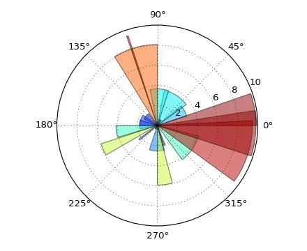
ax = plt.subplot(111, polar=True)bars = ax.bar(theta, radii, width=width, bottom=0.0)This is not all, Matplotlib also supports the insertion of LaTeX formulas. When others’ graphs still look like this (the following images are referenced from the Matplotlib Tutorial (translated))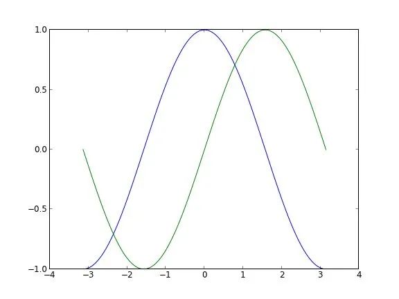 You can turn it into this:
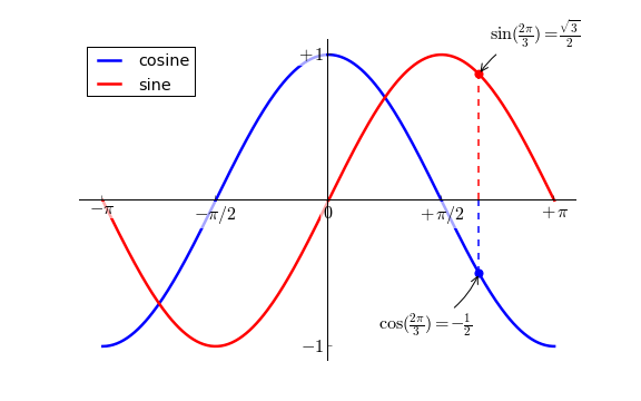 If paired with IPython as the running terminal (this image is my own~):
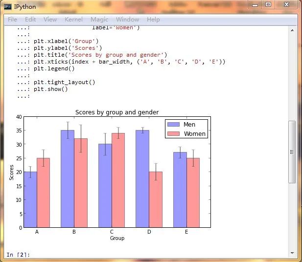 It’s simply a magical tool, isn’t it!If you are excited, why wait?Thanks to @Xu Cheng for the reminder, I’d like to add that matplotlib can also create xkcd style graphs~
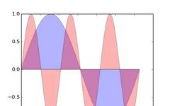
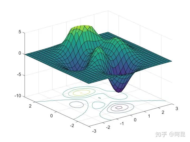
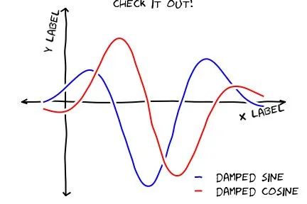 (Images referenced from the internet)Additionally, for more exciting content combined with IPython Notebook, please visit http://nbviewer.ipython.org/If you find installation troublesome and happen to be on Windows, you can try a Python distribution called winpython – Portable Scientific Python 2/3 32/64bit Distribution for Windows.In light of @van li’s questioning whether matplotlib can create the images shown in the title, I have recreated the image from the title using matplotlib as follows:
 The code is here:https://gist.github.com/coldfog/c479124328fc6bb8b789
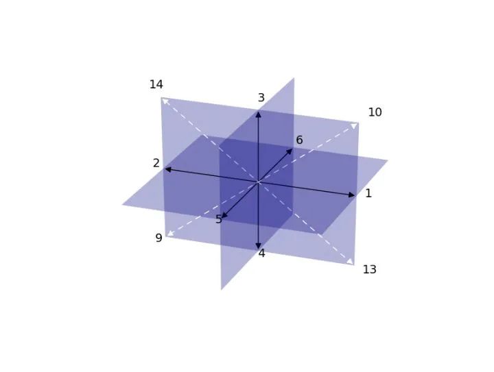 The code is here:https://gist.github.com/coldfog/5da63a6958fc0a949b52I noticed someone below mentioned the color scheme and aesthetics, sigh… let me share a few more… I just didn’t write them due to space constraints originally.First, Python has a dedicated color palette package jiffyclub/brewer2mpl on GitHub, providing exquisite color schemes from an artistic perspective (click here to experience ColorBrewer: Color Advice for Maps).There are also libraries dedicated to beautifying plots, which are very convenient to use, such as olgabot/prettyplotlib on GitHub.Without further ado, the images are the way to go. (The following images are sourced from the internet)
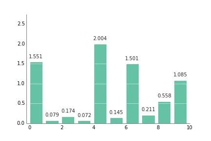
 Some might say complex settings are needed, but actually, it’s not necessary. For example, in the image above, you just need to add one more parameter:
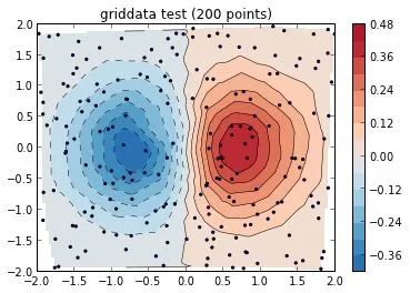
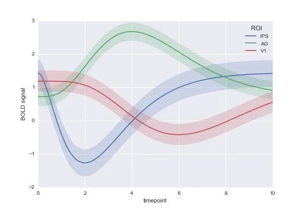
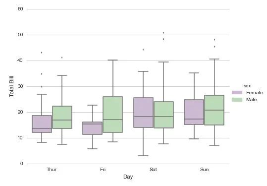
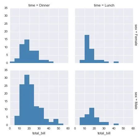
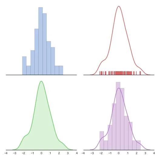
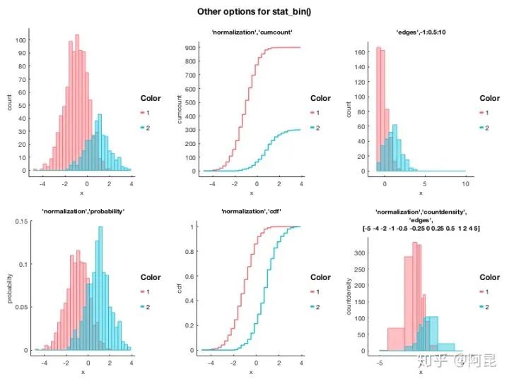
cmap=brewer2mpl.get_map('RdBu', 'diverging', 8, reverse=True).mpl_colormap,Someone below mentioned statistical plotting. Well, seaborn (https://github.com/mwaskom/seaborn) is a statistical plotting library that calls matplotlib, as shown in the image: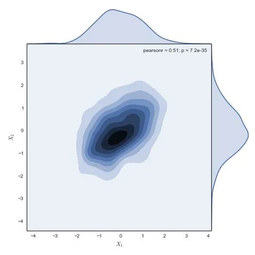 One line of code, and the rest are almost all one-liners, no other settings made, defaults just like this. I won’t post the other code:
g = sns.jointplot(x1, x2, kind="kde", size=7, space=0)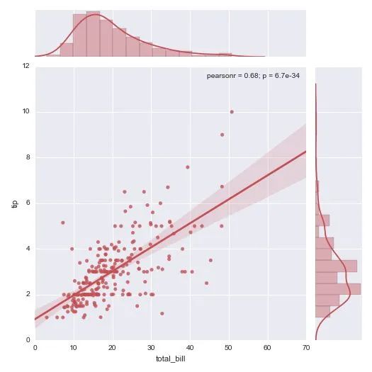
 This also has a cooler interactive plot, everyone can open it to see:http://nbviewer.ipython.org/github/plotly/python-user-guidechaocc/blob/master/s0_getting-started/s0_getting-started.ipynbHmph, it totally crushes it~~~~\(≧▽≦)/~—If you encounter installation issues, please try the Anaconda Python distribution. After downloading and installing, you can use it directly, as it almost pre-installs all the scientific computing and visualization libraries you will need.Some friends in the comments mentioned they hope for a complete tutorial. Indeed, regarding this answer, there is still a long way to go from practical use, and there are not many related Chinese materials online. However, writing it down would exceed the capacity of this answer, and it’s not very appropriate to write it under this question. When I have a column someday, I might write a series of tutorials on visualization.
2
Method 2: Author – Akun
After going through all the answers to this question, I found that any mention of Matlab often comes with tags like ‘jagged’, ‘beginner’, ‘ugly’, ‘unbearable’ etc.However, in 2020, technology has improved, and concepts have progressed. When some basic problems are solved, is Matlab still that ‘unworthy’? Observing the data and result graphs drawn by software like Mathematica, Origin, Python/matplotlib, R/ggplot2, the differences between them and Matlab graphs mainly lie in the attributes of points, lines, and surfaces (position, size, color, etc.).Since it’s just a matter of different attributes, can we achieve various software plotting styles by simply modifying this information?The answer is yes.For example, here is a highly praised answer by @Feng Yuyiao using Python/matplotlib to create a graph:
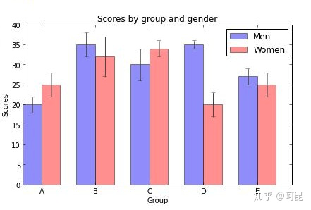 When we plot using Matlab’s default attributes, the result looks like this (no error bars added):
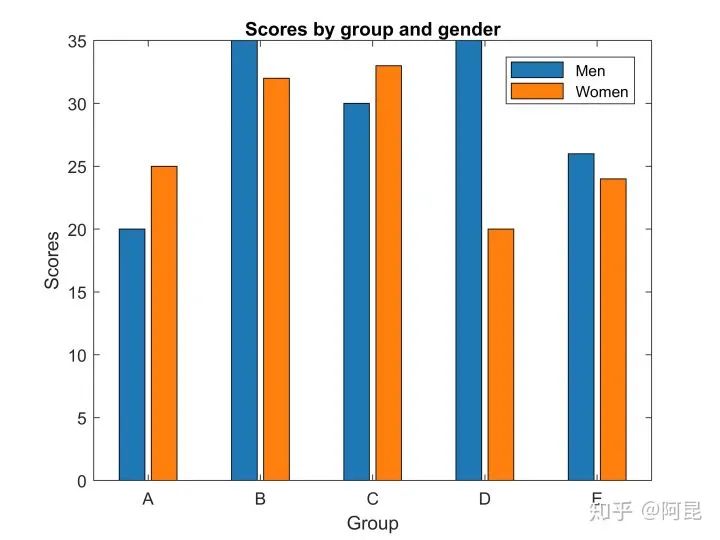 Then, by simply modifying the position, size, color, etc., we can obtain a graph with a similar style (no error bars added):
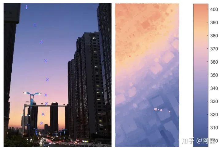
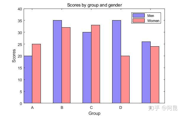 When we think about how to create illustrations using this idea, it becomes easy to implement our little ideas, imitating or even creating ideal illustrations.For example, one day, I noticed the beautiful colors of the evening sky and thought: why not draw it in a paper illustration? (See: Matlab paper illustration color 2 – natural gradient)So,
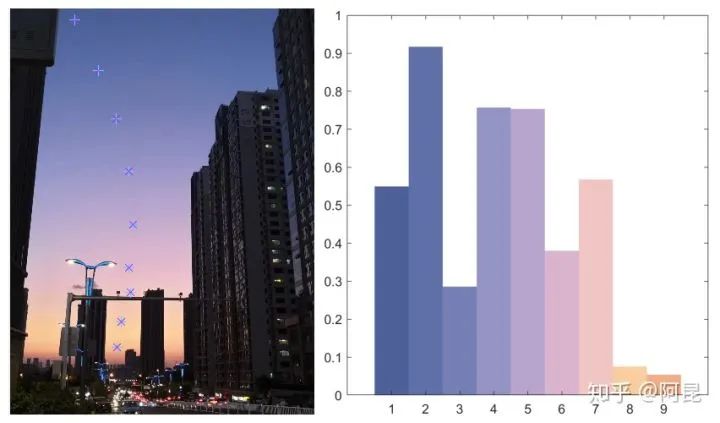
 For another example, one day, I saw a beautiful photo of my girlfriend and thought: why not draw her into a paper illustration? (See: Matlab paper illustration color 1 – the color of my girlfriend)So,
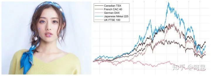 At this point, a friend might say: “Hey, you still have to code line by line to create these fancy things, isn’t that too troublesome?”This statement is wrong.Just like R has ggplot2, Python has matplotlib, Matlab also has many ready-made plotting toolkits that do not require you to develop them yourself.For example,
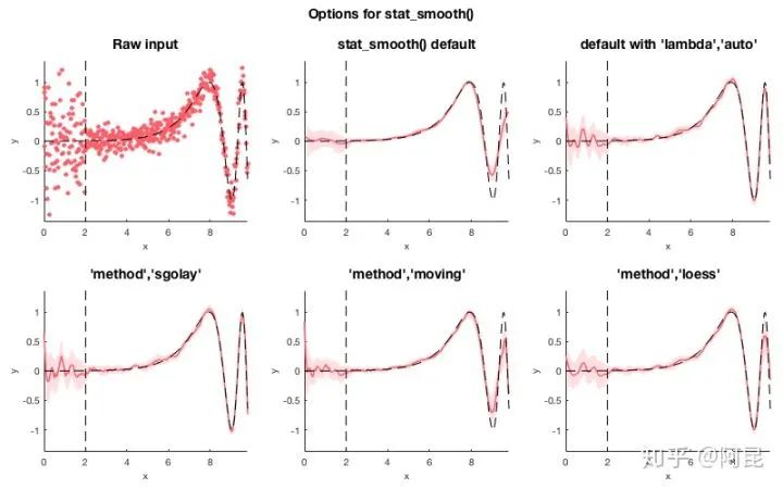
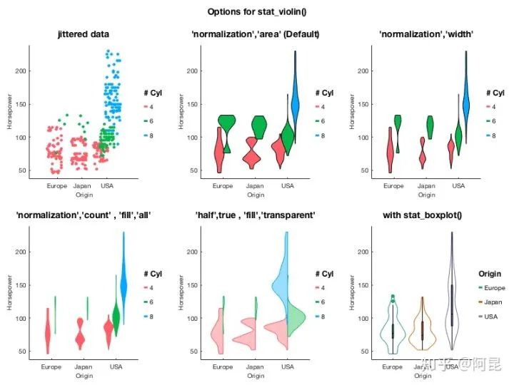
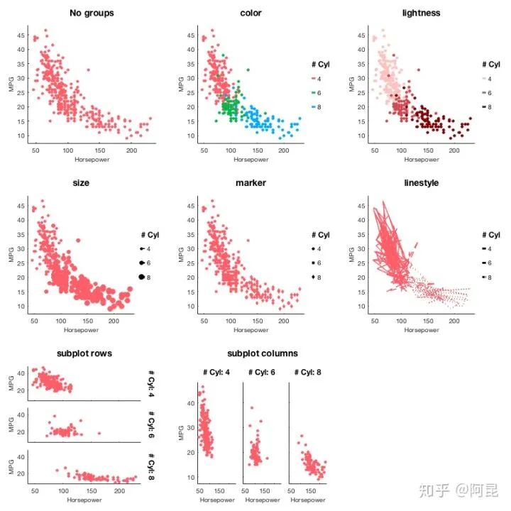
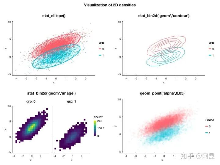
Pierre Morel [1] developed the gramm tool in conjunction with ggplot2 for drawing complex graphics.
Inspired by ggplot2 (Wickham 2009), the R implementation of “grammar of graphics” principles (Wilkinson 1999), gramm improves Matlab’s plotting functionality, allowing the generation of complex figures using high-level object-oriented code.Example effects are as follows: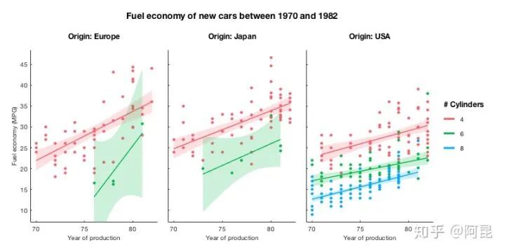
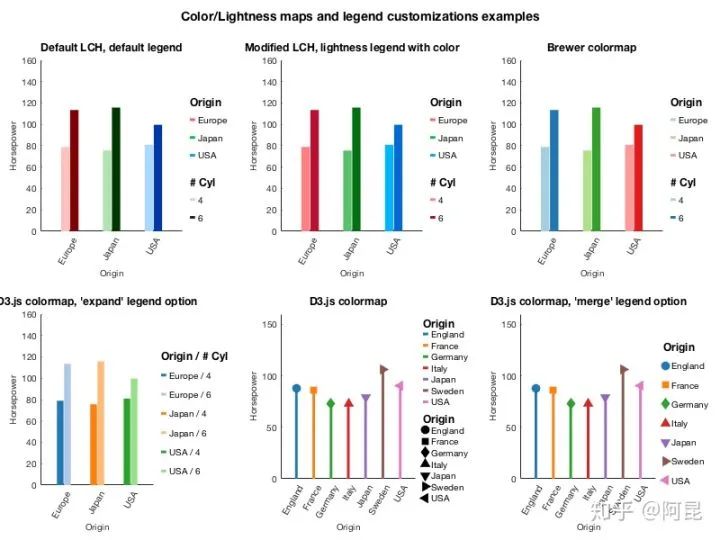
 Similarly, Stephen Cobeldick [2] has ported the matplotlib color schemes to Matlab.This means that you can now directly use matplotlib’s color schemes in Matlab, eliminating the need to always use ‘jet’.The MatPlotLib 2.0 default colormaps ported to MATLAB. This submission also includes the Line ColorOrder colormaps!Example effects are as follows:
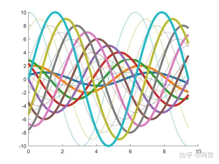
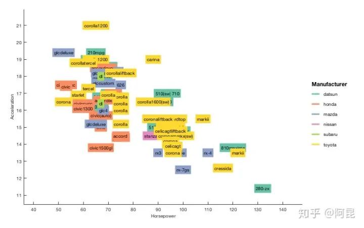
 There are also many toolkits specifically for paper illustrations, which I won’t introduce one by one here.In summary, tools are just tools; there is no distinction of high or low value.If you want to create beautiful illustrations, the key lies in the person using the tools.Focus on one point and reach the peak.References: Morel P. Gramm: grammar of graphics plotting in Matlab. Cobeldick S. MatPlotLib Perceptually Uniform Colormaps.Technical Group Chat Invitation

△ Long press to add assistant
Scan the QR code to add the assistant’s WeChat
Please note: Name – School/Company – Research Direction(e.g., Xiao Zhang – Harbin Institute of Technology – Dialogue System)to apply to join the Natural Language Processing/Pytorch and other technical group chats
About Us
MLNLP Community is a grassroots academic community jointly established by scholars in natural language processing both domestically and internationally. It has now developed into a well-known natural language processing community, including well-known brands such as 10,000-person top conference group chat, AI selection meeting, MLNLP talent gathering, and AI academic gathering, aimed at promoting progress between the academic and industrial fields of machine learning and natural language processing and the broad masses of enthusiasts.The community can provide an open communication platform for professionals in related fields for further studies, employment, and research. Everyone is welcome to follow and join us.