
Star ★TopPublic AccountLove you all♥
1
Introduction
The financial market mainly deals with time series problems, and there are numerous algorithms and tools around time series forecasting. Today, we use CNN for regression-based prediction and compare it with some traditional algorithms to see how it performs.
We focus on market volatility, specifically the volatility before and after the stock market opens.
2
Problem
We believe that the volatility (vol) before the market opens could be a good indicator. If we can accurately predict volatility, we can leverage it for trading.
3
Data Preparation
FTSE 100 index contract data from January 2016 to March 2020.

Visualization:

The data we are interested in is the volatility of prices, which is essentially the standard deviation of prices. The volatility indicator we constructed is: the highest price minus the lowest price (minute bars), while applying a moving average window of size N.

In principle, when prices fluctuate significantly, volatility should increase. To test this, we randomly select a trading day and confirm this based on the day’s vol and prices.
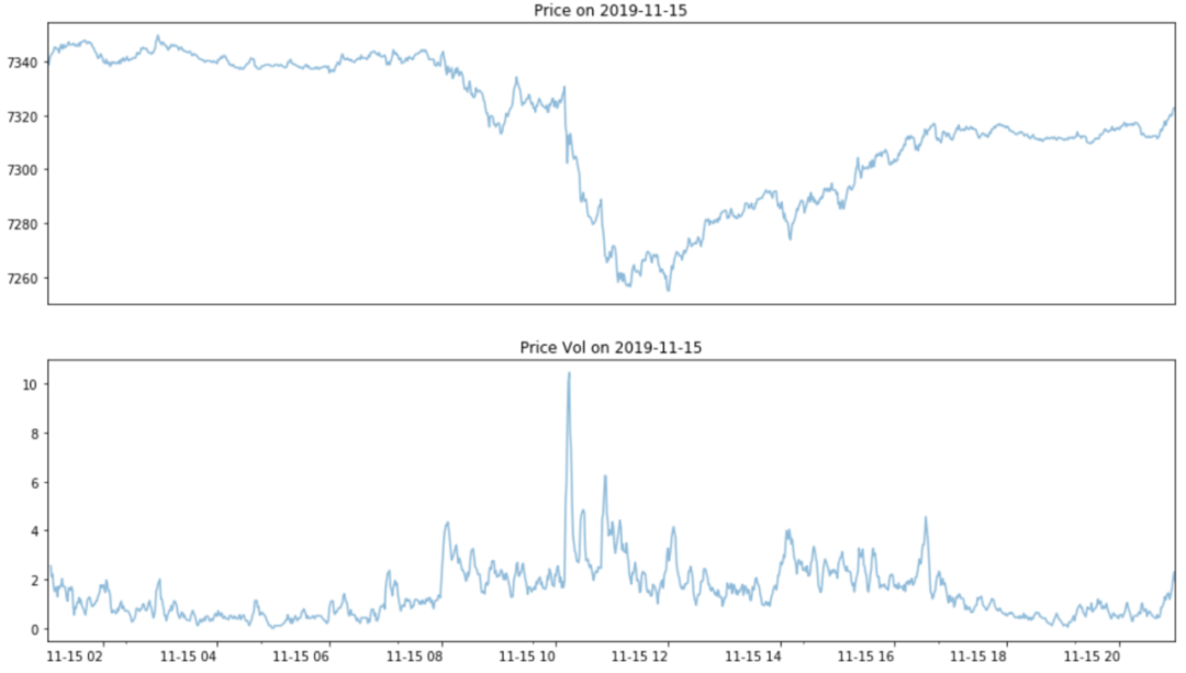
To compare the volatility across all trading days, we plotted time series-based volatility. Volatility is calculated based on a 5-minute time window. Each point represents the volume from the last 5 minutes, calculated every minute over 1070 days.

It can be seen that these peaks seem to recur within an hour, for example, peaks appear at 0000 and 0100, 0700 and 0800. Let’s plot a heatmap to check these values.
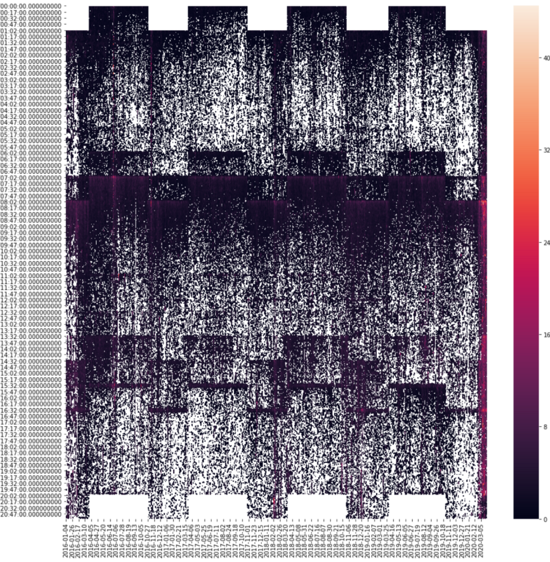
We can see that the time is Daylight Saving Time, so it needs to be adjusted to GMT (Greenwich Mean Time), as shown below:
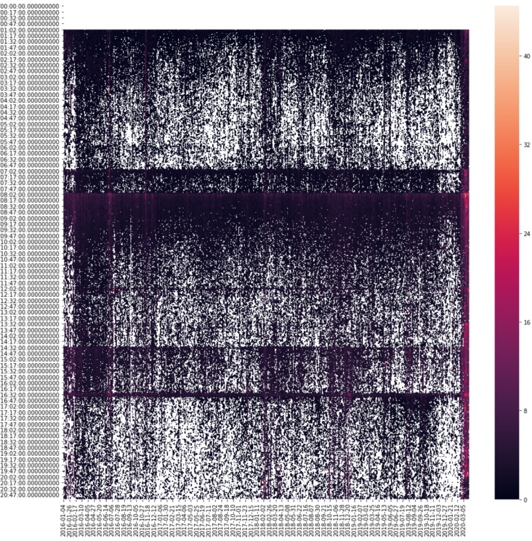
During certain periods, volatility is high. The solid line throughout the heatmap indicates that volatility remains high at certain times, which is reasonable.
-
0100: CFD begins trading
-
0700: EU stock market pre-opening
-
0800: UK stock market opens
-
1200: Noon
-
1430: US stock market opens
-
1630: UK stock market closes
We also see that volatility was high during several days in March 2020.

If we want to leverage volatility, the higher it is, the better. The peak time should be when the stock market opens, which is 0800. If we can use the volatility one hour before the opening to predict the volatility five minutes after the opening (which is usually the time of highest volatility in a day), then we can trade around this time period.

The above figure shows the total volatility for all trading days from 2016 to 2020. We can see that volatility often rebounds immediately after the market opens at 0800, and then falls back a few minutes later.
We assume there is a correlation between the volatility before and after the opening. Therefore, if we plot the average volatility one hour before the opening and five minutes after the opening, they should generally show an upward trend, and indeed they do:
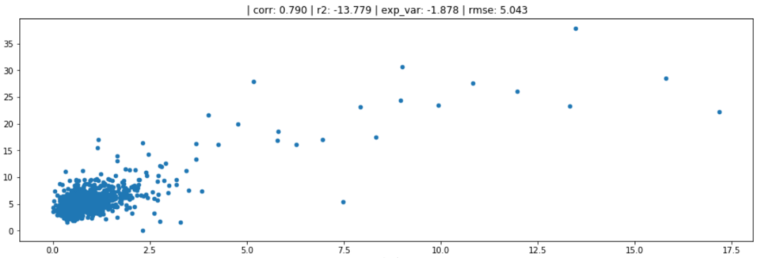
The x-axis is the average volatility one hour before the opening, and the y-axis is the average volatility five minutes after the opening. Although there is a correlation, there are many variables between them, so it is not a reliable predictor. For example, based on this chart, if the average volatility before the opening is 7.5, we have reason to assume that the volatility after the market opens will be between 5 and 25, which is not very helpful.
4
Further Discussion
We basically performed linear regression analysis on the volatility before and after the opening. Next, we add some slightly more complex algorithms. The 1070 samples are divided into three groups: training, validation, and testing.
-
Training: 0-699 (up to 2018-10-09)
-
Validation: 700-899 (up to 2019-07-25)
-
Testing: 900-1070 (up to 2020-03-25)
▌Method 1: Linear Regression
Since the data is grouped, the statistics for linear regression differ slightly from those generated using the full dataset.
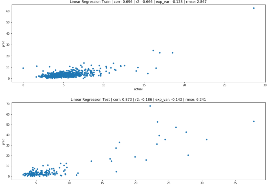
From the above figure, we can see that the correlation is still strong, but the coefficient of determination is low, and we cannot use this method to explain the changes in volatility after the opening.
One way to improve prediction is to increase the number of features, leading to multivariable (poly) regression. In this case, we can use the minute (1min) data from the hour before the opening to predict the volatility after the opening:
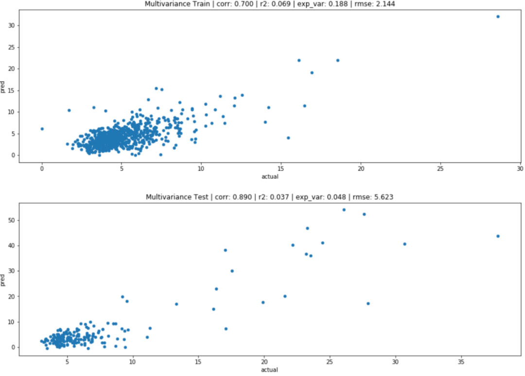
The overall statistics improve, but still not enough; all linear regression uses OLS from the statsmodel library.
import statsmodels.api as sm

def lingres(X, y, title=''):
    X_test = X[900:]
    y_test = y[900:]
    X = X[:700]
    y = y[:700]

    model = sm.OLS(y, X).fit()
    predictions = model.predict(X)
    plot_out(y, predictions, title + ' Train')
    predictions = model.predict(X_test)
    plot_out(y_test, predictions, title + ' Test')
    return model
▌Method 2: Gradient Boosting
When making predictions, especially for classification, gradient boosting is the standard method that will provide us with a very good baseline for further improvements.
Here we use LightGBM, and the features input into the model are essentially the same as those for multivariable regression.
from lightgbm import LGBMRegressor
from sklearn.model_selection import cross_validate

regr = LGBMRegressor()
scores = cross_validate(regr, X, y, cv=5, scoring=['neg_mean_squared_error', 'r2'])
scores
#{'fit_time': array([0.242456, 0.243822, 0.285033, 0.266963, 0.213427]),
# 'score_time': array([0.003387, 0.003706, 0.004177, 0.003168, 0.003078]),
# 'test_neg_mean_squared_error': array([ -3.989691, -1.751312, -1.646064, -2.936831, -11.072056]),
# 'test_r2': array([0.473771, 0.327672, 0.443433, 0.042896, 0.609157])}
Through five different cross-validation evaluations, the model does not perform very consistently on different facets of our data sample, indicating some imbalance in outlier samples across different parts of our data. Although this may be a problem when we delve deeper into the prediction process, for the purposes of this article, as long as we have the same training, validation, and testing sets, we do not need to worry too much, as this is our first attempt.
As mentioned earlier, we need to maintain sample consistency across different methods, so we only train the first 700 samples and predict the samples 900+.
train_index = [x for x in range(700)]
test_index = [x for x in range(900, 1070)]
X_train, X_test = X[train_index], X[test_index]
y_train, y_test = y[train_index], y[test_index]
regr.fit(X_train, y_train)
y_hat = regr.predict(X_test)
y_train_hat = regr.predict(X_train)
Training and testing results:
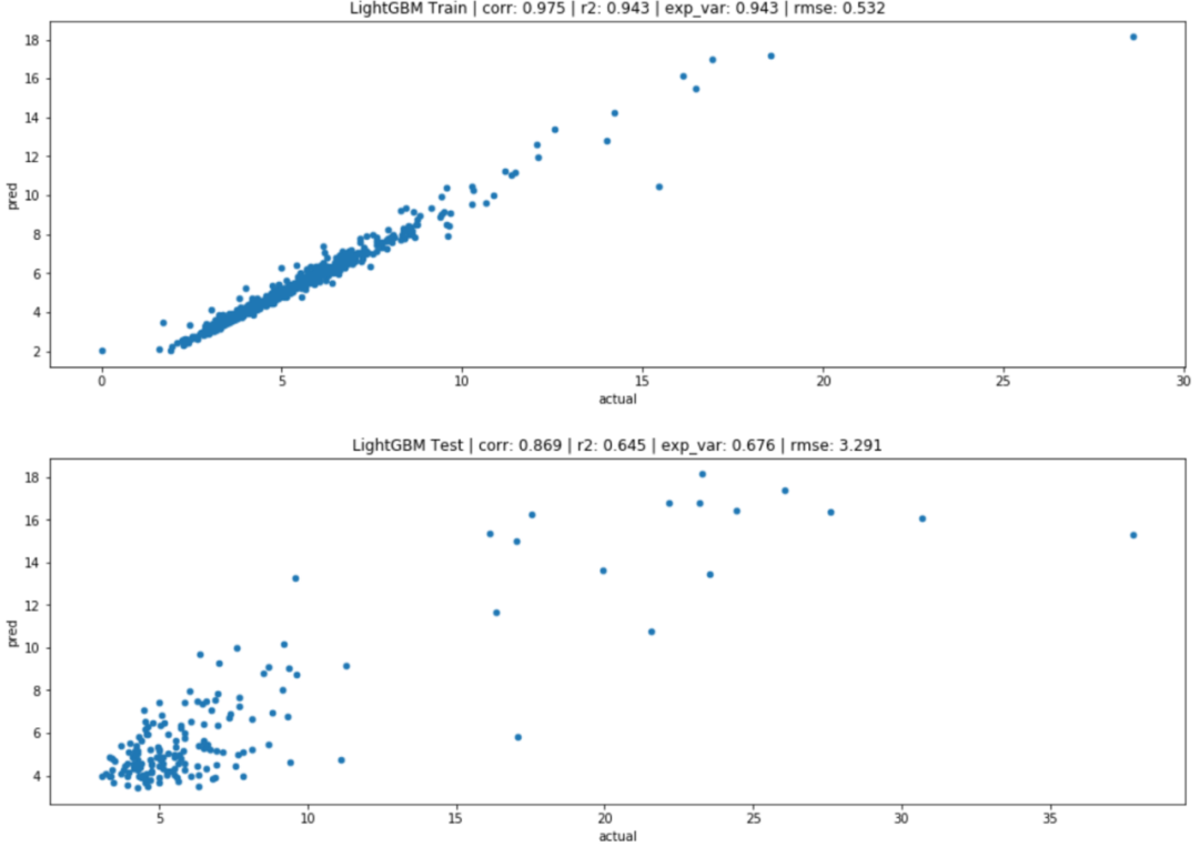
The training results are better than Method 1, with an R-squared of 0.94, but the predictions on the test set failed. Although it did not perform well on the test set, it is still better than what we achieved with pure linear regression.
▌Method 3: MLP (Neural Network)
When we have such high variance in predictions, neural networks may be able to describe the complex relationships between input features and discover hidden relationships among them.
We use FastAI as the deep learning library to build the underlying network, which is currently built on PyTorch. You can describe custom PyTorch models and pass them to FastAI for the training tools it provides.

https://www.fast.ai/
We use the same input and output sets as LightGBM and input the data into an MLP network with two hidden layers, each containing 300 neurons.
from fastai.tabular import *

dep_var = 'target'
y.name = dep_var
mlp_df = pd.concat([X, y], axis=1)
procs = [Normalize]

data = TabularDataBunch.from_df('.', mlp_df.iloc[:900], dep_var, valid_idx=range(700, 900), procs=procs)
learn = tabular_learner(data, layers=[300,300], loss_func=mse, metrics=[r2_score, explained_variance])

learn.lr_find(start_lr=1e-6, num_it=50, end_lr=1e-1)
learn.recorder.plot()
learn.fit_one_cycle(3, slice(3e-4), wd=0.2)
After several iterations of training, we can obtain predictions similar to the following:
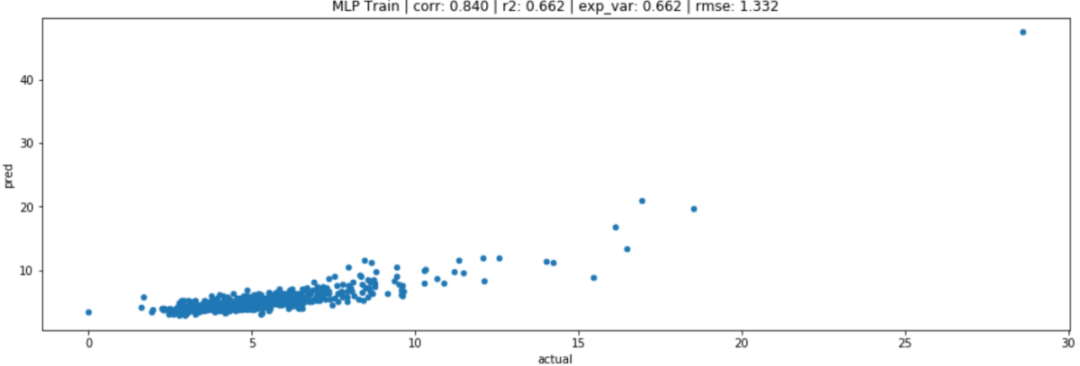
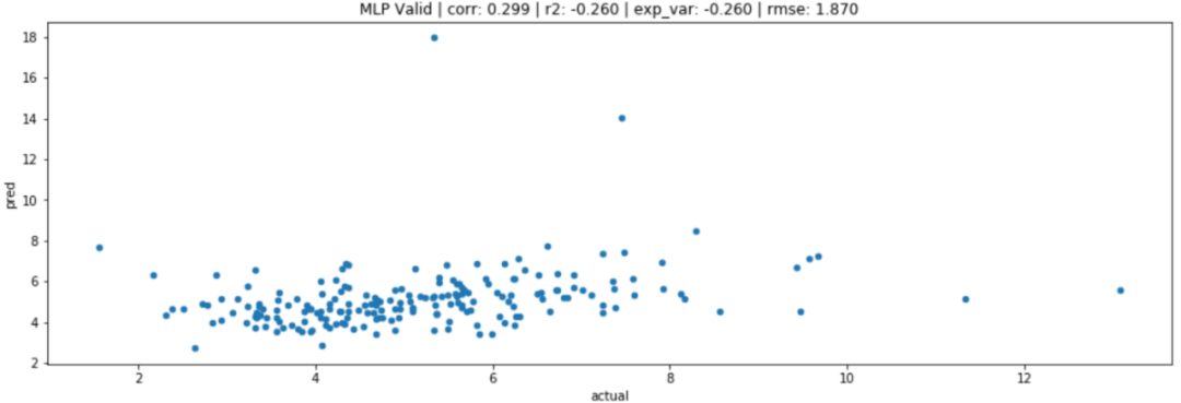
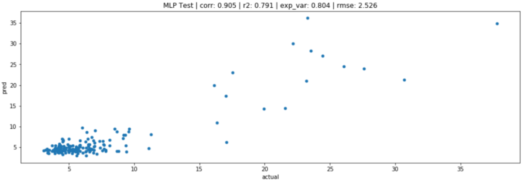
We can see that due to recent market fluctuations, the volatility in the test set is the highest, thus the validation dataset is not representative of our test data. However, compared to previous methods, it performs better statistically.
5
Image-Based Regression Analysis
Before performing image-based regression, we need to modify our target parameters slightly, as we will lose values during the transformation. Because the values within each time window are normalized before converting to images.
To compensate for this shortcoming, we use the ratio of average prices before and after the opening as our target. In this way, we pose a question to the neural network: how much will the volatility after the opening be compared to the volatility before the opening? For example, if the average volatility before the opening is 10 and the volatility after the opening is 50, our target is to predict 5 instead of the original 50.
To avoid this issue, we trained an MLP network that has the same structure and data as the previous methods.
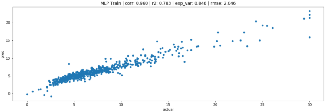
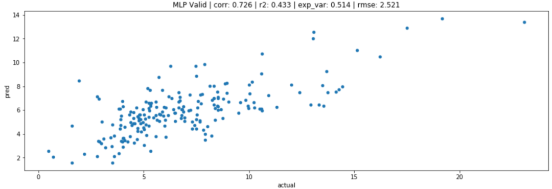
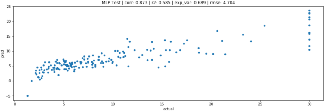
Note: Due to huge peaks occurring after division calculations, the upper limit of volatility is set to 30, as shown below:
 Raw vol_after / vol_before

Capped@30 vol_after / vol_before
Compared to the original value predictions, the MLP’s indirect prediction results are slightly worse, but not significantly. Now we have a CNN network to compare against.
6
Image Transformation
With the help of Gramian Angular Field and the pyts library, we can now convert any time series into an image based on the polar coordinate relationship between points.
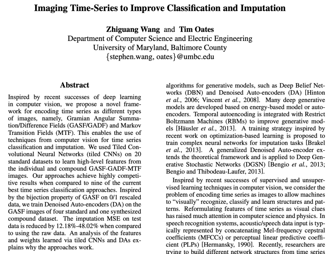
https://arxiv.org/pdf/1506.00327.pdf
In the code below, an image is created daily, each image describes the volatility for the 60 minutes before the opening.
from pyts.image import GramianAngularField
from matplotlib import pyplot as plt

from multiprocessing import Pool, cpu_count

gadf = GramianAngularField(image_size=60, method='difference')
X_gadf = gadf.fit_transform(X)

def convert_img(idx):
    fig = plt.figure()
    ax = plt.subplot(111)
    try:
        fname = f'imgs/{idx}.png'
        if os.path.exists(fname):
            return
    except:
        return
    ax.imshow(X_gadf[idx], cmap='rainbow', origin='lower')
    ax.set_title('')
    ax.set_xticks([])
    ax.set_yticks([])
    fig.savefig(fname, bbox_inches='tight')

p = Pool(cpu_count())
_ = p.map(convert_img, (i for i in range(1070)))
For the CNN network, it essentially uses ResNET34 as the base, then adds a dense layer of [1024,512] on top and performs the final regression with a simple linear activation node.
data = (ImageList.from_csv('imgs', 'labels.csv')
                 .split_by_idxs(list(range(700)), list(range(700, 900)))
                 .label_from_df()
                 .databunch())

learner = cnn_learner(data, models.resnet34, loss_func=mae, metrics=[r2_score])
learner.model[1]
# Sequential(
# (0): AdaptiveConcatPool2d(
# (ap): AdaptiveAvgPool2d(output_size=1)
# (mp): AdaptiveMaxPool2d(output_size=1)
# )
# (1): Flatten()
# (2): BatchNorm1d(1024, eps=1e-05, momentum=0.1, affine=True, track_running_stats=True)
# (3): Dropout(p=0.25, inplace=False)
# (4): Linear(in_features=1024, out_features=512, bias=True)
# (5): ReLU(inplace=True)
# (6): BatchNorm1d(512, eps=1e-05, momentum=0.1, affine=True, track_running_stats=True)
# (7): Dropout(p=0.5, inplace=False)
# (8): Linear(in_features=512, out_features=1, bias=True)
# )
After repeated training, we obtained results like this:
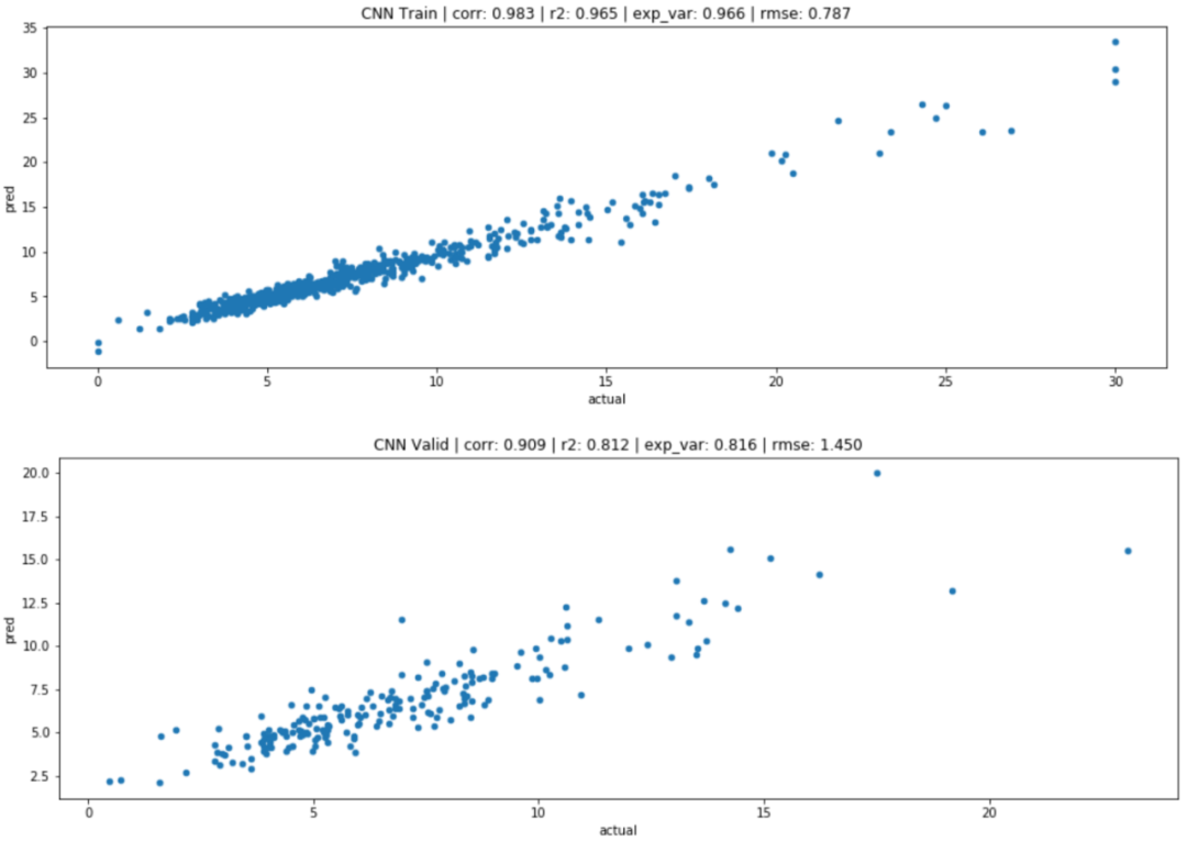
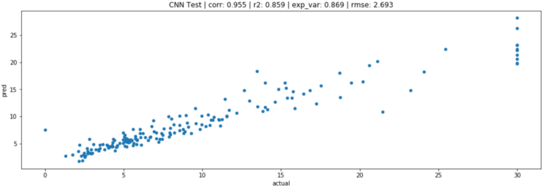
We can see that even when predicting the same target, image-based regression performs much better than the corresponding regression of MLP.
Comparison of different methods:
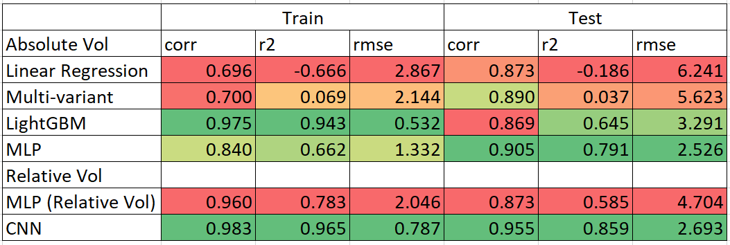
We can see that MLP performs better than all other methods in predicting absolute volatility values, while CNN outperforms in predicting relative volatility across the board.
Therefore, CNN is a great choice for time series forecasting, although it does require a lot of computational power for image conversion and training.
The WeChat public account on quantitative investment and machine learning is a mainstream self-media in the industry focusing onQuant, MFE, Fintech, AI, ML and other fields. The public account has over 180,000+ followers from various sectors including public funds, private equity, securities, futures, banking, insurance asset management, and overseas. It publishes cutting-edge research results and the latest quantitative information daily.

