Message from the Chief Editor
The development of microbiome research has reached a mature stage, with various analytical techniques and systems available. The methods for analyzing microbiome data are numerous. We leverage our previously published paper, “Best Practices for Microbiome Analysis Using R,” to guide everyone through the entire code from simple to complex, from basic to workflow, from single functions to combined functions, and from upstream analysis to downstream analysis. The complete workflow is based on RStudio as the platform and can be fully executed on Windows, Linux, and macOS. Everyone can prepare the necessary hardware resources and follow this series of tutorials for comprehensive learning.
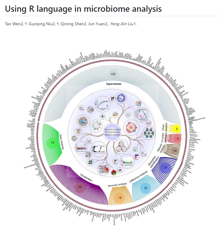
This review was published by our group in the journal Protein & Cell in 2023, encompassing almost all aspects of microbiome data analysis. The code scripts exceed 20,000 lines and are all in the public sharing phase. However, due to the extensive content, we have chosen to present it in phases to facilitate understanding and usage.
The content shared by the Microbiome Bioinformatics team has gone through the following steps:
Student A organized and executed the code, wrote basic annotations, forming the basic layout of the shared document;
Student B reproduced the code, resolved issues where it could not run smoothly, and clarified areas that were not understood, refining the shared document;
Student C ran the entire process again, learned the code throughout the workflow, continued annotating unclear areas, and ultimately produced a complete shared document.
We hope this tutorial will help those who need to learn to embark on a free learning era of microbiome joint mining. We aim to create high-quality tutorials for everyone;
Introduction
The overview process of “Best Practices for Microbiome Analysis Using R” has led everyone through four sections. We believe everyone is now quite familiar with each section’s content. Now, let’s continue to dive deeper into microbiome data mining.
Today, we will learn about: differential analysis (edgeR, DESeq2, STAMP).
Note: Before each analysis, you need to load the code from the “Data Analysis Preparation” section to start downstream analysis.
We hope this shared content will help everyone dive deeper into their data, making data analysis more convenient. We also welcome everyone to cite our article.
Here are the specific details of the article:
Wen, T., et al., The best practice for microbiome analysis using R. Protein & Cell, 2023. 14(10): p. 713-725.Article Link: https://doi.org/10.1093/procel/pwad024
Workflow Practice Data: https://github.com/taowenmicro/EasyMicrobiomeR
Data Code Acquisition Address
Data Address: https://github.com/taowenmicro/EasyMicrobiomeR/tree/master/data
Full Data Code Workflow Download Address: https://github.com/taowenmicro/EasyMicrobiomeR/tree/master
Differential Analysis: edgeR, DESeq2, and STAMP – Commonalities and Differences
DESeq2, edgeR, and STAMP are software packages used for gene expression data analysis in bioinformatics. They share commonalities and differences in differential expression analysis. Below is an overview of their commonalities and differences:
Commonalities
Purpose: They all aim to identify genes or functional units (such as metabolic pathways or functional categories in STAMP) with significantly altered expression levels under different conditions or treatments. Applicable Data Types: These tools can be applied to high-throughput sequencing data, especially RNA-seq data (DESeq2 and edgeR) and metagenomic data (STAMP). Statistical Methods: They all use statistical models to evaluate changes in gene expression levels, controlling the error rate in multiple comparisons through P-values and correction methods (such as FDR). Data Visualization: These packages provide data visualization tools, such as volcano plots and heatmaps, to help users understand analysis results.
Differences
Focus Areas: DESeq2 and edgeR primarily focus on gene expression analysis in single cells or individual organisms. STAMP focuses on metagenomic data, specifically functional gene analysis in multiple organisms or environmental samples.
Analysis Methods: DESeq2 uses negative binomial distribution models and linear models to analyze data and provides methods for data normalization. edgeR also uses negative binomial distribution models but offers different data normalization and variability estimation methods. STAMP employs methods including t-tests, ANOVA, and DESeq2-like methods, suitable for functional abundance comparisons in metagenomic data.
Application Scope: DESeq2 and edgeR are primarily used in biomedical research, such as disease mechanisms and drug effects. STAMP is used in environmental microbiology, ecology, and metagenomics research, such as environmental adaptability and ecosystem functions.
Output Results: DESeq2 and edgeR provide gene-level differential expression results. STAMP provides differential expression results at the functional category or metabolic pathway level.
Software Environment: DESeq2 and edgeR are R language packages and need to run in an R environment. STAMP is a standalone software that can run in a command-line environment or through a graphical user interface.
Overall, DESeq2 and edgeR focus more on gene expression differential analysis in individual organisms, while STAMP emphasizes functional differential analysis in metagenomic data. Despite their differences in analysis methods and application scopes, they are all powerful tools that help researchers identify key genes or functions in biological processes within their respective fields.
Differential Analysis: edgeR, DESeq2, and STAMP – Features and Functions
edgeR Differential Analysis
edgeR is a popular bioinformatics software package primarily used for differential expression gene analysis of RNA sequencing (RNA-seq) data. It is an R language package developed by Michael D. Lawrence and others at the University of British Columbia, Canada. edgeR is widely used in biomedical research, particularly in transcriptomics and gene expression analysis.
Key features and functions of edgeR include:
Negative Binomial Distribution Model: edgeR uses a negative binomial distribution model to analyze count data, which is common in RNA-seq data. This model accounts for the discreteness and variability of RNA-seq data.
Log CPM (Counts Per Million) Transformation: edgeR provides a data normalization method that converts raw read counts into log CPM values for subsequent statistical analysis.
Differential Expression Testing: edgeR offers a series of statistical methods to determine whether the differences in gene expression levels between different conditions or treatment groups are significant. These methods include exact tests and general linear models (GLM) fitted to the negative binomial distribution model.
Multiple Comparison Correction: When performing comparisons across multiple genes, edgeR can apply multiple comparison correction methods, such as FDR (False Discovery Rate) control, to reduce the occurrence of false positives.
Biological Interpretation: The analysis results of edgeR can help researchers identify genes that may play a role in specific biological processes, disease states, or treatment responses.
Visualization Tools: edgeR provides various data visualization tools, such as volcano plots, scatter plots, and heatmaps, to help users intuitively present and interpret analysis results.
DESeq2 Differential Analysis
DESeq2 is a bioinformatics software package used for differential expression analysis of RNA sequencing (RNA-seq) data. It is an upgraded version of DESeq, providing more accurate and powerful statistical methods. DESeq2 primarily runs in the R language environment and is widely used in transcriptomics research, especially when comparing changes in gene expression levels under different conditions.
Key features and functions of DESeq2 include:
Model-Based Analysis: DESeq2 uses a negative binomial distribution and linear models to analyze RNA-seq data, considering the data’s discreteness, biological replicates, and various factors in experimental design.
Data Normalization: DESeq2 normalizes the data before analysis to eliminate the effects of sequencing depth and technical biases, making comparisons between different samples more accurate.
Differential Expression Testing: DESeq2 provides statistical methods to determine whether changes in gene expression levels between different conditions or treatment groups are statistically significant. It achieves this by fitting linear models and estimating parameter variances.
Multiple Comparison Correction: DESeq2 uses multiple comparison correction methods, such as the Benjamini-Hochberg procedure, to control the false positive rate (FDR) and ensure the reliability of results.
Biological Interpretation: Through the analysis results, researchers can identify genes that may play a role in specific biological processes, disease states, or treatment responses, providing a basis for subsequent experimental validation and functional studies.
Visualization Tools: DESeq2 can generate various visualizations, such as volcano plots, box plots, and MA plots, helping users intuitively present and interpret analysis results.
STAMP Differential Analysis
STAMP (Statistical Analysis of Metagenomic Profiles) is a bioinformatics software specifically designed for the statistical analysis of metagenomic data. It provides a range of tools and methods that enable researchers to compare the functional gene composition between different metagenomic samples, identifying microbial functions that significantly change under specific environmental or experimental conditions.
Key features and functions of STAMP include:
Functional Abundance Comparison: STAMP allows users to compare the relative abundance of functional genes in different samples to discover changes in microbial functions associated with specific conditions or treatments.
Multiple Statistical Methods: STAMP supports various statistical testing methods, including t-tests, ANOVA, non-parametric tests, and DESeq2-like methods designed specifically for metagenomic data, which help assess the statistical significance of functional gene abundance differences.
Multiple Comparison Correction: When conducting multiple comparisons, STAMP provides correction methods (such as FDR, False Discovery Rate) to control the error discovery rate, ensuring the reliability of results.
Data Transformation and Normalization: STAMP can perform transformations and normalization on input data to eliminate technical differences between different samples, making comparison results more accurate and comparable.
Result Visualization: STAMP offers various data visualization options, such as volcano plots and heatmaps, to help users intuitively present and interpret analysis results.
Functional Annotation: STAMP can combine databases such as KEGG (Kyoto Encyclopedia of Genes and Genomes) to annotate detected functional genes, providing biological interpretations.
Let’s Start Practical Operations
edgeR – Volcano
The volcano plot of edgeR is a tool used to visualize gene expression differences, suitable for various scenarios, especially in studies comparing gene expression changes under different conditions. Below are some applicable scenarios for edgeR volcano plots:
Condition Comparison: When you want to compare gene expression differences between two or more biological conditions (such as healthy vs. disease, different time points, different treatments, etc.), the volcano plot can help you visually display these differences.
Identifying Significantly Changed Genes: The volcano plot clearly shows which genes have significantly changed in expression levels. By setting specific log fold change (logFC) and P-value thresholds, you can quickly identify genes of interest.
Discovering Biomarkers: In disease studies, the volcano plot can help researchers discover potential biomarkers or therapeutic targets, which may play crucial roles in disease onset or progression.
Data Exploration: The volcano plot is a useful data exploration tool that can help you discover patterns and trends within large datasets, providing clues for further data analysis.
Method Comparison: If you have used different statistical methods or data analysis workflows in your study, the volcano plot can help you compare the effectiveness of these methods and understand their impact on results.
The edgeR volcano plot is a versatile tool suitable for various scenarios requiring comparison and presentation of gene expression differences. Through volcano plots, researchers can more effectively analyze and interpret RNA-seq data, advancing biological research.
# Data loading
ps = readRDS("./data/dataNEW/ps_16s.rds")
diffpath = paste(otupath,"/diff_tax/",sep = "")
dir.create(diffpath)
diffpath.1 = paste(diffpath,"/DEsep2/",sep = "")
dir.create(diffpath.1)
diffpath.2 = diffpath.1
# Preparing script
group  = "Group"
pvalue = 0.05
lfc = 0
artGroup = NULL
method = "TMM"
j = 2 # Setting the analysis level to phylum
path = diffpath
b = NULL
# Read the taxonomic ranks
if (j %in% c("OTU","gene","meta")) {
    ps = ps
} else if (j %in% c(1:7)) {
    ps = ps %>%
      ggClusterNet::tax_glom_wt(ranks = j)
} else if (j %in% c("Kingdom","Phylum","Class","Order","Family","Genus","Species")){
} else {
    ps = ps
    print("unknown j, checked please")
}
sub_design <- as.data.frame(phyloseq::sample_data(ps))
# Setting sample groups
Desep_group <- as.character(levels(as.factor(sub_design$Group)))
Desep_group
if (is.null(artGroup)) {
    #--Construct pairwise combinations#-----
    aaa = combn(Desep_group,2)
    # sub_design <- as.data.frame(sample_data(ps))
}
if (!is.null(artGroup)) {
    aaa  = as.matrix(b)
}
otu_table = as.data.frame(ggClusterNet::vegan_otu(ps))
count = as.matrix(otu_table)
count <- t(count)
sub_design <- as.data.frame(phyloseq::sample_data(ps))
dim(sub_design)
sub_design$SampleType = as.character(sub_design$Group)
sub_design$SampleType <- as.factor(sub_design$Group)
# Create DGE list for normalization
# DGE table has two parts: one is the number of species appearing in the samples, and the other is the library size (sequencing depth) for each sample
d = edgeR::DGEList(counts=count, group=sub_design$SampleType)
d$samples
d = edgeR::calcNormFactors(d,method=method) # Default is TMM normalization

# Building experiment matrix


design.mat = model.matrix(~ 0 + d$samples$group)
colnames(design.mat)=levels(sub_design$SampleType)
d2 = edgeR::estimateGLMCommonDisp(d, design.mat)
d2 = edgeR::estimateGLMTagwiseDisp(d2, design.mat)
fit = edgeR::glmFit(d2, design.mat)
#------------Extracting the required differential results based on groups#------------
# Start calculating the differences between groupX and groupY
# Plotting in the form of a volcano plot and saving to the path
for (i in 1:dim(aaa)[2]) {
    # i = 1
    Desep_group = aaa[,i]
    print(Desep_group)

    # head(design)
    # Set the comparison group, writing the first group as enrich indicating the first group has a higher content
    # ?limma::makeContrasts
    group = paste(Desep_group[1],Desep_group[2],sep = "-")
    group
    BvsA <- limma::makeContrasts(contrasts = group,levels=c(as.character(levels(as.factor(sub_design$Group))))) # Note it is compared with GF1 as the control group
    # Group comparison, calculating Fold change, P-value
    lrt = edgeR::glmLRT(fit,contrast=BvsA)
    # FDR correction, controlling the false positive rate to be less than 5%
    de_lrt = edgeR::decideTestsDGE(lrt, adjust.method="fdr", p.value=pvalue,lfc=lfc) # lfc=0 is the default value
    summary(de_lrt)
    # Export calculation results
    x=lrt$table
    x$sig=de_lrt
    head(x)
    #------Differential results conform to the order of the OTU table
    row.names(count)[1:6]
    x <- cbind(x, padj = p.adjust(x$PValue, method = "fdr"))
    enriched = row.names(subset(x,sig==1))
    depleted = row.names(subset(x,sig==-1))
    x$level = as.factor(ifelse(as.vector(x$sig) ==1, "enriched",ifelse(as.vector(x$sig)==-1, "depleted","nosig")))
    x = data.frame(row.names = row.names(x),logFC = x$logFC,level = x$level,p = x$PValue)
    head(x)
    # colnames(x) = paste(group,colnames(x),sep = "")
    # x = res
    # head(x)
    #------Differential results conform to the order of the OTU table
    # x = data.frame(row.names = row.names(x),logFC = x$log2FoldChange,level = x$level,p = x$pvalue)
    x1 = x %>%
      dplyr::filter(level %in% c("enriched","depleted","nosig"))
    head(x1)
    x1$Genus = row.names(x1)
    # x$level = factor(x$level,levels = c("enriched","depleted","nosig"))
    if (nrow(x1)<= 1) {
    }
    x2 <- x1 %>%
      dplyr::mutate(ord = logFC^2) %>%
      dplyr::filter(level != "nosig") %>%
      dplyr::arrange(desc(ord)) %>%
      head(n = 5)
    file = paste(path,"/",group,j,"_","Edger_Volcano_Top5.csv",sep = "")
    write.csv(x2,file,quote = F)
    head(x2)
    # To adjust colors here
    p <- ggplot(x1,aes(x =logFC ,y = -log2(p), colour=level)) +
      geom_point() +
      geom_hline(yintercept=-log10(0.2),
                 linetype=4,
                 color = 'black',
                 size = 0.5) +
      geom_vline(xintercept=c(-1,1),
                 linetype=3,
                 color = 'black',
                 size = 0.5) +
      ggrepel::geom_text_repel(data=x2, aes(x =logFC ,y = -log2(p), label=Genus), size=1) +
      scale_color_manual(values = c('blue2','red2', 'gray30')) +
       ggtitle(group) + theme_bw()

    p
    file = paste(path,"/",group,j,"_","Edger_Volcano.pdf",sep = "")
    ggsave(file,p,width = 8,height = 6)

    file = paste(path,"/",group,j,"_","Edger_Volcano.png",sep = "")
    ggsave(file,p,width = 8,height = 6)

            colnames(x) = paste(group,colnames(x),sep = "")
    if (i ==1) {
      table =x
    }
    if (i != 1) {
      table = cbind(table,x)
    }
}
x = table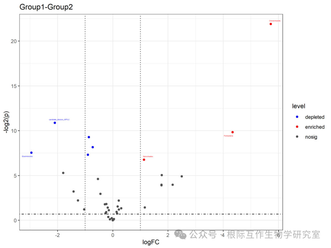
The volcano plot is an intuitive tool for identifying and comparing genes or species that show significant changes under two conditions, helping researchers identify candidate genes or species that may play important roles in biological processes. In this case, the volcano plot may be used in microbiome studies to identify microbial populations whose abundance changes under different environments or conditions. The chart title is “Group1-Group2,” indicating that the volcano plot compares data differences between the two groups (Group1 and Group2). The horizontal axis (x-axis) represents the log fold change (logFC), which is the log value of the ratio of relative expression levels between the two groups. A positive value indicates higher expression in Group1 compared to Group2, while a negative value indicates the opposite.
The vertical axis (y-axis) represents the significance level (level), usually related to the P-value, which measures the statistical significance of expression level changes. “nosig” indicates no significant change, “depleted” indicates significantly lower expression in Group1 compared to Group2, while “enriched” indicates significantly higher expression in Group1 compared to Group2. The lines and points in the chart represent different data points, positioned according to their log fold change and significance levels. The lines are usually used to delineate the thresholds for significance and magnitude of change.
###########Adding Species Abundance#----------
# dim(count)
# str(count)
count = as.matrix(count)
norm = t(t(count)/colSums(count)) #* 100 # normalization to total 100
dim(norm)
norm1 = norm %>%
    t() %>%
    as.data.frame()  # head(norm1)
# Grouping data to calculate averages
library("tidyverse")
head(norm1)
iris.split <- split(norm1,as.factor(sub_design$SampleType))
iris.apply <- lapply(iris.split,function(x)colMeans(x))
# Combining results
iris.combine <- do.call(rbind,iris.apply)
norm2= t(iris.combine)
#head(norm)
str(norm2)
norm2 = as.data.frame(norm2)
# dim(x)
head(norm2)
# Get the relative quantity of species in each group
x = cbind(x,norm2)
head(x)
# When adding this file taxonomy, remove the last two unrelated columns
# Read taxonomy and add column names
if (!is.null(ps@tax_table)) {
    taxonomy = as.data.frame(ggClusterNet::vegan_tax(ps))
    head(taxonomy)
    # taxonomy <- as.data.frame(tax_table(ps1))
    # Discover that this annotation file is not suitable for direct plotting.
    # Use Excel to split the columns and delete the last column before it can run.
    if (length(colnames(taxonomy)) == 6) {
      colnames(taxonomy) = c("kingdom","phylum","class","order","family","genus")
    }else if (length(colnames(taxonomy)) == 7) {
      colnames(taxonomy) = c("kingdom","phylum","class","order","family","genus","species")
    }else if (length(colnames(taxonomy)) == 8) {
      colnames(taxonomy) = c("kingdom","phylum","class","order","family","genus","species","rep")
    }
    # colnames(taxonomy) = c("kingdom","phylum","class","order","family","genus")
    # Taxonomy sorting and filtering based on the OTU table
    library(dplyr)
    taxonomy$id=rownames(taxonomy)
    # head(taxonomy)
    tax = taxonomy[row.names(x),]
    x = x[rownames(tax), ] # reorder according to tax
    if (length(colnames(taxonomy)) == 7) {
      x = x[rownames(tax), ] # reorder according to tax
      x$phylum = gsub("","",tax$phylum,perl=TRUE)
      x$class = gsub("","",tax$class,perl=TRUE)
      x$order = gsub("","",tax$order,perl=TRUE)
      x$family = gsub("","",tax$family,perl=TRUE)
      x$genus = gsub("","",tax$genus,perl=TRUE)
      # x$species = gsub("","",tax$species,perl=TRUE)
    }else if (length(colnames(taxonomy)) == 8) {
      x$phylum = gsub("","",tax$phylum,perl=TRUE)
      x$class = gsub("","",tax$class,perl=TRUE)
      x$order = gsub("","",tax$order,perl=TRUE)
      x$family = gsub("","",tax$family,perl=TRUE)
      x$genus = gsub("","",tax$genus,perl=TRUE)
      x$species = gsub("","",tax$species,perl=TRUE)
    }else if (length(colnames(taxonomy)) == 9) {
      x = x[rownames(tax), ] # reorder according to tax
      x$phylum = gsub("","",tax$phylum,perl=TRUE)
      x$class = gsub("","",tax$class,perl=TRUE)
      x$order = gsub("","",tax$order,perl=TRUE)
      x$family = gsub("","",tax$family,perl=TRUE)
      x$genus = gsub("","",tax$genus,perl=TRUE)
      x$species = gsub("","",tax$species,perl=TRUE)
    }
}
else {
    x = cbind(x,tax)
}

res = x
head(res)
filename = paste(diffpath.2,"/","_",j,"_","edger_all.csv",sep = "")
write.csv(res,filename)
edger_all.csv: This file contains the comparative results of the relative abundance of different microbial populations among three different groups (Group1, Group2, Group3). The comparison results for each microbial population include log fold change (logFC), significance level (level), and P-value (p). These data are typically used to analyze microbiome data to understand changes in the relative abundance of microbial populations under different environments or conditions.
-
Log fold change (logFC): Indicates the relative abundance changes between Group1 and Group2, Group1 and Group3, and Group2 and Group3.
-
Significance level (level): Indicates whether the change is statistically significant. “nosig” indicates no significance, “depleted” indicates lower abundance in Group1 compared to Group2 or Group3, while “enriched” indicates increased abundance.
-
P-value (p): Used to assess the statistical significance of the differences, with smaller P-values indicating more significant differences.
DESeq2 – Volcano
DESeq2 – Volcano plots are a data visualization tool generated based on the DESeq2 software package, used to display differences in gene expression levels in RNA-seq data analysis. Similar to edgeR volcano plots, DESeq2 – Volcano plots are widely used in various biological research scenarios, particularly in differential expression gene analysis. Below are some applicable scenarios for DESeq2 – Volcano plots:
Differential Expression Analysis: When comparing gene expression levels from different biological samples (such as different tissues, disease states, or experimental treatments), DESeq2 – Volcano plots can visually display changes in gene expression levels.
Statistical Significance Display: Through the distribution of the horizontal axis (usually representing log fold change logFC) and the vertical axis (representing statistical significance, such as negative log P-values), researchers can quickly identify genes that are statistically significantly differentially expressed.
Gene Screening: Researchers can filter potential candidate genes for further study based on set significance thresholds (such as adjusted P-value FDR) and expression level change thresholds from thousands of genes.
Biological Hypothesis Verification: DESeq2 – Volcano plots can help verify specific biological hypotheses, such as whether a particular gene is upregulated or downregulated under specific conditions.
Due to their intuitiveness and richness of information, DESeq2 – Volcano plots are widely used in RNA-seq data analysis. They not only help researchers identify and interpret changes in gene expression but also facilitate scientific discoveries and the generation of new knowledge.
The basic workflow is similar to that of edgeR.
# Setting the analysis level to genus
j = "Genus"
group  = "Group"
pvalue = 0.05
artGroup = NULL
path = diffpath
# Read the taxonomic ranks
# ps = ps %>%  #   ggClusterNet::tax_glom_wt(ranks = j)
if (j %in% c("OTU","gene","meta")) {
    ps = ps
} else if (j %in% c(1:7)) {
    ps = ps %>%
      ggClusterNet::tax_glom_wt(ranks = j)
} else if (j %in% c("Kingdom","Phylum","Class","Order","Family","Genus","Species")){
} else {
    ps = ps
    print("unknown j, checked please")
}
# Setting groups
Desep_group <- ps %>%
    phyloseq::sample_data() %>%
    .$Group %>%
    as.factor() %>%
    levels() %>%
    as.character()
if (is.null(artGroup)) {
    #--Construct pairwise combinations#-----
    aaa = combn(Desep_group,2)
    # sub_design <- as.data.frame(sample_data(ps))
} else if (!is.null(artGroup)) {
    aaa  = as.matrix(b)
}
count <- ps %>%
    ggClusterNet::vegan_otu() %>%
    round(0) %>%
    t()
map = ps %>%
    phyloseq::sample_data() %>%
    as.tibble() %>%
    as.data.frame()
dds <- DESeq2::DESeqDataSetFromMatrix(countData = count,
                                colData = map,
                                design = ~ Group)
dds2 <- DESeq2::DESeq(dds)  ##Second step, normalization
# resultsNames(dds2)
#------------Extracting the required differential results based on groups#------------
for (i in 1:dim(aaa)[2]) {
    # i = 1
    Desep_group = aaa[,i]
    print(Desep_group)
    # head(design)
    # Set the comparison group, writing the first group as enrich indicating the first group has a higher content
    group = paste(Desep_group[1],Desep_group[2],sep = "-")
    group
    # Using the results() function to get results and assign to the res variable
    res <-  DESeq2::results(dds2, contrast=c("Group",Desep_group),alpha=0.05)
    # Export calculation results
x = res
    head(x)
    #------Differential results conform to the order of the OTU table
    x$level = as.factor(ifelse(as.vector(x$padj) < 0.05 & x$log2FoldChange > 0, "enriched",
                               ifelse(as.vector(x$padj) < 0.05 & x$log2FoldChange < 0, "depleted","nosig")))
    x = data.frame(row.names = row.names(x),logFC = x$log2FoldChange,level = x$level,p = x$pvalue)
    x1 = x %>%
      filter(level %in% c("enriched","depleted","nosig"))
    head(x1)
    x1$Genus = row.names(x1)
    # x$level = factor(x$level,levels = c("enriched","depleted","nosig"))
    x2 <- x1 %>%
      dplyr::mutate(ord = logFC^2) %>%
      dplyr::filter(level != "nosig") %>%
      dplyr::arrange(desc(ord)) %>%
      head(n = 5)
    file = paste(path,"/",group,j,"_","DESep2_Volcano_Top5.csv",sep = "")
    write.csv(x2,file,quote = F)
    head(x2)
    # Plotting, relevant colors can be adjusted here
    p <- ggplot(x1,aes(x =logFC ,y = -log2(p), colour=level)) +
      geom_point() +
      geom_hline(yintercept=-log10(0.2),
                 linetype=4,
                 color = 'black',
                 size = 0.5) +
      geom_vline(xintercept=c(-1,1),
                 linetype=3,
                 color = 'black',
                 size = 0.5) +
      ggrepel::geom_text_repel(data=x2, aes(x =logFC ,y = -log2(p), label=Genus), size=1) +
      scale_color_manual(values = c('blue2','red2', 'gray30')) +
       ggtitle(group) + theme_bw()

    p
    file = paste(path,"/",group,j,"_","DESep2_Volcano.pdf",sep = "")
    ggsave(file,p,width = 8,height = 6)

    file = paste(path,"/",group,j,"_","DESep2_Volcano.png",sep = "")
    ggsave(file,p,width = 8,height = 6)

    colnames(x) = paste(group,colnames(x),sep = "")
    if (i ==1) {
      table =x
    }
    if (i != 1) {
      table = cbind(table,x)
    }
}

The chart title is “Group1-Group2,” indicating that this volcano plot compares data differences between the two groups (Group1 and Group2).
The horizontal axis (x-axis) represents the log fold change (logFC), which is the log value of the ratio of relative expression levels between the two groups. A positive value indicates higher expression in Group1 compared to Group2, while a negative value indicates the opposite.
The vertical axis (y-axis) represents the significance level (level), usually related to the P-value, which measures the statistical significance of expression level changes. “nosig” indicates no significant change, “depleted” indicates significantly lower expression in Group1 compared to Group2, while “enriched” indicates significantly higher expression in Group1 compared to Group2.
In the chart, the specific species or gene “ASV_4375” may be highlighted, indicating that this particular species or gene shows significant changes in Group1 compared to Group2. Based on its position in the chart, it can be determined whether it is enriched or depleted.
count = as.matrix(count)
norm = t(t(count)/colSums(count)) #* 100 # normalization to total 100
dim(norm)
norm1 = norm %>%
    t() %>%
    as.data.frame()  # head(norm1)
# Grouping data to calculate averages
# library("tidyverse")
head(norm1)
iris.split <- split(norm1,as.factor(map$Group))
iris.apply <- lapply(iris.split,function(x)colMeans(x))
# Combining results
iris.combine <- do.call(rbind,iris.apply)
norm2= t(iris.combine)
#head(norm)
str(norm2)
norm2 = as.data.frame(norm2)
head(norm2)
x = cbind(table,norm2)
head(x)
# When adding this file taxonomy, remove the last two unrelated columns
# Read taxonomy and add column names
if (!is.null(ps@tax_table)) {
taxonomy = as.data.frame(ggClusterNet::vegan_tax(ps))
head(taxonomy)
# taxonomy <- as.data.frame(tax_table(ps1))
# Discover that this annotation file is not suitable for direct plotting.
# Use Excel to split the columns and delete the last column before it can run.
if (length(colnames(taxonomy)) == 6) {
  colnames(taxonomy) = c("kingdom","phylum","class","order","family","genus")
}else if (length(colnames(taxonomy)) == 7) {
  colnames(taxonomy) = c("kingdom","phylum","class","order","family","genus","species")
}else if (length(colnames(taxonomy)) == 8) {
  colnames(taxonomy) = c("kingdom","phylum","class","order","family","genus","species","rep")
}
# colnames(taxonomy) = c("kingdom","phylum","class","order","family","genus")
# Taxonomy sorting and filtering based on the OTU table
library(dplyr)
taxonomy$id=rownames(taxonomy)
# head(taxonomy)
tax = taxonomy[row.names(x),]
x = x[rownames(tax), ] # reorder according to tax
if (length(colnames(taxonomy)) == 7) {
x = x[rownames(tax), ] # reorder according to tax
x$phylum = gsub("","",tax$phylum,perl=TRUE)
x$class = gsub("","",tax$class,perl=TRUE)
x$order = gsub("","",tax$order,perl=TRUE)
x$family = gsub("","",tax$family,perl=TRUE)
x$genus = gsub("","",tax$genus,perl=TRUE)
# x$species = gsub("","",tax$species,perl=TRUE)
}else if (length(colnames(taxonomy)) == 8) {
x$phylum = gsub("","",tax$phylum,perl=TRUE)
x$class = gsub("","",tax$class,perl=TRUE)
x$order = gsub("","",tax$order,perl=TRUE)
x$family = gsub("","",tax$family,perl=TRUE)
x$genus = gsub("","",tax$genus,perl=TRUE)
x$species = gsub("","",tax$species,perl=TRUE)
}else if (length(colnames(taxonomy)) == 9) {
x = x[rownames(tax), ] # reorder according to tax
x$phylum = gsub("","",tax$phylum,perl=TRUE)
x$class = gsub("","",tax$class,perl=TRUE)
x$order = gsub("","",tax$order,perl=TRUE)
x$family = gsub("","",tax$family,perl=TRUE)
x$genus = gsub("","",tax$genus,perl=TRUE)
x$species = gsub("","",tax$species,perl=TRUE)
}
}
else {
x = cbind(x,tax)
}

res = x
head(res)
filename = paste(diffpath.1,"/","_",j,"_","DESep2_all.csv",sep = "")
write.csv(res,filename,quote = F)
STAMP Differential Analysis
STAMP (Statistical Analysis of Metagenomic Profiles) is a software tool specifically designed for differential analysis of metagenomic data. It is suitable for various scenarios in the biological field, particularly when studying changes in microbial community structure and function under different environmental conditions. Below are some use cases for STAMP differential analysis in biology:
Environmental Microbial Research: STAMP can be used to compare differences in the composition and functional gene abundance of microbial communities in different environmental samples (such as soil, water, atmosphere, etc.), helping researchers understand how environmental factors affect microbial ecosystems.
Host-Microbe Interactions: When studying interactions between hosts (such as humans, animals, and plants) and microbes, STAMP can analyze changes in host-associated microbial communities and how these changes affect host health and disease states.
Disease vs. Health Comparison: STAMP can be used to study the differences in microbial communities under disease and healthy states, identifying microbial biomarkers or potential pathogenic microbes associated with diseases.
Drug and Treatment Effects: When assessing the impact of drugs or other treatments on microbial communities, STAMP can analyze changes in microbial community structure and function before and after treatment, revealing the microbiological basis of the treatment.
Ecological and Evolutionary Research: STAMP can be used in ecological research to compare differences in microbial communities across different ecosystems and how these differences reflect the functionality and stability of the ecosystems.
Agriculture and Soil Science: In agricultural and soil science research, STAMP can analyze the effects of different agricultural practices, fertilization, or soil management measures on soil microbial communities.
The differential analysis functionality of STAMP is powerful, capable of processing large amounts of metagenomic data and providing rich statistical methods and data visualization tools, making it a powerful tool for studying microbial community structure and function in biology. Through STAMP, researchers can better understand the diversity, functionality, and ecological roles of microbes in nature and human society.
ps = readRDS("./data/dataNEW/ps_16s.rds")
diffpath = paste(otupath,"/stemp_diff/",sep = "")
dir.create(diffpath)
allgroup <- combn(unique(map$Group),2) # Only do the first arrangement and combination, change here
allgroup[,1]
ps_sub <- phyloseq::subset_samples(ps,Group %in% allgroup[,1]);ps_subTop = 20 # Number of prominent microbes to display
ranks = 6 # Set to phylum
method = "TMM"
test.method = "t.test"

#--Merge data at the phylum level
data   = ggClusterNet::tax_glom_wt(ps_sub,ranks = phyloseq::rank_names(ps)[ranks]) %>%
    ggClusterNet::scale_micro(method = method) %>%
    ggClusterNet::filter_OTU_ps(Top = 200) %>%
    ggClusterNet::vegan_otu() %>%
    as.data.frame()
tem = colnames(data)
data$ID = row.names(data)
data <- data %>%
    dplyr::inner_join(as.tibble(phyloseq::sample_data(ps)),by = "ID")
data$Group = as.factor(data$Group)
# Conduct t-tests and check p-values
if (test.method == "t.test") {
    diff <- data[,tem] %>%
      # dplyr::select_if(is.numeric) %>%
      purrr::map_df(~ broom::tidy(t.test(. ~ Group,data = data)), .id = 'var')
} else if(test.method == "wilcox.test"){
    diff <- data[,tem] %>%
      # dplyr::select_if(is.numeric) %>%
      purrr::map_df(~ broom::tidy(wilcox.test(. ~ Group,data = data)), .id = 'var')
}
diff$p.value[is.nan(diff$p.value)] = 1
diff$p.value <- p.adjust(diff$p.value,"bonferroni")
tem = diff$p.value[diff$p.value < 0.05] %>% length()
if (tem > 30) {
    diff <- diff %>%
       dplyr::filter(p.value < 0.05) %>%
      head(30)
} else {
    diff <- diff %>%
       # filter(p.value < 0.05) %>%
      head(30)
}
# diff1$p.value <- p.adjust(diff1$p.value,"bonferroni")
# diff1 <- diff1 %>% filter(p.value < 0.05)
# Start plotting
abun.bar <- data[,c(diff$var,"Group")] %>%
    tidyr::gather(variable,value,-Group) %>%
    dplyr::group_by(variable,Group) %>%
    dplyr::summarise(Mean = mean(value))
diff.mean <- diff[,c("var","estimate","conf.low","conf.high","p.value")]
diff.mean$Group <- c(ifelse(diff.mean$estimate >0,levels(data$Group)[1],
                              levels(data$Group)[2]))
diff.mean <- diff.mean[order(diff.mean$estimate,decreasing = TRUE),]
cbbPalette <- c("#E69F00", "#56B4E9") # Set group colors
abun.bar$variable <- factor(abun.bar$variable,levels = rev(diff.mean$var))
p1 <- ggplot(abun.bar,aes(variable,Mean,fill = Group)) +
    scale_x_discrete(limits = levels(diff.mean$var)) +
    coord_flip() +
    xlab("") +
    ylab("Mean proportion (%)") +
    theme(panel.background = element_rect(fill = 'transparent'),
          panel.grid = element_blank(),
          axis.ticks.length = unit(0.4,"lines"),
          axis.ticks = element_line(color='black'),
          axis.line = element_line(colour = "black"),
          axis.title.x=element_text(colour='black', size=12,face = "bold"),
          axis.text=element_text(colour='black',size=10,face = "bold"),
          legend.title=element_blank(),
          # legend.text=element_text(size=12,face = "bold",colour = "black",
          #                          margin = margin(r = 20)),
          legend.position = c(-1,-0.1),
          legend.direction = "horizontal",
          legend.key.width = unit(0.8,"cm"),
          legend.key.height = unit(0.5,"cm"))
p1 # The bare plot, only x and y coordinates
for (i in 1:(nrow(diff.mean) - 1))
    p1 <- p1 + annotate('rect', xmin = i+0.5, xmax = i+1.5, ymin = -Inf, ymax = Inf,
                        fill = ifelse(i %% 2 == 0, 'white', 'gray95'))
p1 # The bare plot, only x and y coordinates
p1 <- p1 +
    geom_bar(stat = "identity",position = "dodge",width = 0.7,colour = "black") +
    scale_fill_manual(values=cbbPalette) + theme(legend.position = "bottom")
p1 # Bar chart
diff.mean$var <- factor(diff.mean$var,levels = levels(abun.bar$variable))
diff.mean$p.value <- signif(diff.mean$p.value,3)
diff.mean$p.value <- as.character(diff.mean$p.value)
p2 <- ggplot(diff.mean,aes(var,estimate,fill = Group)) +
    theme(panel.background = element_rect(fill = 'transparent'),
          panel.grid = element_blank(),
          axis.ticks.length = unit(0.4,"lines"),
          axis.ticks = element_line(color='black'),
          axis.line = element_line(colour = "black"),
          axis.title.x=element_text(colour='black', size=12,face = "bold"),
          axis.text=element_text(colour='black',size=10,face = "bold"),
          legend.position = "none",
          axis.line.y = element_blank(),
          axis.ticks.y = element_blank(),
          plot.title = element_text(size = 15,face = "bold",colour = "black",hjust = 0.5)) +
    scale_x_discrete(limits = levels(diff.mean$var)) +
    coord_flip() +
    xlab("") +
    ylab("Difference in mean proportions (%)") +
    labs(title="95% confidence intervals")
for (i in 1:(nrow(diff.mean) - 1))
    p2 <- p2 + annotate('rect', xmin = i+0.5, xmax = i+1.5, ymin = -Inf, ymax = Inf,
                        fill = ifelse(i %% 2 == 0, 'white', 'gray95'))
p2 <- p2 +
    geom_errorbar(aes(ymin = conf.low, ymax = conf.high),
                  position = position_dodge(0.8), width = 0.5, size = 0.5) +
    geom_point(shape = 21,size = 3) +
    scale_fill_manual(values=cbbPalette) +
    geom_hline(aes(yintercept = 0), linetype = 'dashed', color = 'black')  # p2 is the Cleveland dot plot
p3 <- ggplot(diff.mean,aes(var,estimate,fill = Group)) +
    geom_text(aes(y = 0,x = var),label = diff.mean$p.value,
              hjust = 0,fontface = "bold",inherit.aes = FALSE,size = 3) +
    geom_text(aes(x = nrow(diff.mean)/2 +0.5,y = 0.85),label = "P-value (corrected)",
              srt = 90,fontface = "bold",size = 5) +
    coord_flip() +
    ylim(c(0,1)) +
    theme(panel.background = element_blank(),
          panel.grid = element_blank(),
          axis.line = element_blank(),
          axis.ticks = element_blank(),
          axis.text = element_blank(),
          axis.title = element_blank())  # p3 is the value label
# Merge images
library(patchwork)
p <- p1 + p2 + p3 + plot_layout(widths = c(4,6,2))
p
filename = paste(diffpath,"/",paste(allgroup[,i][1],allgroup[,i][2],sep = "_"),"stemp_P_plot.csv",sep = "")# write.csv(diff.mean,filename)
filename = paste(diffpath,"/",paste(allgroup[,i][1],
                                        allgroup[,i][2],sep = "_"),phyloseq::rank.names(ps)[j],"stemp_plot.pdf",sep = "")
ggsave(filename,p,width = 14,height = 6)
filename = paste(diffpath,"/",paste(allgroup[,i][1],
                                        allgroup[,i][2],sep = "_"),phyloseq::rank.names(ps)[j],"stemp_plot.jpg",sep = "")
ggsave(filename,p,width = 14,height = 6)
detach("package:patchwork")
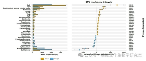
This image is part of the STAMP differential analysis results, providing an intuitive way to present and compare the relative abundance and significant differences of different microbial genera in two groups. Through this analysis, researchers can identify key microbial genera that may change under specific environmental conditions or experimental treatments, which is important for understanding the dynamics and functionality of microbial communities.
Microbial Genera and Their Relative Abundance: The image lists a series of microbial genera, such as Spartobacteria_genera_incertae_sedis, Ralstonia, Dongia, Nitrosopumilus, Dokdonella, Chondromyces, etc., and shows their relative abundance percentages in Group1 and Group2.
Mean Proportion: The x-axis of the image represents the mean abundance percentage (Mean proportion (%)) of each microbial genus in the two groups, helping to understand the relative importance of each genus in different groups.
Difference Proportion: The y-axis of the image represents the average difference percentage in the abundance of microbial genera between the two groups, with positive values indicating higher abundance in Group1 and negative values indicating the opposite.
Confidence Interval: The lines in the image represent the 95% confidence intervals for the difference proportions, providing information about the statistical significance of abundance differences. If the confidence interval does not include zero, the difference is considered statistically significant.
Significance Markers: Some points in the image may be marked with different colors or symbols to indicate their significance levels, such as significantly higher (P < 0.05) or significantly lower (P < 0.05) genera may have different markers.
This run concludes. If you find it useful, feel free to cite our article: Wen, T., et al., The best practice for microbiome analysis using R. Protein & Cell, 2023. 14(10): p. 713-725.
Introduction to the Rhizosphere Interaction Biology Laboratory
The Rhizosphere Interaction Biology Laboratory is a research group under Academician Qirong Shen's Soil Microbiology and Organic Fertilizer Team, focusing on rhizosphere interactions. This group, led by Professor Jun Yuan, primarily focuses on: 1. The role of plant-microbe interactions in disease resistance; 2. Integration of environmental microbial big data research; 3. Development and application of environmental metabolomics and its relationship with microbial processes. In the past three years, the team has published multiple articles in journals such as Nature Communications, ISME J, Microbiome, SCLS, New Phytologist, iMeta, Fundamental Research, PCE, SBB, JAFC (Cover), Horticulture Research, SEL (Cover), BMC Plant Biology, etc. Welcome to follow the Microbiome Bioinformatics public account to learn more about this research group.

Written by: Wen Tao, Niu Guoqing, Wen Haoyang, Zhou Kecheng
Revised by: Wen Tao
Typeset by: Yang Wenyu
Reviewed by: Yuan Jun
Team Work and Achievements (Click to view) Learn, Communicate, Collaborate-
Group Leader Email: Yuan Jun: [email protected];
-
Group Member Wen Tao: [email protected], etc.
-
Team Public Account: Microbiome Bioinformatics. Add the chief editor’s WeChat or leave a message in the background.
-
1. Only personnel related to relevant majors or research directions can add; real names are required, and non-real names will be ignored by default.
-
2. Other personnel from unrelated majors and promotional personnel are prohibited from adding.
-
3. Adding the chief editor’s WeChat requires a brief discussion about professional-related issues. After the chief editor’s judgment, you may be added to the group.
-
4 The Microbiome Bioinformatics VIP WeChat group is not restricted; you can join by contributing once to Microbiome Bioinformatics (sending the article code + efficiently assisting in solving article operation issues + daily problem consultation responses).
-
Team Focus
-
Team Article Achievements
-
Team Achievements – EasyStat Special Topic
-
ggClusterNet Special Topic
-
Professor Yuan’s Small Group
Add Chief Editor WeChat to Join Group Chat
Currently, there are too many marketers. To maintain the more than 5,500 group chats that Microbiome Bioinformatics has maintained for three years, the following requirements for joining the group have been updated: