
Source: Xiao Bai Learns Vision


This article is about 4500 words long and suggests reading for more than 10 minutes.
It illustrates the entire architecture of neural networks and tools and techniques for understanding specific modules.
Baseline Model
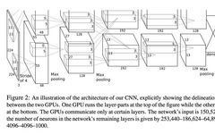
AlexNet is a groundbreaking architecture that has made convolutional networks (CNN) the primary machine learning algorithm for handling large image classification tasks. The paper introducing AlexNet presents a great diagram, but it seems to be missing something…
It is easy to see that the upper half of this diagram has been unexpectedly cropped, and this diagram will run through all subsequent slides, references, etc. In my opinion, this suggests that visualization is not valued in deep learning research (of course, there are exceptions, such as the online journal Distill).
Some might argue: developing new algorithms and tuning parameters is the real science/engineering, while visual presentation belongs to the realm of art and is of no value. I completely disagree with this viewpoint!
Of course, for the computer running the program, a lack of indentation or vague variable naming may not be a big deal. But for humans, it is different. Academic papers are not a means of discovery, but a means of communication.
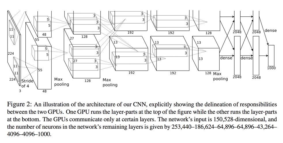
Take another complex theory—quantum field theory—as an example. If you want to present the process of electron-positron annihilation, you need to create a muon-antimuon pair, and the following diagram is a Feynman diagram (first-order term):
Isn’t that cute? But this diagram lacks any artistic quality. It is merely a graphical representation of scattering amplitudes, where each line is a propagator and each vertex represents the interaction between points. This diagram can be directly translated into the following:
I might prefer to “make things simpler,” just like I handle complex tensor operations in JavaScript, and visualizing results in advance is a cool thing. In both quantum mechanics and deep learning, we can perform a lot of linear algebra operations using tensor structures. In fact, some even implement Einstein’s summation convention using Pytorch.
Explaining the Layers of Neural Networks
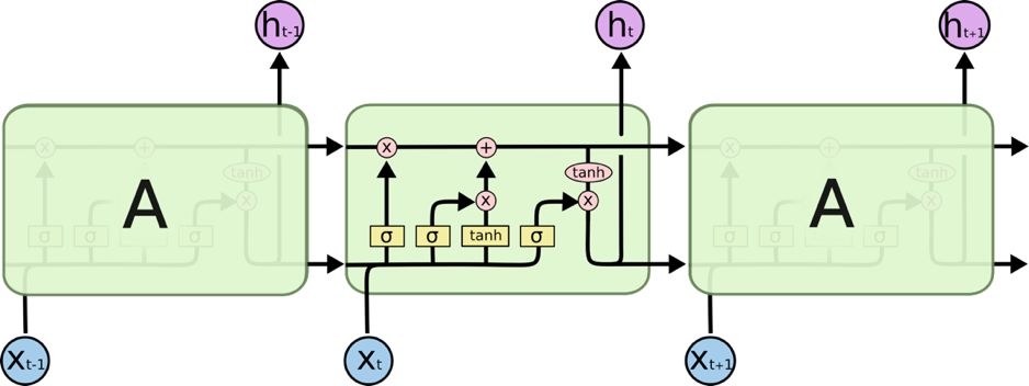
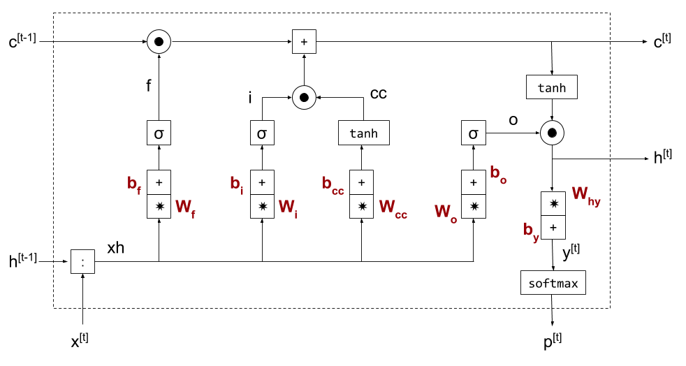
Before understanding the network architecture, let’s focus on the basic building blocks of the network—layers. For example, the long short-term memory (LSTM) unit can be described with the following equation:
Of course, if you are familiar with matrix multiplication, you can easily solve these equations. But solving these equations is one thing, and understanding them is another. When I first saw the formula for LSTM, I could solve it, but I didn’t know what it meant.
What I mean by “understanding” is not a mental enlightenment but rather building a mental model that we can use (for explaining, simplifying, modifying, and predicting what-if scenarios, etc.). Generally speaking, diagrams are clearer than verbal descriptions:
Source: http://colah.github.io/posts/2015-08-Understanding-LSTMs/
“Understanding LSTM Networks” is a great article about LSTMs that explains the principles step by step. This article gave me a lightbulb moment, turning a seemingly random set of multiplications into a reasonable way to write (read) data.
The following diagram is a clearer LSTM diagram:
Source: https://eli.thegreenplace.net/2018/minimal-character-based-lstm-implementation/
I believe: a good diagram is worth a thousand formulas.
This applies to almost any module. We can visualize concepts like dropout:
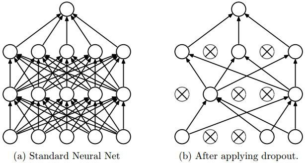
Source: Paper “Dropout: A Simple Way to Prevent Neural Networks from Overfitting” (http://www.cs.toronto.edu/~rsalakhu/papers/srivastava14a.pdf)
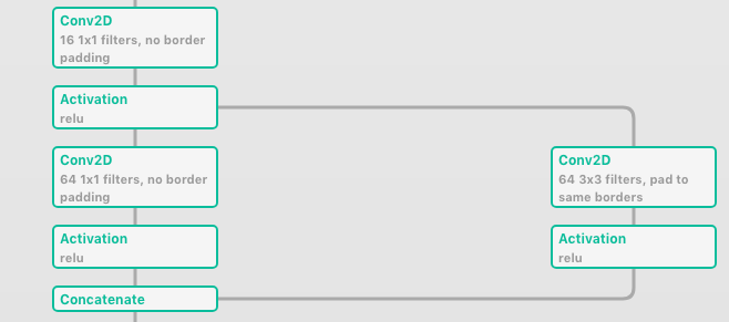
Diagrams can be used to explain composite modules made up of smaller modules (like several convolutions behind). Take a look at this Inception module diagram:
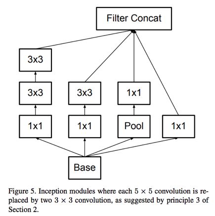
Source: Paper “Rethinking the Inception Architecture for Computer Vision” (https://arxiv.org/abs/1512.00567)
Every visualized image is different—not only in style but also in the emphasis and abstraction it highlights. So what are the important aspects? The number of layers, the connections between layers, the size of convolution kernels, or the activation functions? It all depends. Abstraction means “the process of independently thinking about the relationships and properties of things.” The difficulty lies in determining what to emphasize and what can be briefly summarized.
For example, in the diagram of batch normalization, the focus is on the reverse propagation process:
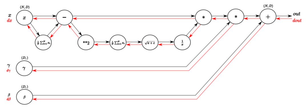
Source: https://kratzert.github.io/2016/02/12/understanding-the-gradient-flow-through-the-batch-normalization-layer.html
Data Visualization and Data Art
You might think I want to make deep learning articles look more attractive. But making diagrams look better doesn’t hurt. When I explore data, I generally use nice color schemes to provide readers with a better reading experience. My main point is to transform visual images into a more efficient means of communication.
So, does looking better mean better? Not necessarily. Lisa Charlotte Rost’s article “The Line between Data Vis and Data Art” insightfully explains the difference between the two.
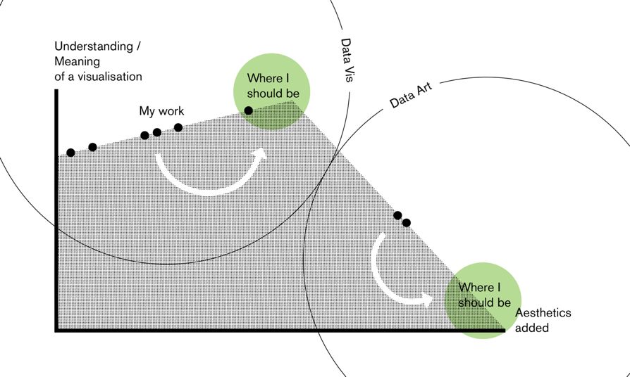
Source: https://lisacharlotterost.github.io/2015/12/19/Meaning-and-Beauty-in-Data-Vis/
Take the following image as an example:
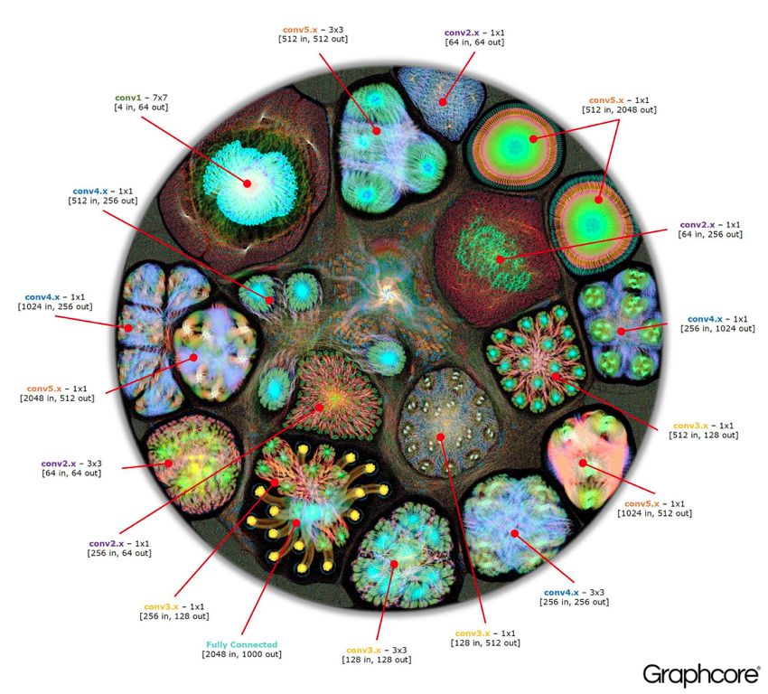
Source: https://www.graphcore.ai/posts/what-does-machine-learning-look-like
Isn’t it beautiful? To me, it looks alive—like a cell with organelles. But can we infer anything from it? Can you guess that it is actually AlexNet?
Here’s another example, a more aesthetic-oriented animated illustration of a multilayer perceptron:
Source: http://chumo.github.io/Sinapsis/
To be clear: as long as we do not confuse artistic value and educational value, data art itself has value. If you like my point, then I encourage you to visualize real convolutional networks with 3D animations like Spark or colorful brains.
Sometimes this trade-off is not so clear. Like the image below, does it represent data visualization or data art?
Source: Paper “Going Deeper with Convolutions” (https://arxiv.org/abs/1409.4842Christian)
I bet you would say: “This is clearly data visualization.” In this case, our opinions diverge. While the color scheme of this diagram is nice, and the repetition of similar structures looks pleasant, it is difficult to implement this network based on this diagram (at least without a magnifying glass). Of course, you can get the key points of the network architecture—namely, the number of layers and the structure of the modules, but these alone are not enough to reproduce the network (at least not without a magnifying glass).
To make images clearer, publications generally leave some space for data art. For example, in a network used to detect skin conditions, we can see the diagram of the Inception v3 feature extraction layer. It is clear that the author simply used this model and represented it with a diagram without explaining its internal workings:
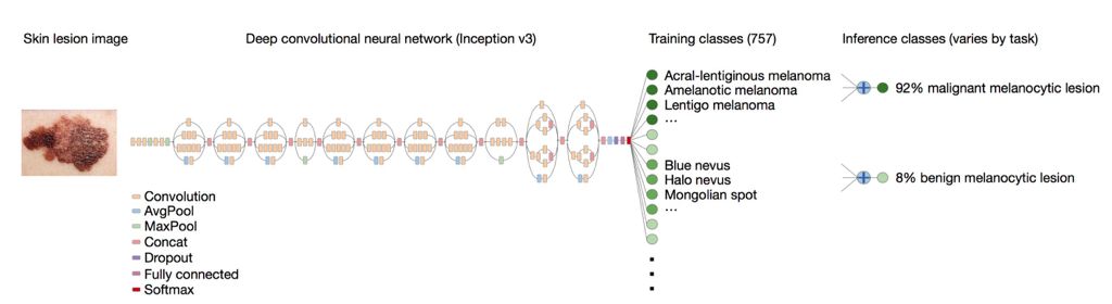
Source: https://cs.stanford.edu/people/esteva/nature/
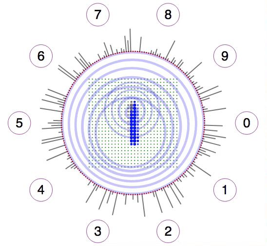
To study the visual patterns of the activated selected channels, how would you classify the following two images?
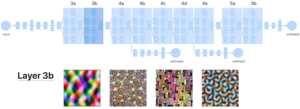
Source: https://distill.pub/2017/feature-visualization/appendix/
I would consider the diagram below a good example of data visualization. Psychedelic images do not mean data art. The emphasis of this example is on the abstraction of network architecture and the presentation of relevant data (the input image that activates a given channel).
Explanatory Architecture Diagrams
We have looked at some examples of layer diagrams and data art related to neural network architecture.
Now let’s learn about the (data) visualization of neural network architecture. The diagram below is of VGG16 architecture, which is a standard network for image classification.
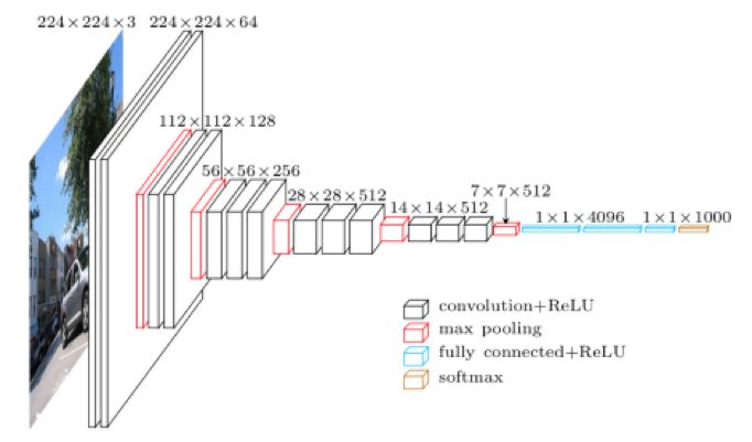
Source: https://blog.heuritech.com/2016/02/29/a-brief-report-of-the-heuritech-deep-learning-meetup-5/
We can see the size of tensors at each step and the operations (marked by color). It is not abstract—the size of the boxes is related to the shape of the tensors. However, the thickness and number of channels are not proportional.
A similar method is to show the values of each channel, such as in the DeepFace working example diagram:
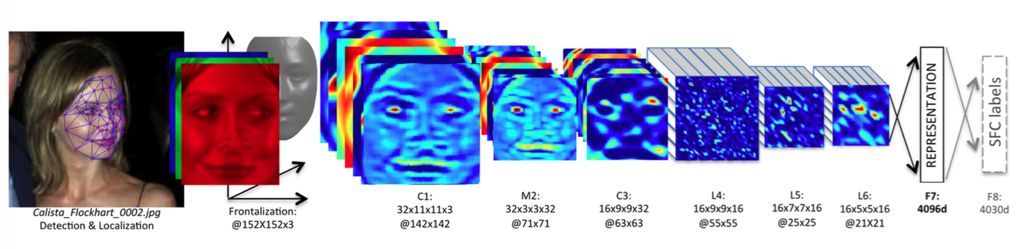
Source: https://research.fb.com/publications/deepface-closing-the-gap-to-human-level-performance-in-face-verification/
Such diagrams are not limited to computer vision. Below is an example of converting text to color:
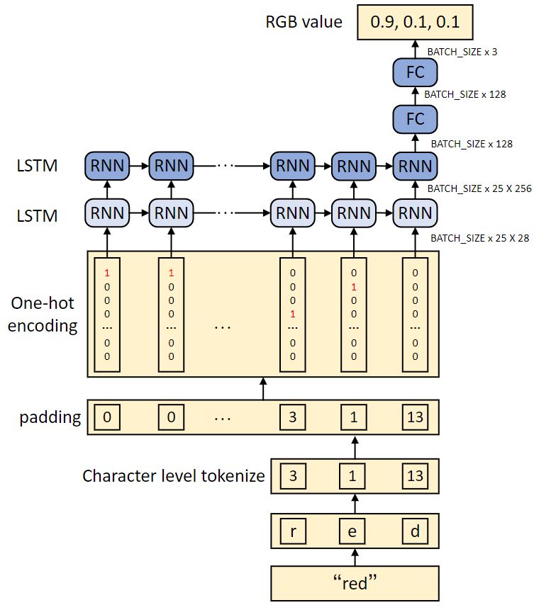
Source: https://heartbeat.fritz.ai/how-to-train-a-keras-model-to-generate-colors-3bc79e54971b
If the goal is to present the network architecture while explaining its internal workings, such diagrams are very useful. They seem especially useful in tutorials, such as http://karpathy.github.io/2015/05/21/rnn-effectiveness/.
Abstract Architecture Diagrams
However, for large models, explanatory diagrams may be too complex or too specific to present all possible layers in one diagram. Therefore, we need to use abstract diagrams. Generally, nodes represent operations and arrows represent the flow of tensors. Comparing VGG-19 and ResNet-34:
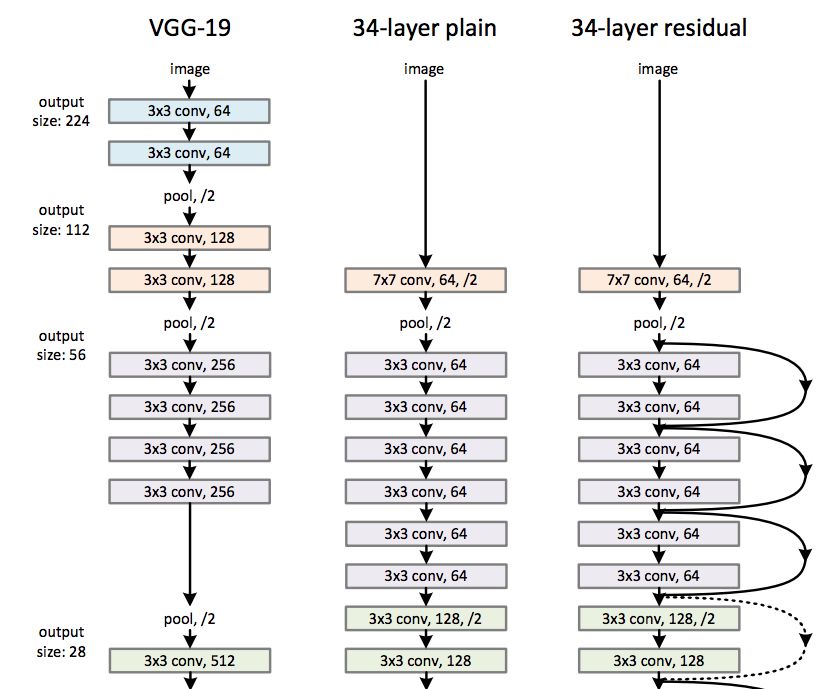
Source: Paper “Deep Residual Learning for Image Recognition” (https://arxiv.org/abs/1512.03385)
We can see that the above diagram has some redundancy because there are some reused units. Since the image may be long, it is better to find its patterns and merge them. Such hierarchical structures make it easier to understand concepts and present them visually (unless we just want to create a data art diagram of GoogLeNet).
For example, let’s look at the diagram of Inception-ResNet-v1:
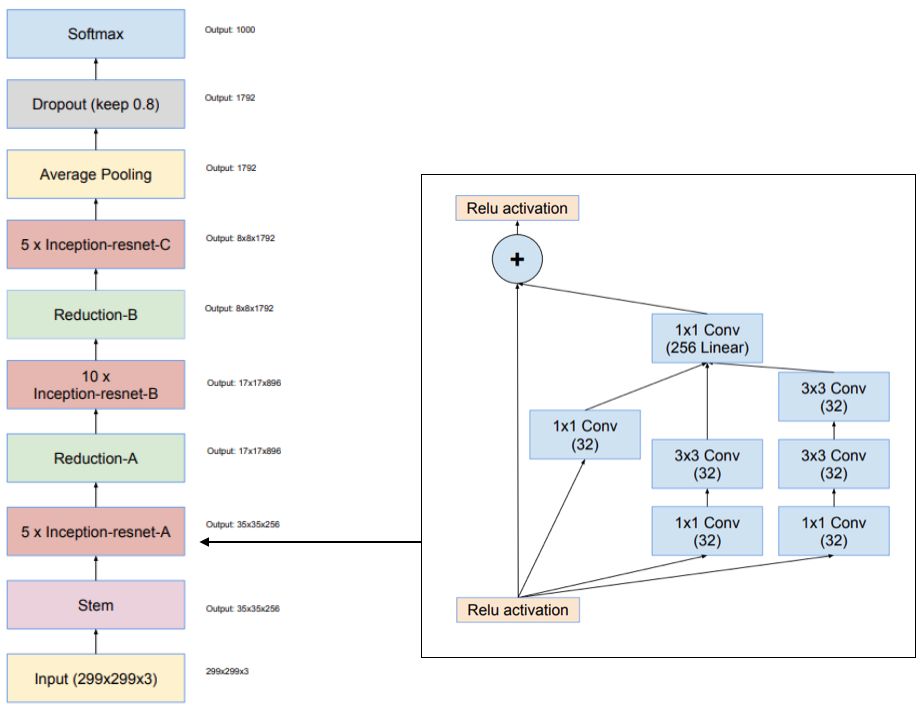
Source: Paper “Inception-v4, Inception-ResNet and the Impact of Residual Connections on Learning” (https://arxiv.org/abs/1602.07261)
I like the composition of this diagram—we can see what is happening and which modules are reused.
Another diagram that clarifies the concept for me is the U-Net diagram used for image segmentation:
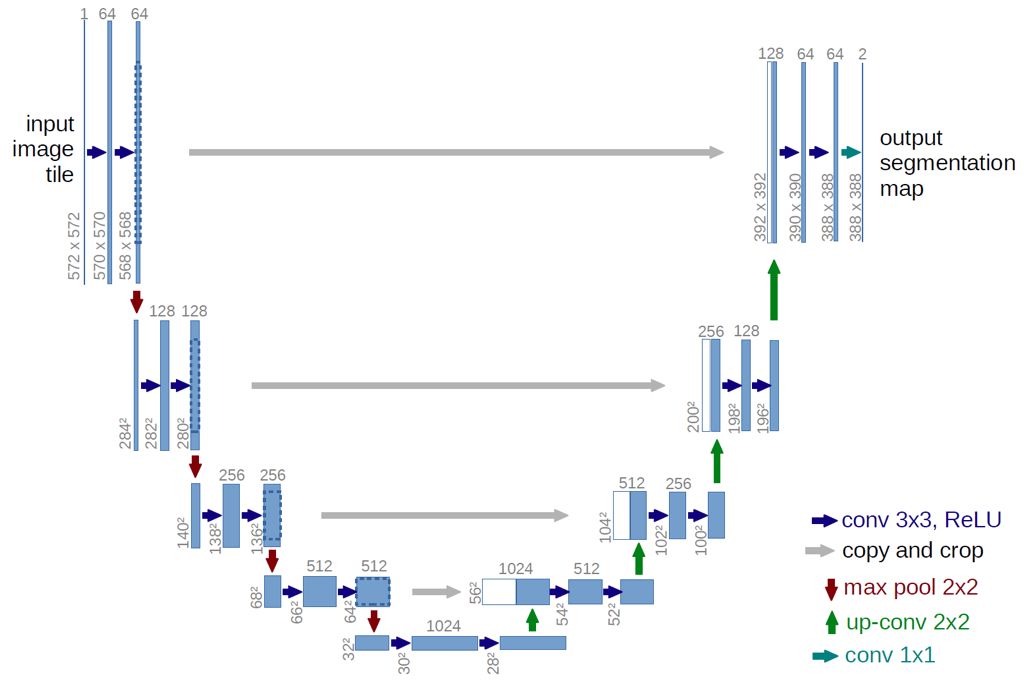
Source: https://lmb.informatik.uni-freiburg.de/people/ronneber/u-net/
Note that here nodes represent tensors and arrows represent operations. I find this diagram very clear—we can see the shape of the tensors, convolution operations, and pooling operations. Since the original U-Net architecture is not very complex, we can overlook its hierarchical structure.
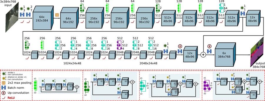
When we want to create clear diagrams with more complex building blocks, it can be slightly more complicated. If we want to reproduce the network, we need to understand the details of the network:
-
Number of channels; -
Convolutions in each max pooling; -
Number of max poolings; -
Batch normalization or dropout; -
Activation functions (is it using ReLU? Is it before or after BN?)
Below is a good example of an abstract diagram:
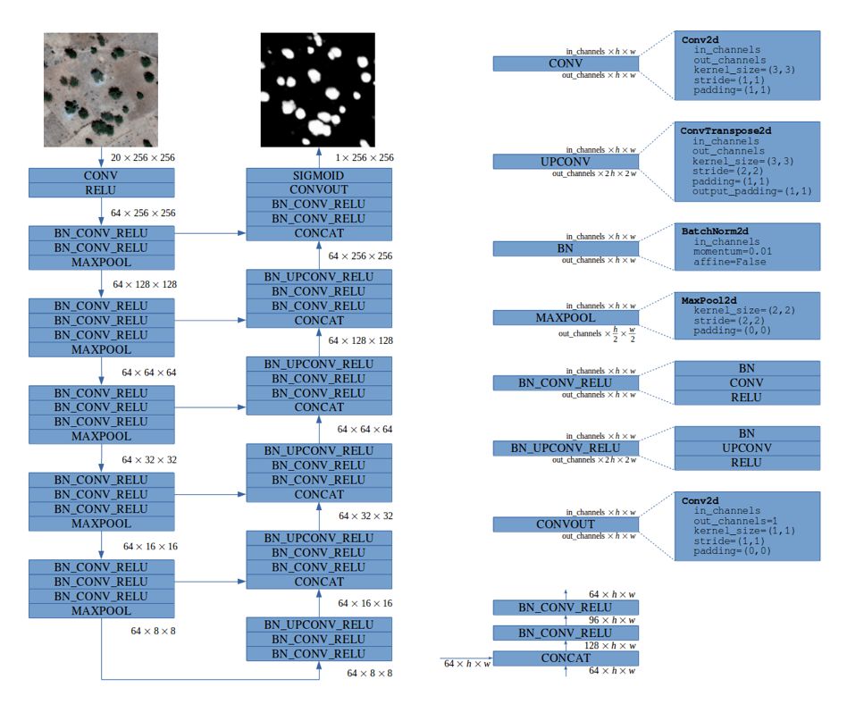
Source: https://deepsense.ai/deep-learning-for-satellite-imagery-via-image-segmentation/)
This diagram could be better in terms of color, but I like its simplicity. The diagram clearly indicates the number of channels, breaking down each complex layer into its building blocks while retaining all the details (note the 3-level hierarchy).
Another interesting way to represent the hierarchical structure of neural network modules:
Source: http://deepscene.cs.uni-freiburg.de/
Automated Tools for Visualizing Neural Network Architectures
You can manually draw networks. Like Chris Olah, use Inkscape, or if you like LaTeX, you can use TikZ, or other tools. You can also automatically generate images.
I hope you realize that you are already using visual representations—code (text is a form of visual representation!)—to interact with computers. For some projects, code is enough, especially if you are using a concise framework (like Keras or PyTorch). For more complex architectures, diagrams add some explanatory value.
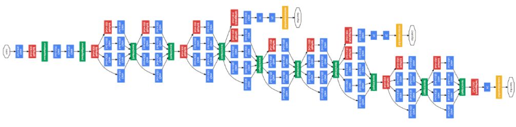
TensorBoard: Graphs
TensorBoard is arguably the most commonly used network visualization tool. The following diagram shows a TensorFlow network graph:
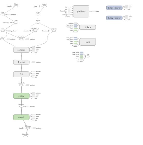
Does this diagram provide a readable overview of the neural network?
I don’t think so.
Although this diagram presents the computational structure, it is still a bit verbose (for example, adding bias terms as separate operations). Moreover, it obscures the most important parts of the network: core parameters in operations (like the size of convolution kernels) and the size of tensors. Despite these shortcomings, I still recommend reading the full paper: Visualizing Dataflow Graphs of Deep Learning Models in TensorFlow (http://idl.cs.washington.edu/files/2018-TensorFlowGraph-VAST.pdf)
This article provides insights into the challenges of creating network graphs from the bottom up. While we can use all TensorFlow operations, including auxiliary operations (like initialization and logging tools), creating a universal, readable graph remains a challenge. If we overlook what the readers value, we cannot create a universal tool that transforms TensorFlow computational graphs into useful (like publication-ready) graphs.
Keras
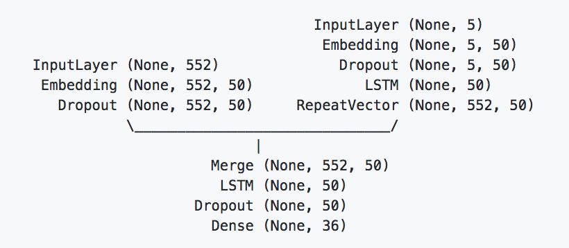
Keras is a high-level deep learning framework, so it has great potential for generating beautiful visual graphs. (Note: If you want to use interactive training graphs for Jupyter Notebook, I wrote one: livelossplot (https://github.com/stared/livelossplot).) However, in my opinion, Keras’s default visualization options (using GraphViz) are not top-notch:
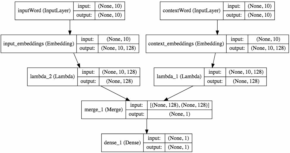
Source: https://keras.io/visualization/
I believe it not only hides important details but also provides redundant data (repeated tensor sizes). Aesthetically, I don’t like it either.
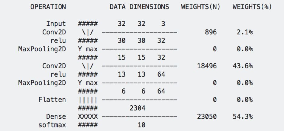 Source: https://github.com/stared/keras-sequential-ascii (2017)
This structure is suitable for small sequential network architectures. I find it useful for training and courses like “Starting deep learning hands-on: image classification on CIFAR-10.” But it is useless for more advanced projects (some suggested I use the branch visualization tool in this git log (https://stackoverflow.com/questions/1057564/pretty-git-branch-graphs)). It is evident that I am not the only one trying to beautify neural network visualization graphs using ASCII:
Source: https://github.com/brianlow/keras_diagram
I think the most aesthetically pleasing diagram I found was in Keras.js:
Source: https://transcranial.github.io/keras-js/#/squeezenet-v1.1
This project is not actively developed, but it supports TensorFlow.js. Since it is open-source and modular (using the Vue.js framework), it can serve as a starting point for creating standalone visualization projects. Ideally, it should work in Jupyter Notebook or a separate browser window, just like displaCy breaks down sentences.
Conclusion
We have looked at many examples of neural network visualizations, all of which made trade-offs in the following aspects:
-
Data visualization vs. data art (utility vs. aesthetics) -
Clarity vs. ambiguity -
Shallow vs. hierarchical -
Static vs. interactive (providing more information) -
Specific vs. general (is it applicable to a wide range of neural network families?) -
Direction of data flow (top-down, bottom-up, or left-to-right?)
Each of these topics could be written as a master’s thesis, and merging them all could write a doctoral dissertation (especially on how people visualize and what should be abstracted in detail).
Editor: Huang Jiyan