

Whether LUI or GUI, what product interaction principles should be followed in the AI era has been discussed many times in 2023. The consensus seems to be that LUI is needed, but GUI is also indispensable.
As a successful breakout product in AI search, Perplexity’s exploration of AI-native interaction is worth studying and learning from. This article analyzes Perplexity’s interaction from the principles of user interface design, drawing on past successful experiences (the interaction principles proposed by Jakob Nielsen in 1994) that can still guide current AI-native product design.
Author: Matt Moore, who has worked in interface design and human-computer interaction at WeWork, Uber, Sonder, Lime, etc.
This article is adapted from a translation by Twitter user Baoyu, with adjustments from Founder Park.
Original article: https://mttmr.com/2024/01/10/perplexitys-high-bar-for-ux-in-the-age-of-ai/
2023 marks the beginning of a new era in computing technology. So far, generative AI has mainly focused on technological development. Meanwhile, most AI products still use chat interfaces designed by the original model providers (similar to ChatGPT), which places high demands on user capabilities, much like command-line interfaces in the early personal computer era.
But now it is 2024. Perplexity is gradually emerging with its innovations in user experience for AI-native products. They are changing the way we use AI to search the web. The heated discussions on Twitter and their Series B funding backed by Bezos are enough to prove they are on the right track.
One of the keys to their success is looking to the past. Given the slow evolution of human behavior, we can draw on some fundamental principles. In 1994, Jakob Nielsen wrote an article titled “Ten Usability Heuristics for User Interface Design.” Here’s how Perplexity effectively applies these principles to achieve great success.

01
Make System Status Visible
Design should ensure that users are always aware of what is happening through timely feedback.
In any product, it is crucial to show users that the system is still running when they perceive performance delays.
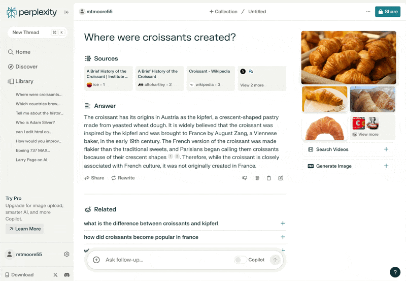
Ideally, performance enhancements can shorten wait times. When this is not possible, a progress indicator becomes a basic necessity. Perplexity excels in this area by clearly showing users what the LLM is doing while searching for the required information. Users can see prompts like “Considering 8 sources” or “Researched and summarized,” which not only informs users that the system is running but also helps them understand how it works and how this new technology operates. This ultimately enhances user trust in technology. Users gain a deeper understanding of the technology, feel more familiar with it, and are thus more willing to use it again.
02
Design Language Based on Users’ Natural Language
Use vocabulary, phrases, and concepts familiar to users in the design, rather than internal jargon. Follow real-life habits to present information in a natural and logical order.

Perplexity is easy to understand because it draws on human conversational thought patterns.
For example, phrases like “Ask follow-up questions…” closely resemble everyday communication style. This not only serves as a friendly prompt but also reflects Perplexity’s advantage: quickly and accurately optimizing web search results based on your initial question. This choice of wording seems simple, but selecting the right terms is not easy. As a result, the product feels more approachable and less intimidating, providing an unprecedented sense of naturalness.
03
Empower Users with Control and Autonomy
Users often accidentally perform incorrect actions. They need a clear “emergency exit” option to immediately undo these actions without going through complex processes.
AI chat products generally encourage users to share chat content as a form of record. Although I, as a user, do not have a strong perception of the value of these features, Perplexity does well in enhancing user control. Users can re-edit previous commands to generate new results and can delete subsequent questions and answers. This allows users to edit the entire conversation sequence, creating a more refined and shareable content.
04
Maintain Consistency and Follow Standards
Users should not be confused about whether different terms, contexts, or actions have the same meaning. Follow common practices in the industry and platform.

Perplexity strictly adheres to vocabulary commonly used on the internet. When introducing new terms or user interfaces, they often explain their meanings through pop-up prompts. Users may not immediately understand all the details, but the Perplexity team makes it simple to learn and understand new things.
05
Error Prevention
While clear error messages are critical, the best designs should focus on preventing problems from occurring in the first place. Eliminate error-prone environments or detect these conditions and provide confirmation choices before users confirm actions.
This is one of the significant innovations achieved by Perplexity. When users’ inquiries do not yield sufficiently specific answers, Perplexity guides users to clarify their questions further. We can understand that Perplexity views overly vague or nonspecific answers as a failure state. While this is common in search products, it is surprising that other search service providers have not developed equally refined solutions.
Requesting users to clarify questions feels more natural, just like people do in everyday conversations. This further enhances users’ sense of trust.
06
Recognition Over Recall
Reduce the user’s memory load by making elements, actions, and options visually apparent. Users should not have to remember information from one part of the interface and apply it to another. Information needed in the design (e.g., field labels or menu items) should be intuitively displayed or easily accessible when needed.
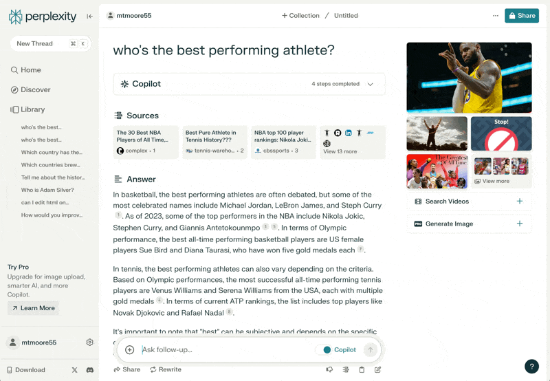
This is another key innovation of Perplexity. Other generative AI chat products often rely too heavily on users’ memory rather than intuitive recognition, which greatly limits their ability to attract a broad user base. Perplexity understands that, just as few people ask questions after large speeches, not all users are adept at asking follow-up questions. Therefore, it predicts what questions users might ask and displays these questions at the end of each answer.
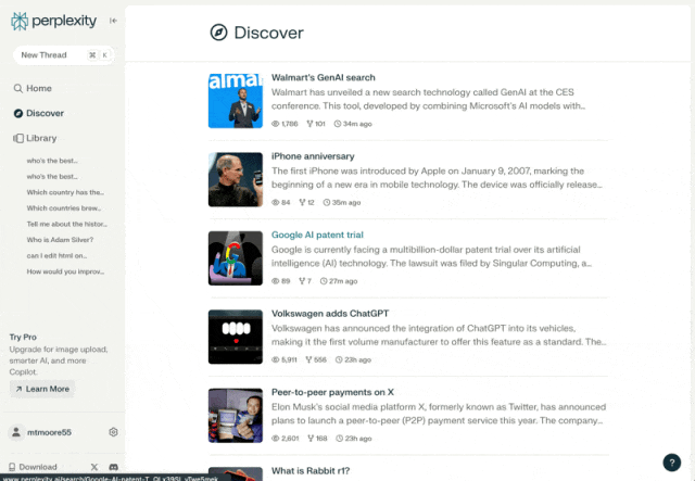
In addition to suggesting follow-up questions, the team has developed a “Discovery” section that showcases new and interesting topics daily. These curated prompts provide users with a simple way to interact with the product even without specific questions. I often find myself inspired to ask follow-up questions while browsing these “Discovery” contents. This has become an interesting and novel way for users to interact with information content.
Just like the evolution from command-line interfaces to graphical user interfaces, Perplexity makes this technology more accessible and usable for a broad user base by consistently providing recognition-based pathways forward, marking a significant step forward.
07
Flexibility and Efficiency of Use
Hide shortcuts for beginners—this allows expert users to interact more quickly, making the design suitable for both novices and experienced users. Users should be allowed to customize their frequently performed actions.
Keyboard shortcuts are ubiquitous in the interface. For early adopters in the tech industry like us, Command K is a very popular shortcut. These details indicate that the product is committed to meeting users’ needs at different stages of use.
08
Aesthetic and Minimalist Design
The interface should not contain irrelevant or rarely needed information. Every additional piece of information in the interface competes with key information, reducing its relative significance.
The interface is clean, friendly, and modern. Unlike other products that emphasize technical and engineering design, Perplexity maintains a warm and advanced style.
09
Help Users Recognize, Diagnose, and Recover from Errors
Error messages should use plain language (no error codes) to accurately indicate the problem and offer constructive solutions.
The only “error” I encountered was exceeding the usage limit for Co-pilot (the advanced search feature) in the free plan. In this case, the system clearly indicates the status. A prompt tool informs you of the reason the feature is unavailable. It clearly states the required action: upgrade.
Perplexity effectively avoids errors by collecting more information from users as needed. Ideally, the best error message is one that does not need to appear.
10
Provide Help and Documentation
The ideal situation is that the system requires no documentation. However, sometimes documentation may be needed to help users understand how to complete their tasks.
Perplexity also meets this requirement. As mentioned earlier, they teach users how to use this new technology through practical use. But if you want to learn more about Perplexity, they provide a concise help and FAQ section. Since they are clearly committed to making the product itself as simple as possible, this section is also straightforward and easy to understand.
* https://blog.perplexity.ai/faq
It will be interesting to see how Perplexity continues to evolve. If you are developing AI-centric products in 2024, consider referencing Perplexity’s approach: always remember to learn from past experiences.

Product Hunt 2023 Annual Product List: GPT-4 Takes the Crown, Complete Introduction to Award-Winning AI Products
Thoughts on Products from Cubox Founder: Don’t Make “Summarize the Whole Article” the Only Highlight of AI Reading Products
8 Million Sales, Over 1 Billion Revenue, the First Controversial AI Hit Game Has Emerged
The 2023 of Three Large Model Entrepreneurs: Excitement, First Battle Success, Hackathon, and Repeated Failures
Over 10 Million Views on YouTube, an Independent AI Game Focusing on Deceiving NPCs is Becoming the New Hit